Web Design
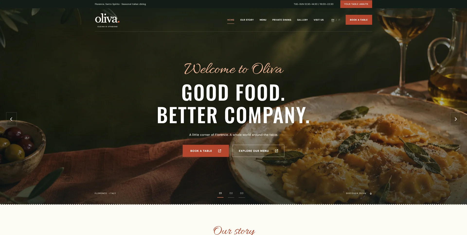
Oliva
A personal restaurant website concept combining an expressive Italian dining atmosphere with a photographic menu, clear visit information and a demonstration reservation journey.
 Let’s talk
Plan restaurant location pages with useful local details. Connect each venue to its menu, dining space and contact route without repeating generic area copy.
Create a restaurant location page when it provides useful information about a real venue, not simply another place name to target. Guests need to know which restaurant they are viewing, how its menu and service arrangements differ, where to go and how to book the correct table.
A restaurant with one dining room may only need one clear visit page. A business with several venues may need separate pages because hours, menus, access and reservation routes differ. A useful structure follows those differences and makes shared information easy to maintain.
A physical restaurant location is a destination guests can visit. A neighbourhood mentioned in directions is context. A delivery area, if the restaurant offers delivery, is another kind of information with its own boundaries.
Do not describe nearby districts as if each contained a branch. For a single restaurant, useful directions and a clear description of the actual setting are more helpful than several near-identical pages with different place names.
The Oliva personal restaurant concept presents one fictional Florence setting and a visit destination. It is a reference for connecting atmosphere with visit information, not evidence of several operating locations or a verified street address.
Before adding a venue page, gather the information that belongs specifically to it. If the only difference is a heading, the page probably needs a clearer purpose.
| Information | What may differ by location | Where it should connect |
|---|---|---|
| Address and entrance | Street, entrance, transport and practical access | Directions and visit details |
| Service times | Lunch, dinner, special openings or closures | The relevant menu and reservation route |
| Food and drinks | Menu availability, prices or service format | Current menu content for that venue |
| Dining spaces | Room character and group arrangements | Private-dining information where relevant |
| Contact handling | Team, telephone or provider destination | The correct booking or enquiry channel |
Confirm these facts with the people responsible for each venue. The structure should make differences visible without encouraging the same shared information to drift into inconsistent versions.
A useful page can identify the venue, show its character, explain the relevant menu and service times, provide practical visit information and lead to the correct reservation route.
Do not make someone return to the homepage to discover which menu or contact action belongs to that location. Place contextual links near the information they support.
The one-page versus multi-page restaurant guide helps decide how much belongs on the page itself. A menu may need its own destination, but the relationship should remain clear in the labels and navigation.
Choose venue-specific images when the places genuinely differ. An entrance photograph, dining-room view or recognisable detail can help a guest confirm that they are considering the right location.
Avoid reusing a room photograph across different venue pages in a way that suggests it depicts them all. Shared food photography may be appropriate when it accurately represents the same offer, but its role should be different from documenting a particular room.
The restaurant photography brief includes a shot-planning approach for entrances, spaces and food. For a real restaurant, those images should represent the place and dishes guests can actually encounter.
Check the complete route from each venue page. The button may lead to the correct provider domain but still select the wrong branch or require the guest to choose again without explanation.
Where supported, preselect the location and show it clearly in the destination. If selection happens later, explain that step and use recognisable venue names. Keep the guest able to correct the choice before confirming anything.
Use the CTA placement guide and contact-channel guide to define this handoff. A prominent button is only useful when it leads to the right operational destination.
Decide which information is shared and which belongs to an individual venue. A common brand story may live on one page. Different service hours or menus need clear ownership at the appropriate level.
If a CMS is part of the project, define those editing responsibilities before implementation. Ask who updates a closure, how a menu change is approved and whether a shared change should affect every location. A flexible layout alone does not answer those questions.
For the implementation choices, read the design-only versus complete-build guide. SavianoDesign’s WordPress option can be scoped around agreed editable content; a custom location-management system is a separate requirement.
Directions can explain the entrance, nearby transport, parking information or landmarks that actually help someone arrive. Use facts the restaurant can verify and keep them current.
Avoid padding the page with repeated city names or generic descriptions of the area. An atmospheric introduction can establish character, but it should lead into information about this venue rather than substitute for it.
If enquiries keep reaching the wrong team, the guide to better reservation enquiries helps turn that pattern into a specific content correction.
A guest visiting from abroad may enter directly on a venue page. Translate the information needed for that visit, including directions, menu context and the next step, rather than relying on an English homepage alone.
The multilingual restaurant website guide helps define a manageable translation scope. Use the mobile navigation testing guide to test a realistic task: choose a venue, find its menu and begin a reservation without losing the selected place.
Review maps and external links as part of the same journey. They should identify the actual destination, and guests should still have useful text information if they choose not to open another service.
Only when those pages have a distinct, useful purpose. In many cases, one accurate visit page with relevant directions is clearer and easier to maintain.
Yes, when the menu and its conditions genuinely apply to them. State that relationship and make any exceptions clear.
Not usually. A consistent structure helps guests compare venues. The content and relevant routes should reflect the actual differences.
Send your venue list, menus, visit details and reservation routes. SavianoDesign’s Website Design service can help define the page structure and agreed editing needs, so each location has a useful purpose within the site.
Web Design
A personal restaurant website concept combining an expressive Italian dining atmosphere with a photographic menu, clear visit information and a demonstration reservation journey.
Web Design
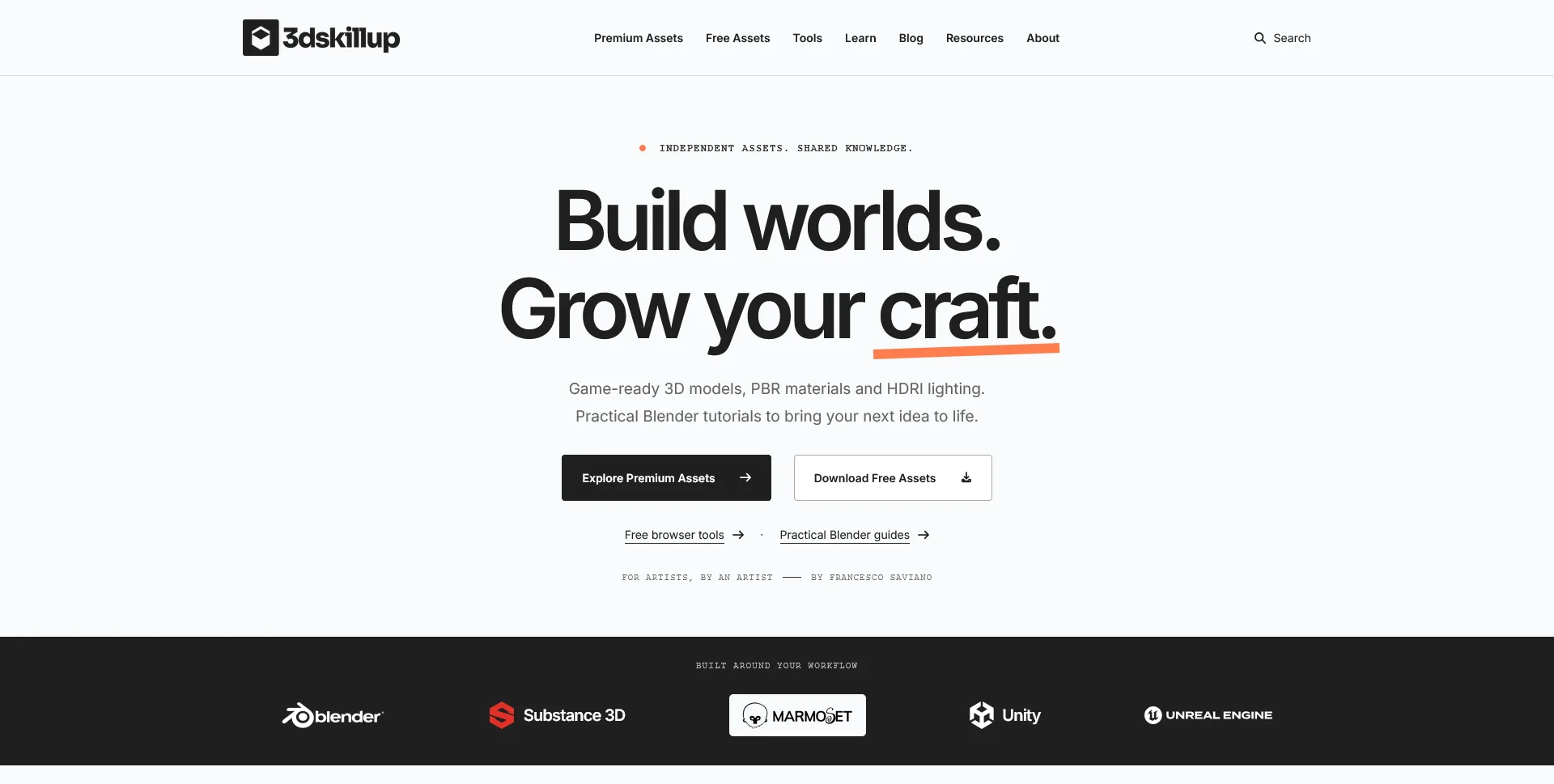
A separate creative platform bringing together game-ready 3D assets, practical tutorials and resources for artists.
Web Design
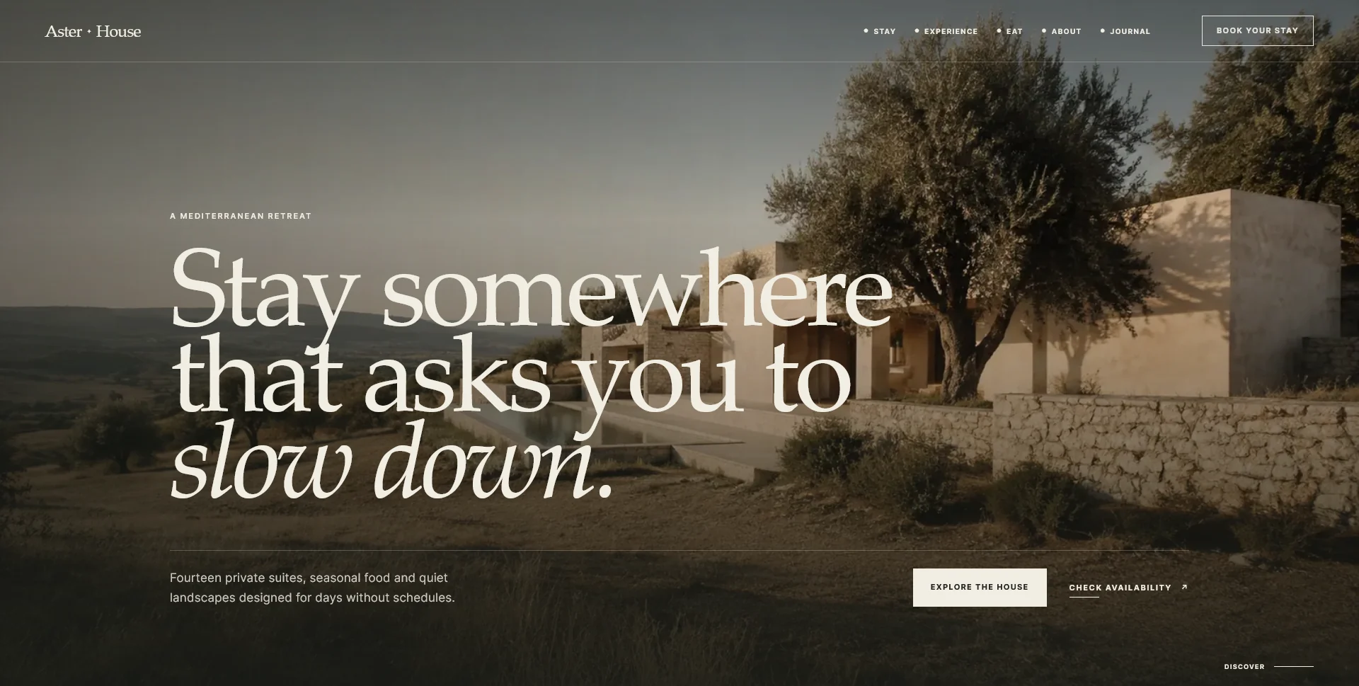
An editorial hospitality concept, combining a Mediterranean visual direction with responsive front-end development.
Web Design · 6 min read
Decide when a restaurant website should prioritise email, phone or online booking. Match each route to guest needs, staff availability and actual follow-up.
Web Design · 6 min read
Prepare a restaurant website photography brief around food, rooms and visiting information. Plan essential shots, useful crops, approvals and the handover.
Web Design · 6 min read
Prioritise translation for a multilingual restaurant website. Plan menus, visit details, contact instructions and confirmation states as one guest journey.
Have a website in mind?
A short outline is enough to start a conversation.
Discuss your project View my 99designs profile5.0 / 5 from 25 reviews on 99designs. Read client feedback.