Web Design
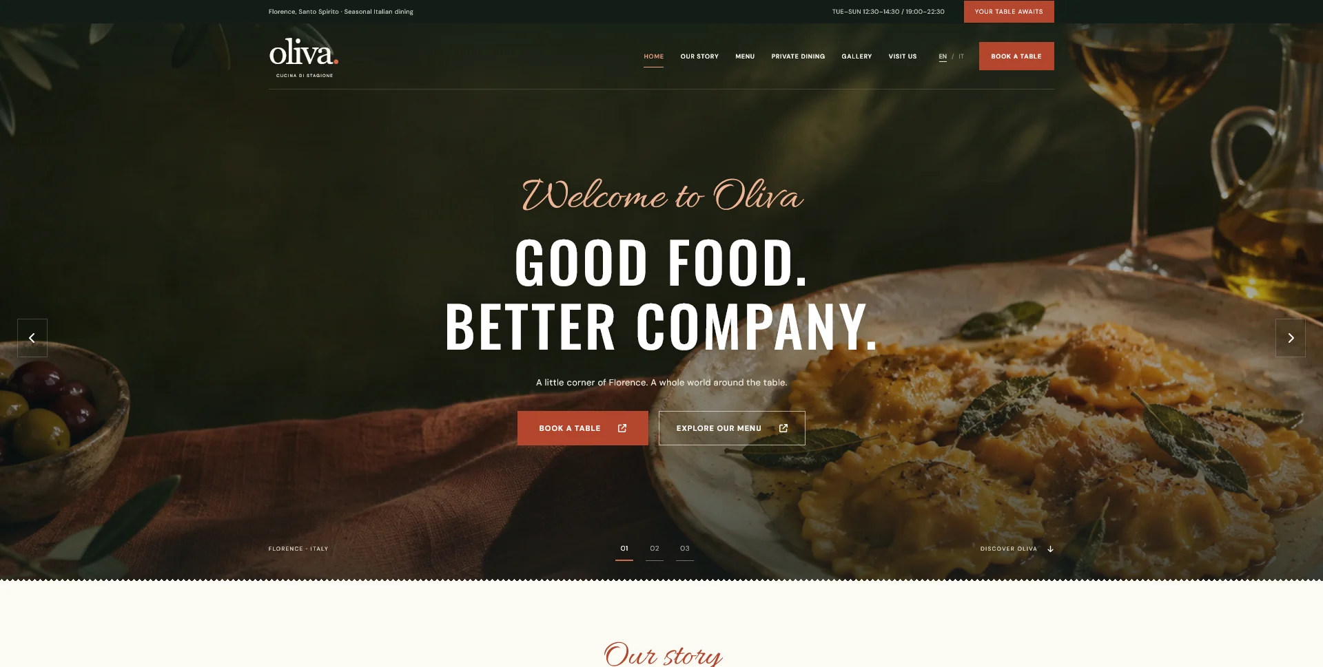
Oliva
A personal restaurant website concept combining an expressive Italian dining atmosphere with a photographic menu, clear visit information and a demonstration reservation journey.
 Let’s talk
Test restaurant website navigation on mobile with real guest tasks. Check menus, booking actions, contact routes and return paths beyond screen-size previews.
Test a restaurant website on mobile by asking people to complete real guest tasks, not only by checking whether the layout fits a small screen. They should be able to find the relevant menu, understand service times, choose the right location and reach the intended reservation route without losing context.
A page can be technically responsive while important information remains difficult to find. The test needs to include navigation, buttons, return journeys, form feedback and any external booking provider. Visual fit is one part of that experience.
Write scenarios that resemble the questions guests bring to the restaurant. Avoid instructions that tell the participant which menu item to click; the route they choose is part of what you are trying to understand.
| Task | What completion looks like | What to observe |
|---|---|---|
| Find the dinner menu | The guest identifies the correct menu and service | Labels, page context and readability |
| Plan a visit | The guest finds the relevant hours and location | Missing distinctions and misleading links |
| Request a table | The guest reaches and understands the right route | Button wording, destination and status expectations |
| Ask about a group dinner | The guest finds the appropriate enquiry | Separation from ordinary reservations |
| Correct an entry | The guest understands and resolves an error | Feedback, preserved input and keyboard behaviour |
For a multi-location restaurant, add a task that requires choosing a particular venue. For a translated site, repeat the important journey in the relevant language rather than inspecting only the homepage.
Guests may enter through a shared menu URL, a search result, a location page or an events link. Test those starting points directly.
Can someone identify the restaurant and find the next step without retracing a journey they never took? Does the page show which meal service or location it concerns? A compact menu page still needs enough context to stand on its own.
The location-page guide and multilingual website guide help identify the extra context required in those situations.
Give the participant a scenario and let them attempt it. Ask what they expect a control to do before they use it. Avoid helping at the first hesitation, because that can hide a label or hierarchy problem.
Record the task, starting page, route, point of hesitation and outcome. A small informal review does not establish a population-wide success rate, but repeated observations can identify practical issues worth investigating.
Separate an isolated preference from an obstacle. “I prefer another colour” is different from “I thought this button would confirm a table, but it opened an enquiry form.” The latter gives the team a specific design question.
Check whether the menu opens predictably, exposes clear destinations and closes when the guest expects it to. Keyboard users should be able to reach the controls, see focus and continue without getting trapped.
Review the order of the links and the distinction between navigation and the primary reservation action. A compact header should not depend on an unfamiliar icon to explain every destination.
The Oliva restaurant concept offers a mobile navigation and a persistent booking action as part of its personal demonstration. Use the live concept to discuss how those controls relate to the content, then test the same tasks with your restaurant’s actual labels and booking process.
A booking action that stays visible can help, but inspect it near the bottom of the page, above a form and while the on-screen keyboard is open. It should not cover the next field, an error message or another essential control.
Check longer translated text and enlarged text settings as well. A design that works with one short English label may need adjustment when the content changes.
The restaurant CTA guide explains how to choose useful placements. Keep the action available without making it compete with the task the guest is already completing.
Follow the actual link into the reservation provider during the agreed test process. Confirm the selected venue and understand whether the visitor is checking availability, submitting a request or making a confirmed booking.
Then return to the restaurant website. Can the guest find the menu again, recover the previous page and understand where they are? If the provider opens another tab, is that transition understandable?
Use test arrangements approved by the restaurant and provider; avoid creating live reservations just to check a button. A route can be reviewed visually, while real delivery and booking tests need a controlled process with the responsible team.
Try an incomplete form and a correction. Check whether labels remain visible, the right input is identified and valid information is preserved. The reservation form-fields guide provides the content decisions behind those fields.
Read the final message and ask what the participant believes has happened. Compare that answer with the actual state using the request-confirmation guide.
Also inspect a less favourable connection. Does the page remain understandable while photographs arrive? Does a large image delay the menu or move a control just as someone tries to use it? The restaurant image optimisation guide connects those observations with the image handover and implementation.
For each issue, record the affected task, evidence, likely cause and proposed change. Prioritise failures that prevent a guest from completing the visit or enquiry journey before minor presentation preferences.
After a change, repeat the affected task. A corrected label does not need a complete redesign, but it should be checked in the context where confusion occurred.
The existing website navigation design guide explains how navigation labels and contextual links work together. Use it to address the route as a whole rather than adjusting only the header.
It is useful for finding layout issues, but real-device checks also reveal touch, keyboard and browser behaviours. Include the devices and routes relevant to the project.
Not for every first review. A focused set of realistic tasks can uncover obvious problems. Keep the conclusions proportionate to the people and conditions actually tested.
No. It provides evidence about the tasks and conditions reviewed. Accessibility evaluation includes additional requirements and methods that should be scoped separately where needed.
Send your current URL and the actions guests should be able to complete. SavianoDesign’s Website Design service can help define the navigation, responsive interface and implementation work around those tasks.
Web Design
A personal restaurant website concept combining an expressive Italian dining atmosphere with a photographic menu, clear visit information and a demonstration reservation journey.
Web Design
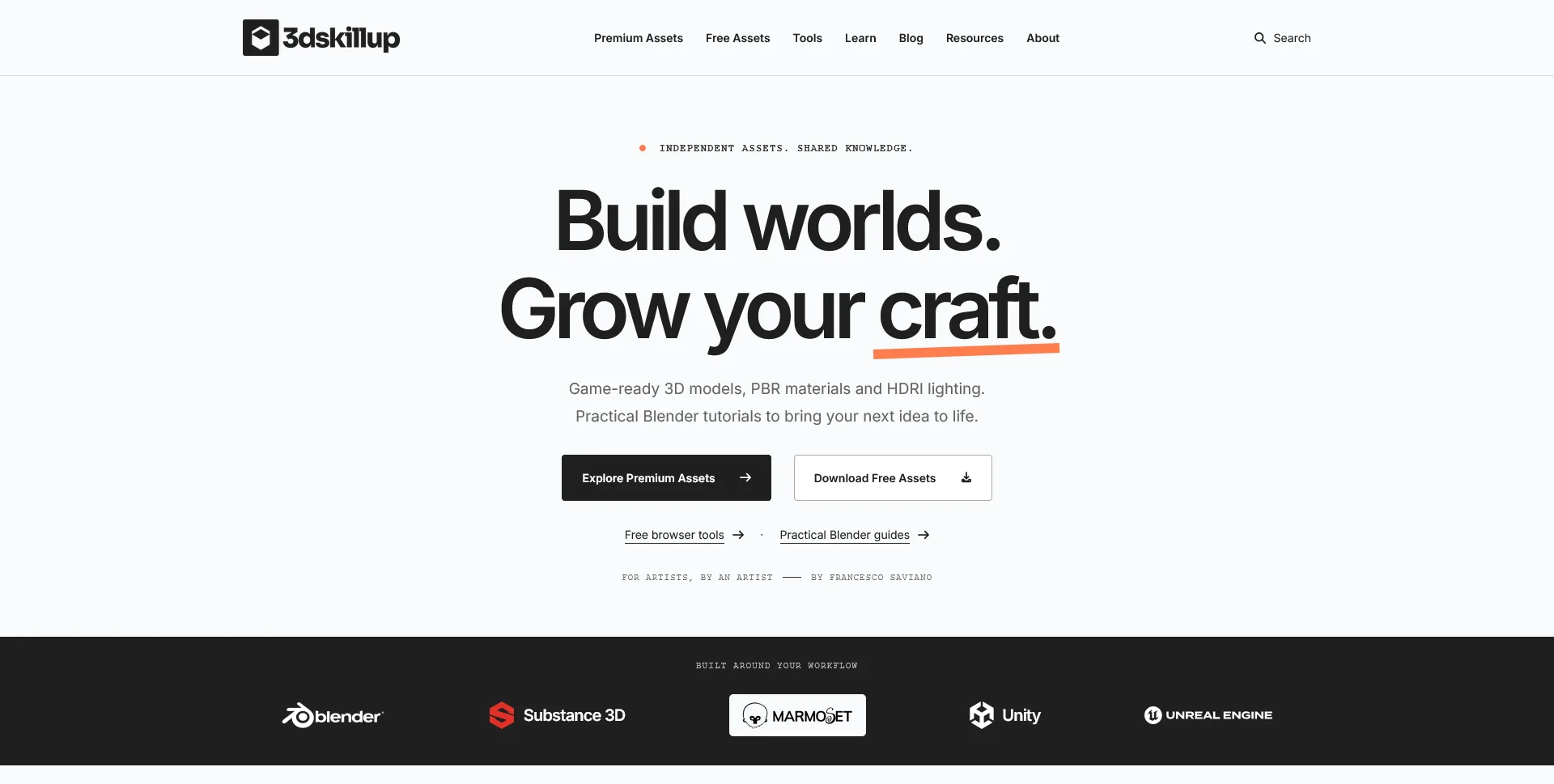
A separate creative platform bringing together game-ready 3D assets, practical tutorials and resources for artists.
Web Design
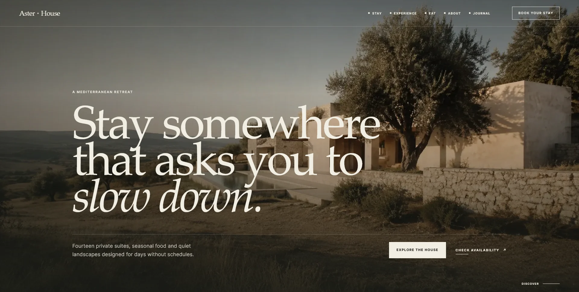
An editorial hospitality concept, combining a Mediterranean visual direction with responsive front-end development.
Web Design · 6 min read
Plan restaurant website calls to action around guest decisions. Choose clear labels, useful positions and reservation routes that match what happens next.
Web Design · 6 min read
Choose the fields a restaurant reservation form really needs. Separate required details, optional context and later questions, with clear request expectations.
Web Design · 6 min read
Keep restaurant website images attractive and efficient. Plan responsive sizes, formats, loading priorities and an upload workflow that preserves useful detail.
Have a website in mind?
A short outline is enough to start a conversation.
Discuss your project View my 99designs profile5.0 / 5 from 25 reviews on 99designs. Read client feedback.