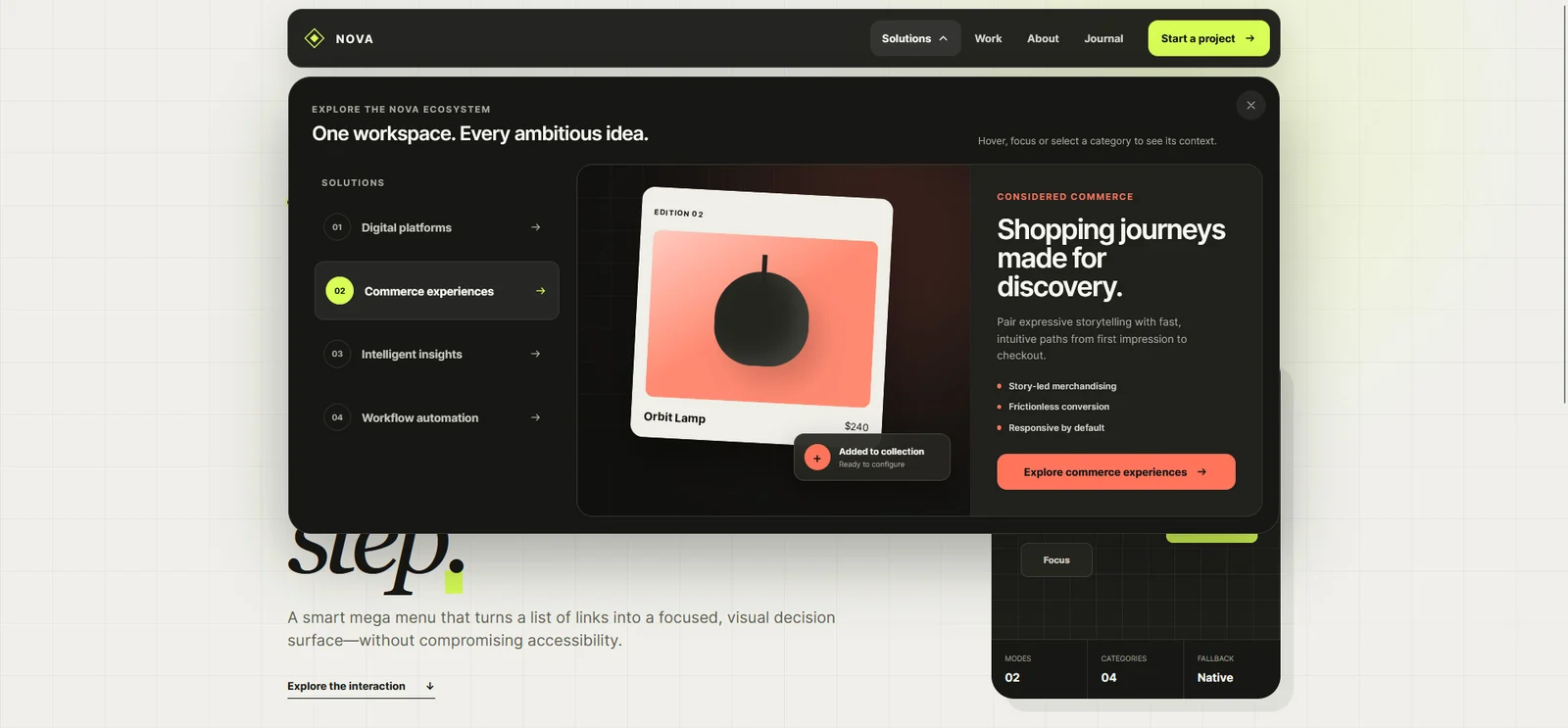
Nova — Smart Mega Menu
Website Design / Front-End Development

Plan website navigation with clear menu labels, useful page groups and mobile behaviour. Includes a practical route map and a checklist for testing.
Website navigation design starts with deciding where people need to go and what they expect to find there. A beautiful header cannot compensate for an unclear page structure. Before choosing a menu animation or deciding whether links belong in a drawer, map the questions a visitor brings to the site.
This guide is for small business websites and content-rich interfaces. It covers the decisions you can make before visual design, then the behaviour to check during implementation. The examples are planning exercises, not claims about measured conversion results.
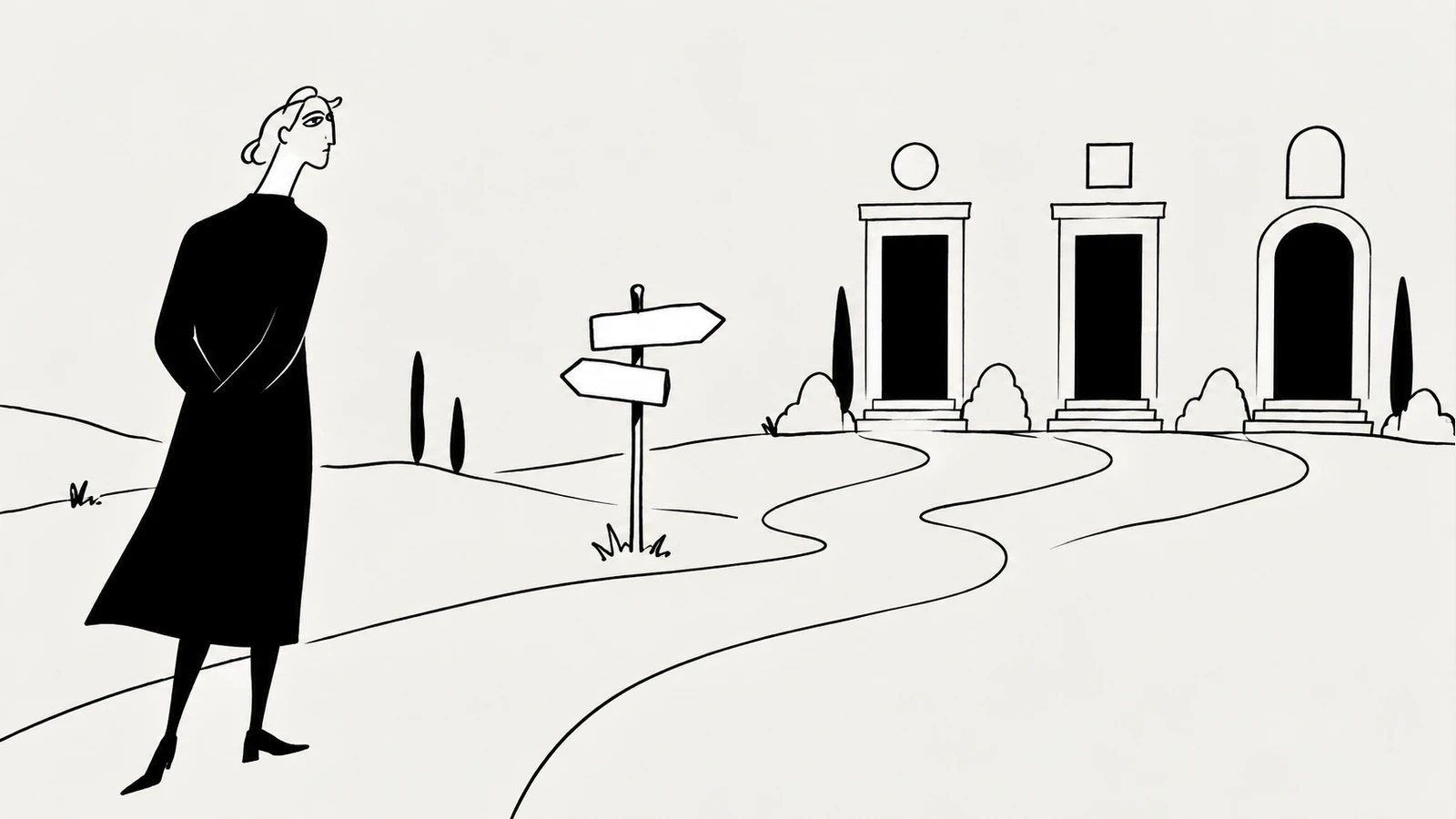
List the tasks that matter: understand the offer, compare services, check relevant work, find a practical answer and contact the business. Match each task to a destination. If a task has no page, the problem is missing content. If several pages seem equally likely to answer it, clarify their purpose before adding more navigation.
For a small architecture studio, a useful structure might distinguish residential projects, the design process and enquiries. Its internal departments may be important to the team but unhelpful as menu labels. Organise the public site around information the visitor can recognise.
The homepage content checklist helps prepare the offer, proof and next steps. Navigation then connects those pieces instead of trying to explain the whole business inside the header.
Choose labels that help someone anticipate the destination. “Projects” is usually easier to interpret than an abstract phrase such as “Our universe.” A distinctive voice can appear in a page headline while the link remains straightforward.
Use consistent language across the menu, page title and breadcrumb. They do not have to match character for character, but they should describe the same thing. A link called “Pricing” should not lead to a generic contact page with no explanation of costs.
Avoid adjacent categories whose boundaries are unclear. If both “Solutions” and “Services” lead to similar offers, either explain the distinction or combine them. Ask someone unfamiliar with the site where they would click for a specific task, and listen to the reason for their choice.
The main menu introduces the principal sections. Local navigation helps people move within a section, such as between service types or documentation chapters. Contextual links connect a sentence or example to the next useful explanation.
These layers work together. You do not need to put every article in a dropdown to make it discoverable. A useful archive, relevant links in the body and related reading can provide a clearer route.
Google’s link guidance recommends crawlable links and descriptive anchor text. For important destinations, use ordinary links with real URLs. An interface that only changes content after a script runs needs additional care to preserve discoverable pages.
Start with a compact table. It exposes missing destinations and ambiguous labels without requiring polished screens.
| Visitor task | Likely starting point | Destination | Useful next step |
|---|---|---|---|
| Understand the offer | Main menu: Services | Services overview | Relevant service detail |
| Check a suitable example | Main menu: Work | Project archive | Case study and its scope |
| Prepare an enquiry | Service page | Preparation guide | Contact details |
| Find a specific topic | Insights archive | Relevant article | Related guide or example |
A mega menu becomes useful when meaningful groups need to be visible together. It also creates more content to maintain and more interaction to test. For a handful of pages, a short list may already solve the task.
The Nova mega menu concept explores contextual previews and a mobile disclosure pattern. Treat it as a component study, then decide whether that degree of navigation actually fits your content.
A desktop dropdown cannot rely solely on hovering if the same choices must work on a touch screen. Specify how a visitor opens a group, follows a destination, closes the panel and returns to their place. Keep the difference between a link and a disclosure control clear.
For example, a section title can be a link while a separately labelled button expands its child links. Alternatively, a disclosure button can open a group containing an explicit overview link. Choose one pattern consistently rather than changing its meaning between sections.
W3C’s menus tutorial explains the importance of meaningful structure, recognisable states and keyboard operation. In practical reviews, check that focus remains visible and every destination is reachable without a pointer. A screenshot cannot establish that these behaviours work.
Search supports people who already have a term in mind. Navigation helps people understand what is available. Filters refine an existing collection. None automatically replaces the others.
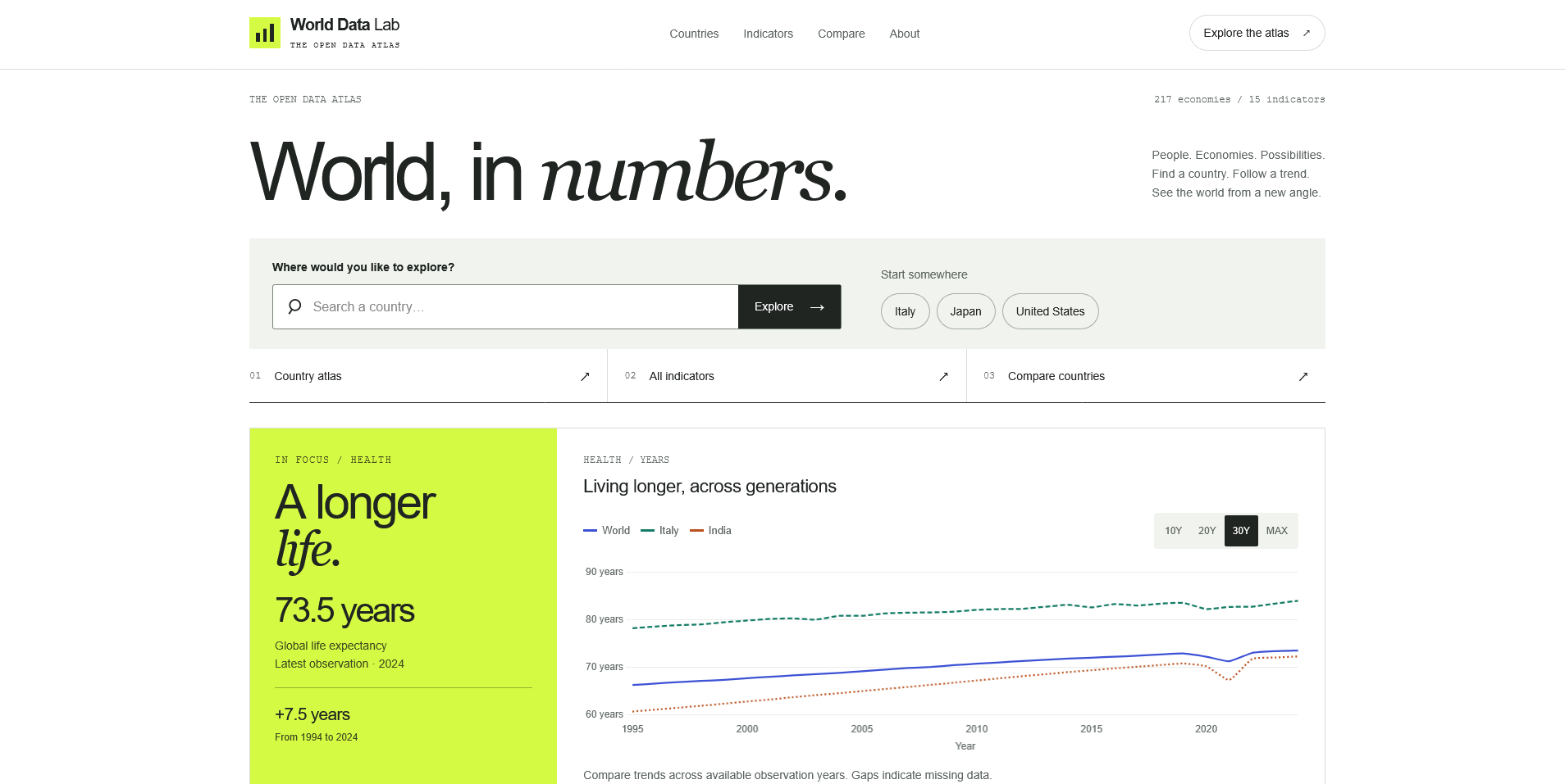
An atlas such as World Data Lab offers different routes through countries and indicators. A visitor’s starting question determines which route is useful. The same distinction applies to an archive organised by service, industry or content type.
For a catalogue, the guide to digital asset marketplace features explores discovery in more detail. When a search returns nothing, the next task is recovery: explain which filters are active and how to broaden the result. The guide to empty, error and loading states covers that part of the journey.
Give a reviewer a concrete task without telling them which menu item to choose. Ask where they expect the link to go before they activate it. Then check whether the destination satisfies that expectation and offers a useful next step.
Repeat with a narrow viewport, keyboard input and a longer page title. Test opening and closing the mobile panel, following a child link and returning through browser history. Look for unexpected focus movement, obscured content and controls that change meaning across breakpoints.
Record what failed and why. “Could not find residential work because the category name was unfamiliar” suggests a content decision. “The submenu closes while moving toward a link” suggests an interaction problem. Keeping those findings separate makes revision more precise.
There is no useful universal number. Start with the principal tasks and test whether the labels remain distinguishable. If the menu feels crowded, first review grouping and priority rather than removing destinations at random.
No. If a short row of visible links fits comfortably, it can make the main choices immediately available. A collapsed menu is a layout decision with an extra interaction to consider, not a requirement for a modern site.
The footer can repeat important routes and add practical links such as contact and policies. Its job is to help someone at the end of a page. It does not need to mirror every nested item exactly.
If you need help connecting content structure with responsive layouts, explore website and interface design.
Website Design / Front-End Development
Website Design / UI/UX
Digital Product / Web Application
Digital Products · 6 min read
Plan a clear homepage with this practical content checklist: positioning, services, proof, calls to action and useful links for a service business.
Digital Products · 6 min read
Design useful empty, error and loading states for web apps. Learn what each message should explain, which action to offer and how to review recovery.
Digital Products · 17 min read
Discover 10 essential digital asset marketplace features, from smart search and licensing to creator profiles, previews and responsive design.
Have something in mind?