Web Design
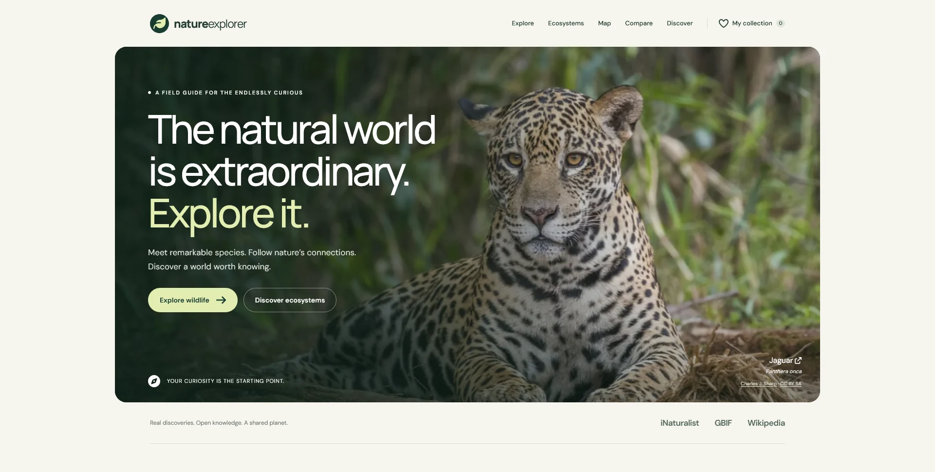
Nature Explorer
A biodiversity exploration web app connecting species, ecosystems, observation maps and comparisons through a clear, image-led interface.
 Let’s talk
Compare one-page and multi-page dental websites using real patient questions, service detail and contact routes. Choose a structure your practice can maintain.
A one-page dental website can work when the practice has a compact offer, a small amount of approved content and one straightforward contact journey. A multi-page site is usually more useful when people need distinct information about professionals, services, locations or appointments. Choose by the depth of those needs, not by a rule that more pages must be better.
The important question is what a visitor must understand before acting. A long page with clear sections can be easier to use than a fragmented site. It can also become difficult to navigate when every service, profile and instruction is squeezed into the same scroll.
List the reasons someone arrives: finding the practice, checking who provides a service, learning about a first visit or contacting reception. Then identify which questions can be answered briefly and which require their own context.
A short team introduction may fit on the homepage. Several professionals with different roles and locations may need a team overview and profiles. A broad service summary may fit in a section, while a detailed explanation with its own preparation information may deserve a page.
Use the essential dental website pages guide to make this inventory before selecting a structure. It is easier to compare formats when the content is known.
A one-page site can suit a new practice with one location, a concise team introduction and a limited first-version scope. It can present the offer, people, visit details and contact route in a clear sequence.
Give sections meaningful headings and provide navigation that helps people reach them directly. Keep the phone number or request action available at appropriate points without repeating an aggressive prompt after every paragraph.
The page still needs accurate content, responsive implementation and a functioning contact route. Calling the site “one page” does not make those responsibilities disappear. Nor does it automatically include the separate notices or policies needed for the site’s actual functions.
Separate destinations become useful when visitors need to arrive directly at a specific subject, share it with someone else or return to it later. They also help keep substantial profiles and service explanations from overwhelming the main introduction.
| Practice situation | One-page possibility | Reason to consider separate pages |
|---|---|---|
| One location and a short introduction | Home sections can cover the basics | Visit instructions may grow beyond a brief summary |
| Several professionals with different roles | A compact team preview can introduce them | Profiles need qualifications, responsibilities and location context |
| Several distinct service groups | An overview can introduce the range | Each service needs its own useful, approved explanation |
| More than one location | A short location summary may orient people | Hours, teams and contact routes differ by location |
| Existing and new patient routes | Clear sections may distinguish them | Different instructions or systems need dedicated destinations |
These are decision prompts. The right structure depends on the material and operating process, not on an arbitrary threshold.
On a one-page site, a visitor might read the introduction, move to the team section and continue to a request form. That route works when each section answers enough of the person’s question.
On a multi-page site, a visitor may enter through a service page, follow a relevant professional profile and then open the contact page. Each step needs a clear relationship; adding pages without contextual links can create dead ends.
The website navigation guide explains how main navigation and links within content support each other. For a practice, the route should preserve context without implying that browsing a service page establishes personal clinical suitability.
A link to a section on the homepage is useful for navigation, but it remains part of the same document. It does not give each service a separate page title, description or independently structured content page.
A separate page gives a subject its own URL and space for a focused explanation. That opportunity is useful only if the page contains something worth reading. Repeating the same paragraph under several service names does not create a stronger information structure.
Plan search-facing titles around the real page purpose and practice context. Neither one page nor many pages guarantees rankings or enquiries. Technical organisation supports useful content; it cannot substitute for it.
Review the actual text on a narrow screen. A desktop section that looks brief can become a long sequence on a phone, especially when it contains several biographies or a wide comparison table.
Use clear headings, short introductions and predictable links. Avoid hiding essential contact information inside a control that is difficult to find. Test keyboard navigation and the journey into any external appointment service as part of the same review.
If a form is included, keep field labels visible and meaningful. The W3C guidance on labelling form controls explains the role of labels in identifying inputs; a placeholder alone should not carry the whole instruction. This matters whichever page structure is chosen.
Nature Explorer is a self-initiated web app that separates species, ecosystems, maps and comparisons into clear destinations while keeping them connected. It offers a useful reference for grouping information around different visitor tasks.
A dental website does not need the same features or visual treatment. The relevant question is when a subject needs its own space and how a visitor moves between overview and detail. Use that principle to organise the practice’s real content.
For a more compact first version, a clear page with a modest navigation can be entirely appropriate. The decision should emerge from content depth, not from the complexity of a portfolio reference.
If the first version is one page, record which sections might later become separate pages and why. Keep the content organised so a service summary can eventually link to a fuller explanation without rewriting the whole introduction.
Do not publish empty service pages or inactive buttons to suggest a larger site. The dental website phased-launch guide explains how to maintain a useful backlog while presenting only functioning routes.
The chosen format also affects cost and maintenance. Use the dental website quote-comparison guide to compare the number of distinct layouts, content-entry tasks and editing requirements, rather than treating page count as the only cost driver.
Not inherently. It can serve a focused purpose well. Separate pages become useful when there are genuinely distinct topics with enough relevant content to support them.
Yes. A small team can offer services or appointment routes that need different explanations. Size of business and depth of information are not the same thing.
Not necessarily. Plan the content structure and implementation around likely expansion, while keeping the first phase proportionate to confirmed needs.
Share the practice’s services, team information and contact process. SavianoDesign’s Website Design service can help agree whether one clear page or a focused multi-page structure best supports the first phase.
Web Design
A biodiversity exploration web app connecting species, ecosystems, observation maps and comparisons through a clear, image-led interface.
Web Design
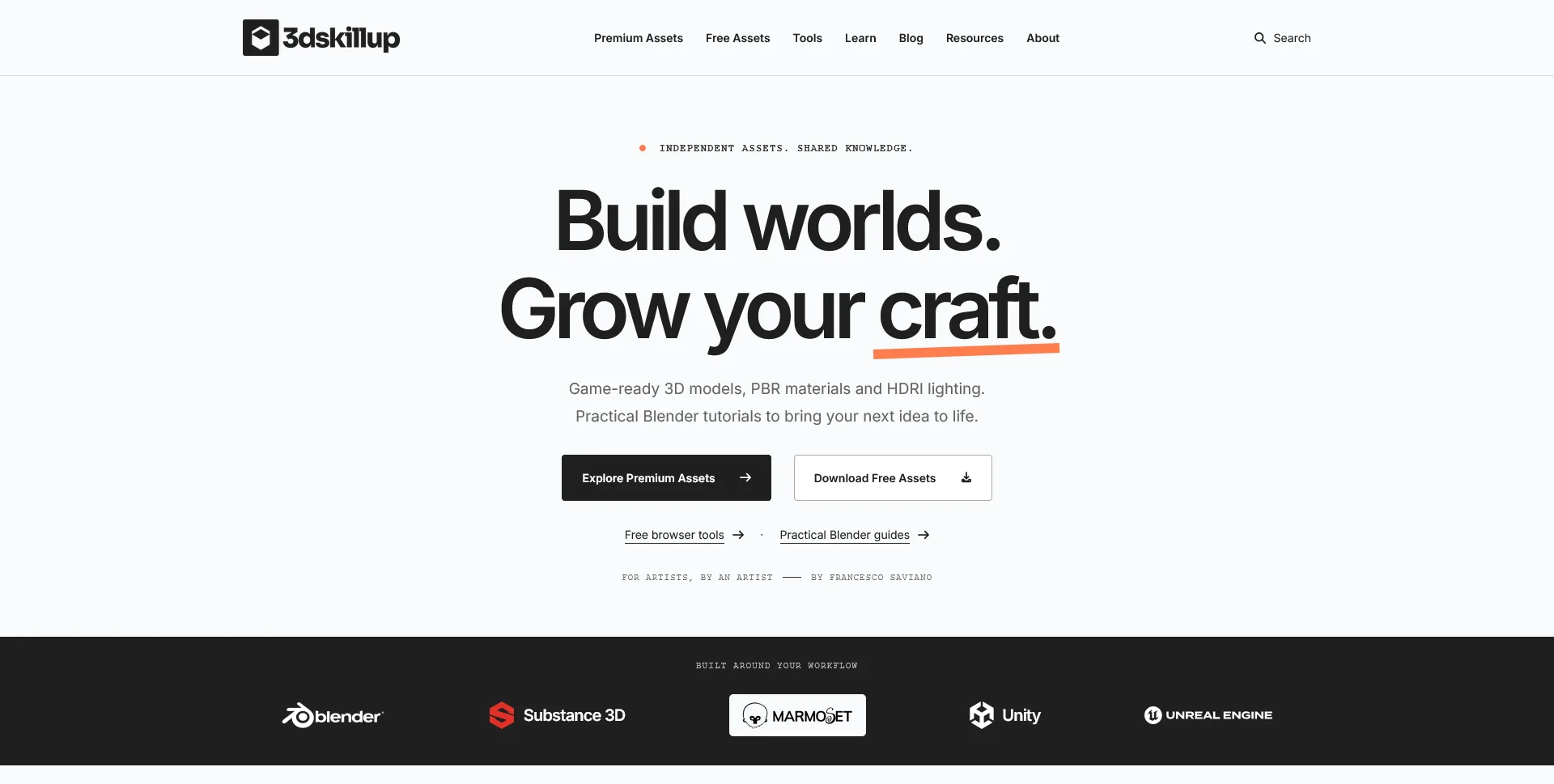
A separate creative platform bringing together game-ready 3D assets, practical tutorials and resources for artists.
Web Design
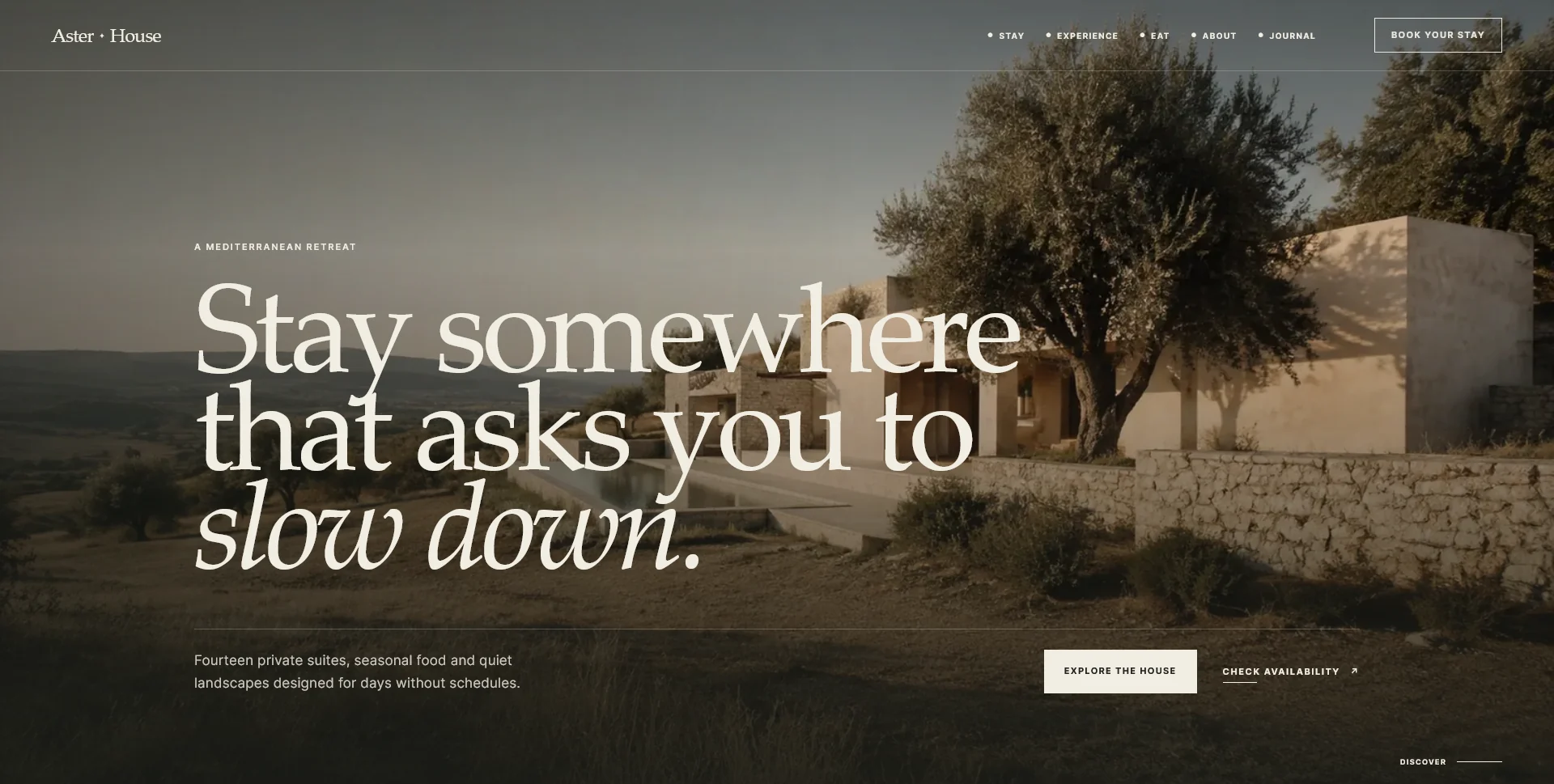
An editorial hospitality concept, combining a Mediterranean visual direction with responsive front-end development.
Web Design · 6 min read
Plan the essential pages for a dental practice website: team, services, visit information and contact. Build a route from questions to appointment requests.
Web Design · 6 min read
Plan a focused dental website launch with essential information and a working enquiry route. Plan later additions without committing to a complete rebuild.
Web Design · 6 min read
Compare a dental website template with custom design using verified team profiles, service content, editing needs and enquiry routes. Define the trade-offs.
Have a website in mind?
A short outline is enough to start a conversation.
Discuss your project View my 99designs profile5.0 / 5 from 25 reviews on 99designs. Read client feedback.