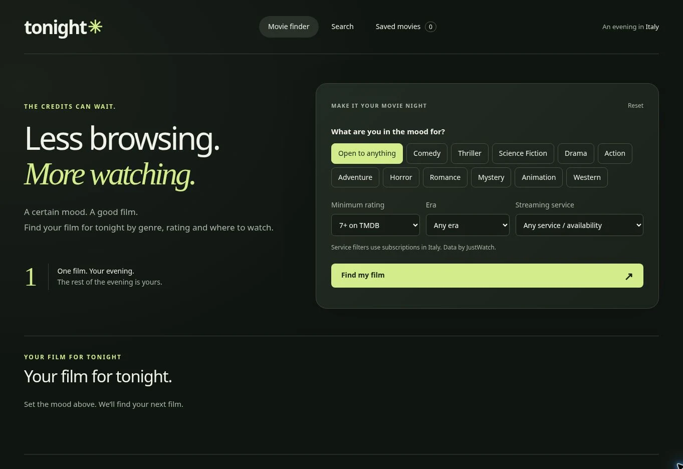
Tonight Movie Finder
Website Design / UI/UX

Design useful empty, error and loading states for web apps. Learn what each message should explain, which action to offer and how to review recovery.
Empty, error and loading states describe different situations in a web app. An empty collection may be working correctly. A failed request means the application could not complete a task. A loading state means the outcome is still unknown. Showing the same vague message for all three makes it harder to know what to do next.
Design these states alongside the successful screen. They affect how people begin, recover and trust what the interface tells them. This guide uses illustrative examples from search, saved collections and data products; the sample wording is proposed copy, not a description of every state implemented in the portfolio demos.

Start with the underlying condition. Does the visitor have no saved items yet? Did a valid search produce zero matches? Did the server fail to respond? Is a value absent from the source dataset? These conditions can look similar on screen but need different explanations.
For each one, record what is known, what remains uncertain and what the visitor can actually control. Do not tell someone to change their filters when the request failed before any results were checked.
| Condition | What to explain | Appropriate next step |
|---|---|---|
| First-use collection | Nothing has been added yet | Show where to find an item |
| No search matches | The current query returned no matches | Edit the query or remove a filter |
| Request still running | Results are being retrieved | Wait; keep the surrounding context |
| Request failed | The requested result is unavailable | Retry or use an available alternative |
| Missing source observation | No value is available for that period | Try another period or inspect source notes |
This small inventory also makes the handover more precise: a developer can connect each state to an actual condition rather than guessing from a single empty-screen mockup.
An empty saved collection is an opportunity to explain how it works. “No saved films yet” describes the state. “Save a film while browsing to find it here later” explains how to change it. A link back to discovery completes the route.
The Tonight Movie Finder project combines discovery with a saved shortlist, making it a useful context for this planning exercise. Decide where a new visitor starts and how they return to the collection after saving something.
Use illustrations as support, not as the only explanation. A decorative empty box cannot tell someone whether their data disappeared or whether they simply have not added anything. Avoid humour that could feel dismissive when the same screen also appears after a problem.
A no-results message should preserve the query and relevant filters. If a visitor selected an era, a genre and a rating threshold, showing those choices helps them understand why the list may be narrow.
Offer an action that matches the cause. “Clear filters” can remove constraints while preserving the search term. “Edit search” can return attention to the query. If the interface clears everything, make that consequence explicit instead of silently discarding the visitor’s choices.
Do not promise that a particular change will produce results unless that is known. “Try a broader date range” is a suggestion; “Remove this filter to see 12 results” requires a verified count. The navigation planning guide explains how search and browsing routes can support each other.
A loading indicator should correspond to work that is actually happening. Keep the relevant heading and controls recognisable so the page does not become an unrelated blank surface. Where a layout is predictable, a placeholder can reserve space without inventing content.
Do not show a percentage unless the application can measure meaningful progress. A short status such as “Loading country data” may be more honest than a progress bar that stalls at an arbitrary value. If a request takes longer than expected, explain what is still happening and what options remain.
Consider changes of mind. When someone starts a second search, a delayed response from the first one should not replace the newer result. This is an implementation detail with a visible consequence, so include it in the review brief.
An error message needs enough context to distinguish the problem and offer a feasible action. “We could not load the results” is clearer than “Something went wrong.” Add a retry control only when retrying is supported, and keep the query in place so the visitor does not have to reconstruct it.
Separate errors that the visitor can correct from failures outside their control. A missing required field needs a nearby explanation of what to enter. A temporary service failure needs a recovery route. Do not ask people to fix an internal error code they cannot influence.
For actions that write data, avoid claiming success until it is confirmed. If the outcome is uncertain, say so rather than inviting an immediate duplicate submission. The right recovery behaviour depends on the operation; it belongs in the implementation scope, not only in the copy document.
In a data product, an unavailable observation does not mean the measured value was zero. Keep missing values distinct in charts, tables and summary cards, and explain the relevant period and source when that context matters.
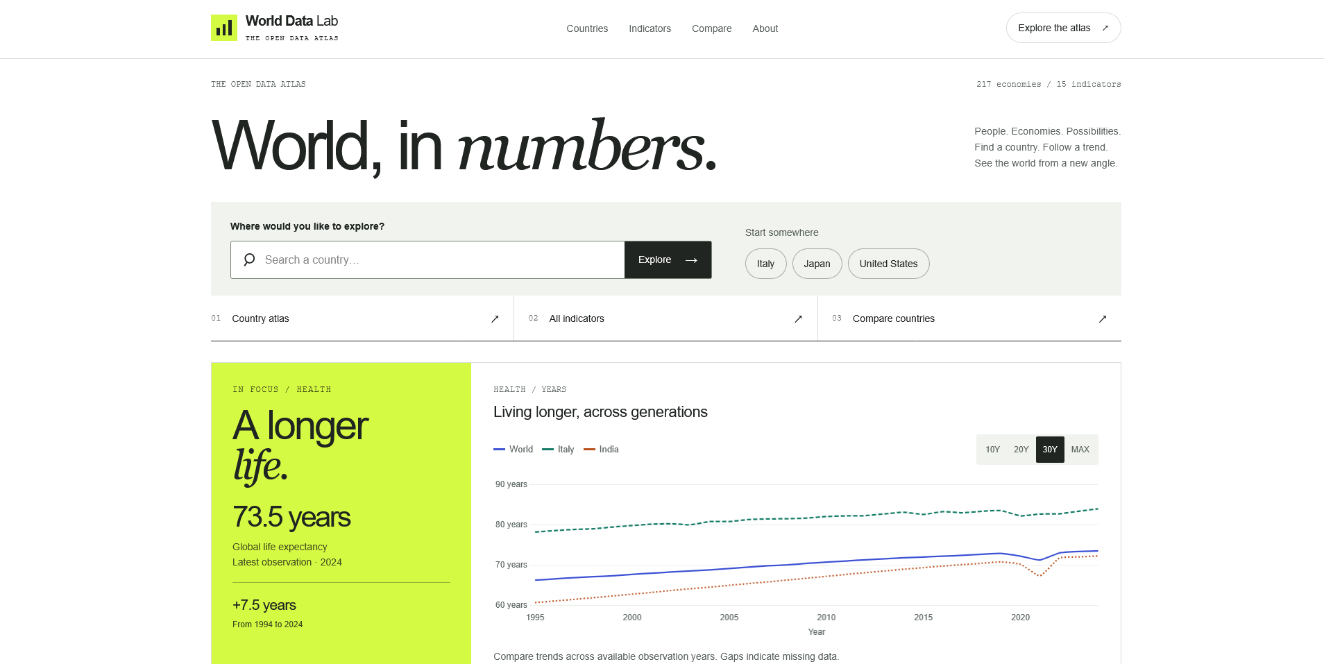
World Data Lab provides a portfolio example of country and indicator exploration. For the broader design considerations, read the guide to accessible data visualization, which discusses labels, missing observations and alternatives to charts.
A useful message might say that no observation is available for the selected year and link to source notes. It should not invent an explanation such as “the country did not report” unless the source supports that claim.
A message inserted into a page can be visible without being apparent to a screen reader user. W3C’s guidance on status messages explains how qualifying updates can be conveyed programmatically without moving focus. Search completion and waiting messages are examples; not every new piece of page content is a status message.
Decide what needs announcing and when. Avoid repeatedly interrupting someone as each small update arrives. Check the final experience with a keyboard and assistive technology; adding an ARIA attribute alone does not establish that the interaction is useful.
Test a first visit, a successful result, no matches, a slow response, a failed request and a retry. Then test the transitions: changing a query while it loads, clearing filters after no matches and returning to a collection after adding an item.
For each route, ask whether the message matches the actual condition, whether existing input remains available and whether the action does what its label promises. Record the outcome in plain language so design and implementation can be reviewed together.
For help turning those states into a coherent interface, explore front-end and digital product development.
Website Design / UI/UX
Website Design / UI/UX
Digital Product / Web Application
Digital Products · 6 min read
Plan website navigation with clear menu labels, useful page groups and mobile behaviour. Includes a practical route map and a checklist for testing.
Digital Products · 6 min read
Design clearer data visualizations with meaningful labels, readable comparisons, text alternatives and honest treatment of missing values.
Digital Products · 17 min read
Discover 10 essential digital asset marketplace features, from smart search and licensing to creator profiles, previews and responsive design.
Have something in mind?