World Data Lab
Website Design / UI/UX

Design clearer data visualizations with meaningful labels, readable comparisons, text alternatives and honest treatment of missing values.
Accessible data visualization begins with a question someone needs to answer. A chart should make its subject, units and comparison clear, while giving people another way to understand the information when the visual presentation is difficult to use.
This guide covers design decisions for public dashboards, country comparisons and small data products. It is a practical review framework, not a claim that adding a table or changing a colour automatically makes an application accessible.

Write down what the visitor is trying to compare. “Which country has the larger population?” needs a different view from “How has population changed over thirty years?” A collection of attractive charts can still leave both questions unanswered.
Define the audience and the decision before selecting a visual form. A visitor exploring a topic for the first time needs definitions and context. Someone checking a known value may need an efficient table, search and a reliable way to return to the same selection.
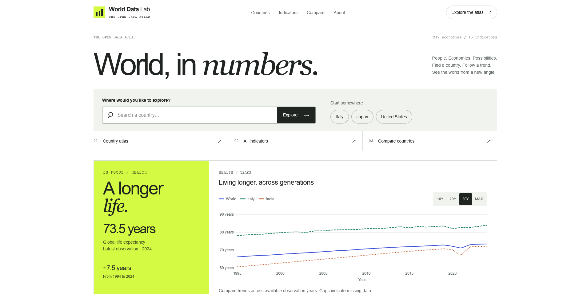
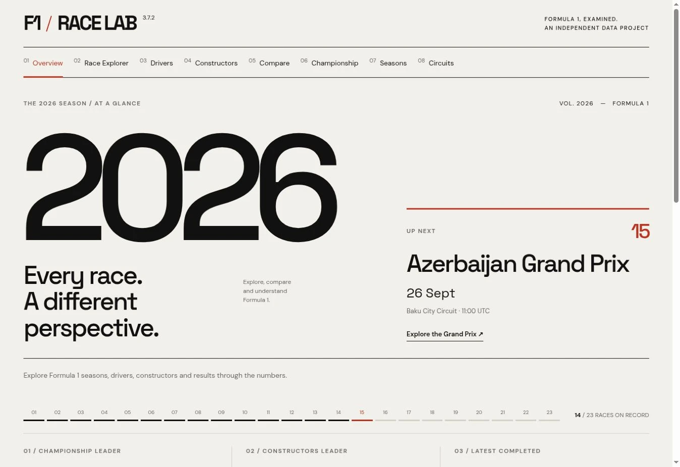
The World Data Lab project connects countries, indicators and historical comparisons. It provides a useful context for thinking about those different routes into the same dataset. The F1 Race Lab case study offers another setting where a season, a race and a participant can lead to different questions.
Use the simplest chart that expresses the relationship you need. A bar chart can compare a small set of categories; a line chart can show a series over time; a table helps when readers need exact values. These are starting points, not automatic rules for every dataset.
Before drawing, check whether the values are comparable. Counts and rates answer different questions. An overall total and a per-person measure should not share an unexplained axis. If definitions, currencies or observation periods differ, the interface should expose that limitation.
| Visitor question | Useful starting point | Context to make visible |
|---|---|---|
| Which category is larger? | Ordered bars or a table | Unit, category definition and period |
| How did one measure change? | Time series | Date range, frequency and missing observations |
| How do two places compare? | Shared-scale series plus values | Matching definitions and observation years |
| What is the exact value? | Table or labelled value | Unit, source and applicable date |
Avoid decorative effects that make quantities harder to judge. With bars, a non-zero baseline can exaggerate differences because the length represents magnitude. A line chart may use a narrower range to reveal variation, but its scale and limits must remain clear.
A label such as “Growth” is incomplete without explaining what grew, over which period and in which unit. A percentage change, a percentage-point difference and an absolute increase are different statements.
Place the indicator name, unit and observation period close to the visualization. Distinguish the date of the observation from the date you retrieved the dataset. A recently downloaded file can contain values from earlier years.
Write chart titles that describe the measure. A stronger interpretive headline can be helpful only when the data actually supports it. Do not let a default “latest” label imply that every selected country has a value for the same year.
Colour can guide attention, but a legend should not require someone to distinguish two similar hues to identify a series. Combine colour with direct labels, different line styles or markers. Keep the relationship between the legend and the chart consistent.
The W3C’s explanation of WCAG’s Use of Color criterion states that colour must not be the only visual way to convey information. For example, identify a selected country by its name and a visible state, rather than changing its line from green to red alone.
Check the smallest labels at the size people will actually see. A screenshot viewed full-screen on a large monitor can hide problems that appear in a narrow card or on a phone. Contrast, focus visibility and readable type need attention alongside the series colours.
A short image description can identify a chart, but it cannot always communicate its important relationships. Give readers an adjacent explanation of the relevant pattern and limitations. Where exact values matter, provide a table with clear headers and units.
The W3C’s tutorial on complex images describes short and longer text alternatives for charts and other information-rich visuals. The longer explanation should convey the essential information, not merely say that a chart exists. A table can support this, while a short summary helps readers understand why the numbers are being shown.
Interactive controls need their own review. A visitor should be able to select an indicator or change the date range without depending on precise pointer movement. If a tooltip is the only place a value appears, provide another way to retrieve that value. A static table alone does not resolve inaccessible filtering controls.
A zero is an observation. A missing value means the observation is not available in the data you have. Substituting one for the other can invent a dramatic change that never occurred.
Consider a fictional series with values of 12, unavailable and 14 across three years. Showing 12, 0 and 14 creates a false collapse and recovery. A gap, accompanied by a clear missing-data label, is the more honest starting point. If interpolation is appropriate for a particular analysis, describe the method and distinguish estimated values from observed ones.
Likewise, avoid hiding missing categories simply to produce a tidy comparison. Explain exclusions and make it possible to see why one country or period has no result.
A useful review covers more than the chart canvas. Try finding an indicator, selecting a comparison, reading its meaning and sharing or revisiting that selection. Then repeat with a keyboard and a narrow viewport.
Use this short sequence:
A product homepage has a different job from the exploration screen: it should explain what visitors can investigate and how to begin. The homepage content checklist helps plan that introduction without crowding it with every indicator.
A table is often useful when exact values are important, but the appropriate alternative depends on the information and task. Some charts need a concise explanation and a detailed description as well. Evaluate whether people can obtain the same essential meaning and complete the task.
No. It does not address missing labels, keyboard access, unclear units or inaccessible tooltips. Treat the palette as one part of a wider design and accessibility review.
Some can, but the data model and component design may already assume hover-only values or colour-only states. Include alternatives and error states in the brief. My front-end and digital product service connects interface design with those implementation decisions.
The surrounding interface matters when a chart is unavailable. The guide to empty, error and loading states explains how to distinguish missing observations from request failures and offer an appropriate next step.
Website Design / UI/UX
Digital Product / Web Application
Website Design / UI/UX
Digital Products · 6 min read
Design useful empty, error and loading states for web apps. Learn what each message should explain, which action to offer and how to review recovery.
Digital Products · 6 min read
Plan a clear homepage with this practical content checklist: positioning, services, proof, calls to action and useful links for a service business.
Digital Products · 17 min read
Discover 10 essential digital asset marketplace features, from smart search and licensing to creator profiles, previews and responsive design.
Have something in mind?