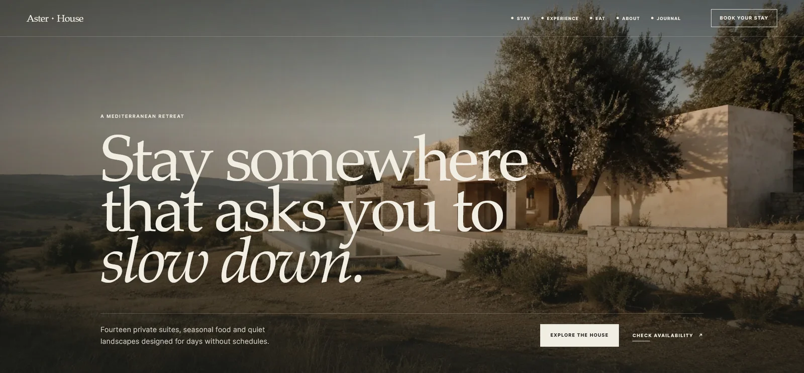
Aster House
Website Design / Front-End Development

Plan a clear homepage with this practical content checklist: positioning, services, proof, calls to action and useful links for a service business.
A useful homepage helps a visitor answer four questions: what do you offer, who is it for, why should they trust you, and what should they do next? This homepage content checklist turns those questions into a practical brief you can prepare before choosing layouts or writing a long introduction.
It is intended for service businesses, studios and independent professionals. An online shop or a searchable product needs additional routes, but the same principle applies: start with the visitor’s task, then give each section a clear job.

Your opening headline should make sense to someone who has never heard of the business. Combine the offer with its audience or useful context. “Accounting support for independent restaurants” tells a visitor more than “Helping you achieve more.” Personality can come through in the supporting sentence and visual direction.
Prepare three pieces of copy: a headline, a short explanation of the service, and a primary action. Keep them separate so the headline does not have to carry every detail. If location affects whether you can serve someone, include the real service area naturally. Do not add a list of unrelated cities to chase searches.
A simple draft exercise is to complete: “We help [audience] with [specific need] through [service].” Then edit the sentence into language you would actually use with a customer. The formula is a starting point, not the final copy.
Decide what a suitably informed visitor should do: request a quote, book a consultation, view availability or explore a service. The label should explain the destination. If the button opens an email application, “Email us about your project” sets a clearer expectation than “Get started.”
A secondary link can serve visitors who need more information. For example, “View recent projects” can sit beside “Discuss your website.” These actions support different levels of readiness. Avoid giving five buttons the same visual emphasis.
Record what happens after the click as part of the brief. A polished button leading to an unclear form simply moves the confusion to another page.
Introduce a small number of meaningful service groups. For each group, write what it includes, who it helps and where a visitor can learn more. A headline such as “Website design” may be sufficient for navigation; the accompanying sentence should explain the type of project and scope.
Use dedicated service pages when the details deserve their own space. The homepage can introduce the offer and link to it without repeating the entire service description. My websites and interfaces service shows how a focused page can bring scope, deliverables and common questions together.
If your business offers a browsable catalogue rather than a few services, the next planning questions are different. See the guide to digital marketplace discovery features for search, categories and product-level information.
Choose evidence that supports the claim beside it. A service description may benefit from a project example; a statement about collaboration may benefit from an attributed review. Explain your role in a case study so visitors can distinguish design, development and other contributors’ work.
Personal concepts can demonstrate judgement and craft, but label them clearly. The Aster House website concept is an example of presenting a hospitality design direction without claiming a commissioned client result. A concept and a commercial project can both be useful when their context is accurate.
Use real testimonials with permission where needed, and avoid adding unverified scores, client counts or conversion claims. If a number matters to your argument, keep the source and measurement period with it.
Write down the questions customers ask before contacting you. Typical subjects include project scope, process, what they need to provide, timing and how you estimate the work. You do not need to force every answer into a large FAQ block. Place an explanation near the section where the question arises.
A short process can clarify the sequence: brief, direction, refinement and delivery. Describe what the customer does at each stage. “Review a proposed direction” is more informative than a row of decorative process labels.
For pricing, state what you can explain reliably. A fixed package can show an actual price and exclusions; a bespoke service can explain which inputs affect a quote. Unsupported precision creates expectations that the project may not meet.
A homepage should introduce useful destinations: relevant work, service detail, a preparation guide and a contact route. Give each link a descriptive label and enough surrounding context to explain why it belongs there.
Google’s guidance on crawlable links and anchor text supports using ordinary HTML links and meaningful wording. There is no required link count to hit. A link is useful when the next page answers a question the current section raises.
For a design brief, identity assets are part of the content inventory too. The guide to logo variations explains which versions may be needed for a header, small icon and social profile.
Before design begins, gather the following in one document. Mark missing material instead of filling the gaps with invented copy or stock testimonials.
| Content | What to prepare | Completion check |
|---|---|---|
| Positioning | Offer, audience and relevant location | A new reader can describe the business |
| Primary action | Label, destination and next step | The click does what the label promises |
| Services | Short summaries and detail pages | Each offer has a distinct purpose |
| Evidence | Project images, roles and sourced reviews | Every claim has appropriate support |
| Process | Stages and customer responsibilities | Expectations are clear before contact |
| Identity | Logo files, approved colours and imagery | Assets work at their intended size |
| Contact | Working address or booking route | A real person can complete the journey |
Read the draft in the order it will appear on a phone. Remove repeated promises, explain unfamiliar terms and make sure essential information is not embedded only in images. A designer can then work on hierarchy with real content rather than compensating for missing decisions.
Long enough to explain the offer and help visitors take the next appropriate step. A straightforward local service may need fewer sections than a complex consultancy. Evaluate the job of each section rather than aiming for a word count. Google’s people-first content guidance explicitly rejects the idea of a preferred word count for search performance.
Introduce the main service groups and link to detail. Listing every variation can make the offer harder to scan. Less common services can remain discoverable through a services overview and clear navigation.
Prepare the offer, evidence and action before final layout. Copy and design can then develop together. If the page looks complete but nobody can explain its primary action, return to the brief before polishing the visuals.
For help turning that brief into a clear interface, discuss your website project.
Once the main content is ready, use the website navigation planning guide to group pages and choose menu labels that match your visitors’ tasks.
Website Design / Front-End Development
Website Design / Front-End Development
Digital Product / Website Design
Digital Products · 6 min read
Plan website navigation with clear menu labels, useful page groups and mobile behaviour. Includes a practical route map and a checklist for testing.
Digital Products · 6 min read
Design clearer data visualizations with meaningful labels, readable comparisons, text alternatives and honest treatment of missing values.
Logo Design · 6 min read
Learn when to use a primary logo, stacked lockup, symbol and monochrome version, with a practical checklist for a consistent logo handover.
Have something in mind?