Web Design
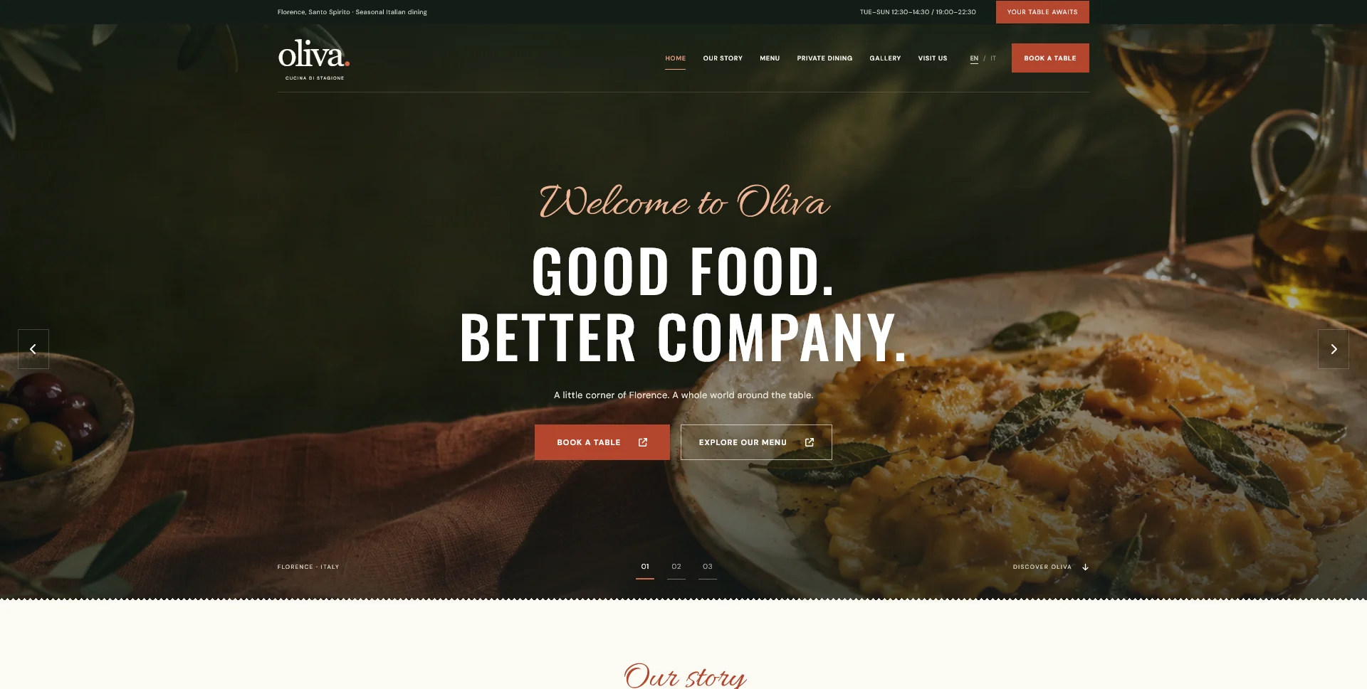
Oliva
A personal restaurant website concept combining an expressive Italian dining atmosphere with a photographic menu, clear visit information and a demonstration reservation journey.
 Let’s talk
Plan restaurant website calls to action around guest decisions. Choose clear labels, useful positions and reservation routes that match what happens next.
A restaurant website should propose the next action that fits what the guest has just learned. Someone checking the food needs a useful route from the menu to availability. Someone planning a group dinner may need an enquiry about the space. A generic “Contact us” button asks both people to interpret a step the website could explain for them.
The aim is not to put the largest possible booking button in every section. It is to make the main route obvious, preserve useful alternatives and describe accurately what each action will do. Start by mapping the guest’s decision, then choose the label, location and visual emphasis of the call to action.
Before writing a button, ask how the restaurant actually takes reservations. Does an external service show availability and confirm a table? Does the team review a request before offering a time? Are some enquiries handled by telephone?
“Book a table”, “Check availability” and “Request a table” make different promises. Use the phrase that matches the destination and the result. If staff approval is required, explain that close to the action rather than revealing it only after submission.
The restaurant contact-channel guide helps decide which route deserves priority. A designer can make the route visible, but its wording needs an operating process behind it.
For a guest discovering the restaurant, viewing the menu and arranging a visit are often related tasks. A homepage can give booking the strongest visual emphasis while keeping the menu easy to find.
The Oliva restaurant website concept places a table-booking action beside a menu action in the photographic opening. The terracotta primary button and outlined secondary button establish a hierarchy without relying on different destinations hidden behind identical labels.
Oliva is a fictional personal project, and its forms are demonstrations. Use it to discuss the relationship between atmosphere and action; a real restaurant’s primary button must connect to its actual reservation process.
Map the main pages and identify what a visitor is likely to need next. A good placement follows useful information rather than interrupting it.
| Page or section | What the guest has learned | Suitable next step |
|---|---|---|
| Homepage opening | The restaurant’s character and location | View the menu or begin the reservation route |
| Food menu | Dishes, prices and the relevant service | Check availability for that visit |
| Private dining | Room, occasion and group arrangements | Ask about a private event |
| Visit information | Where to go and when the restaurant serves | Get directions or contact the team |
| Request confirmation | Whether a request was received | Follow the stated next step or manage the request |
This is a planning example, not a requirement to add five different buttons to every page. Keep one clear primary action for each context and make secondary routes visibly secondary.
A label cannot explain every condition. Use a short supporting sentence for the detail that materially affects the decision.
For a manually reviewed request, an illustrative combination is “Request a table” with “Your reservation is confirmed only after the team replies.” For a group-dining page, “Ask about a private dinner” can sit beside the information the team needs to assess the occasion.
Avoid writing a response deadline unless the restaurant has agreed one. The guide to reservation-request confirmations explains how the initial promise should match the message after submission.
Keep the wording specific enough to distinguish routes. “Discover more” may suit an editorial story, but it does little to explain whether a guest is opening a menu, requesting a booking or leaving for another service.
A guest who selects a particular location should not arrive at a reservation page with no indication of which restaurant they chose. Someone reading private-dining information should reach the relevant enquiry rather than a general form with no context.
Where the system supports it, carry the selected location or enquiry type into the next step and show it clearly. Let the guest correct it. Do not hide a consequential choice in a URL or assume that a prefilled value will always be appropriate.
Plan the destination with the reservation form-fields guide. A persuasive button followed by an unexplained form is an incomplete design decision.
Use contrast, spacing and a recognisable control shape to make the primary action easy to identify. Several equally prominent buttons can compete with one another even when each looks attractive in isolation.
On mobile, a persistent booking action may be useful, but it must not cover the menu, form fields or confirmation. Check the screen with the keyboard open and with longer translated labels. Avoid making essential information depend on hovering over an image.
The mobile navigation testing guide provides tasks for checking that the action remains usable throughout the journey, not just in a screenshot of the opening screen.
Ask someone unfamiliar with the design to find dinner information, request a table and locate the route for a group event. Before they click, ask what they expect to happen. Then compare their expectation with the actual destination.
Record the label, location, expected outcome and observed outcome. If “Book now” opens a general email without context, the issue may be the promise rather than the button colour. If a clear route is repeatedly missed, examine its placement and visual priority.
Use the existing guide to restaurant reservation goals when reviewing results after launch. A button click is not itself a received request or confirmed table, so measure the appropriate stage before drawing conclusions.
It can be part of consistent navigation where relevant. Additional prompts within a page should follow useful decision points rather than repeat after every paragraph.
No. It can identify a general contact destination. More specific wording helps when the visitor is choosing between reservations, events and other enquiries.
Not necessarily. Agree the main task, then keep the supporting task easy to find. Review the hierarchy with guests who arrive at different stages of their decision.
Share your current website, reservation method and the pages where guests hesitate. SavianoDesign’s Website Design service can help define a coherent route through the content, with clear calls to action and scoped frontend or WordPress implementation.
Web Design
A personal restaurant website concept combining an expressive Italian dining atmosphere with a photographic menu, clear visit information and a demonstration reservation journey.
Web Design
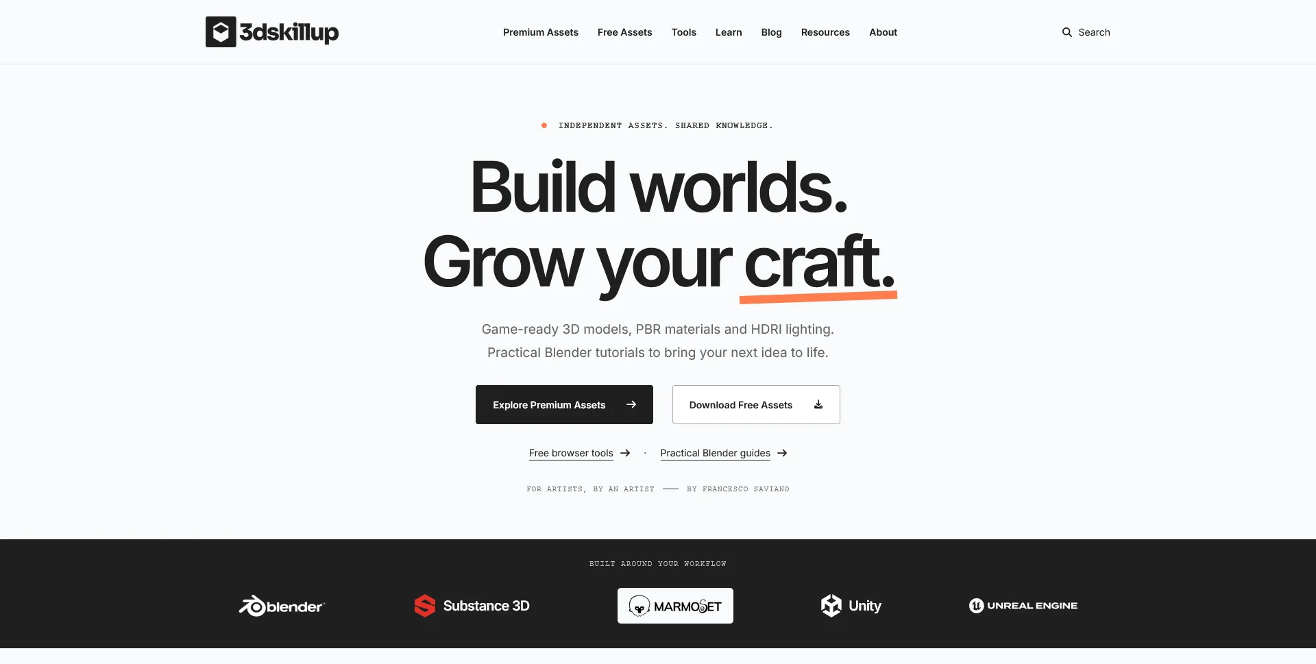
A separate creative platform bringing together game-ready 3D assets, practical tutorials and resources for artists.
Web Design
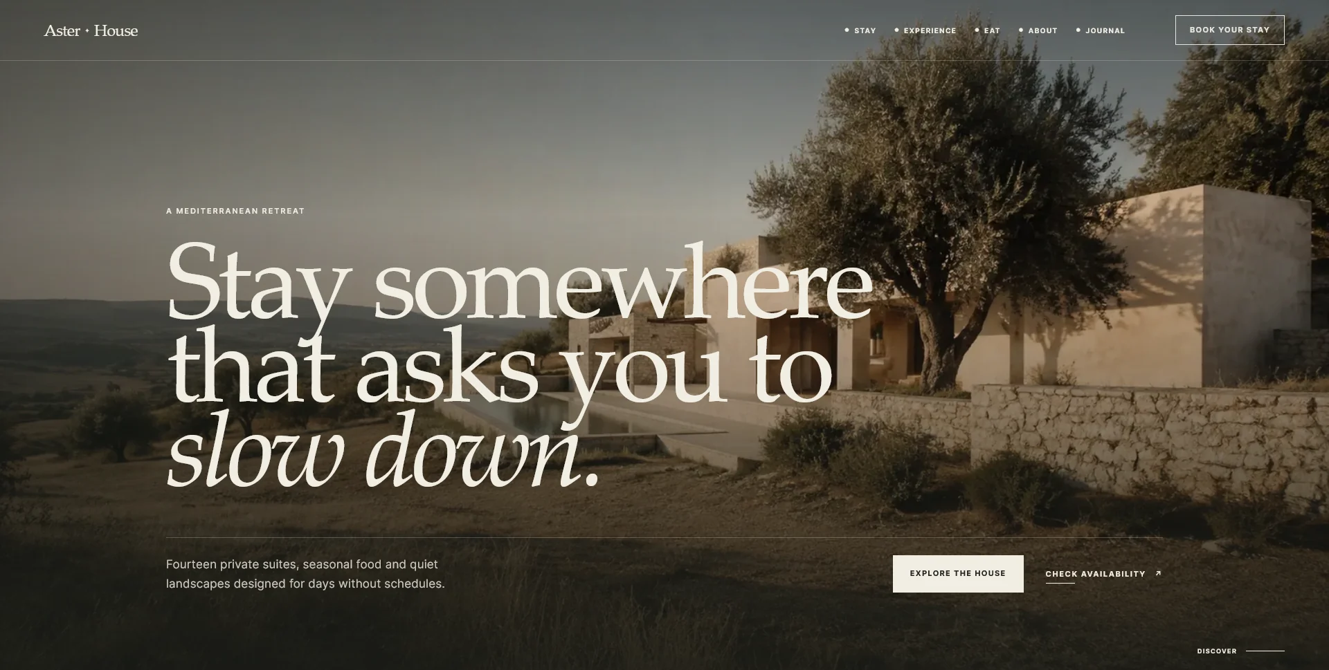
An editorial hospitality concept, combining a Mediterranean visual direction with responsive front-end development.
Web Design · 6 min read
Decide when a restaurant website should prioritise email, phone or online booking. Match each route to guest needs, staff availability and actual follow-up.
Web Design · 6 min read
Choose the fields a restaurant reservation form really needs. Separate required details, optional context and later questions, with clear request expectations.
Web Design · 6 min read
Test restaurant website navigation on mobile with real guest tasks. Check menus, booking actions, contact routes and return paths beyond screen-size previews.
Have a website in mind?
A short outline is enough to start a conversation.
Discuss your project View my 99designs profile5.0 / 5 from 25 reviews on 99designs. Read client feedback.