3DSkillUp
Web Design

Audit the journey from advert to consultation landing page. Check the audience, offer, conditions and next step with a practical message-match worksheet.
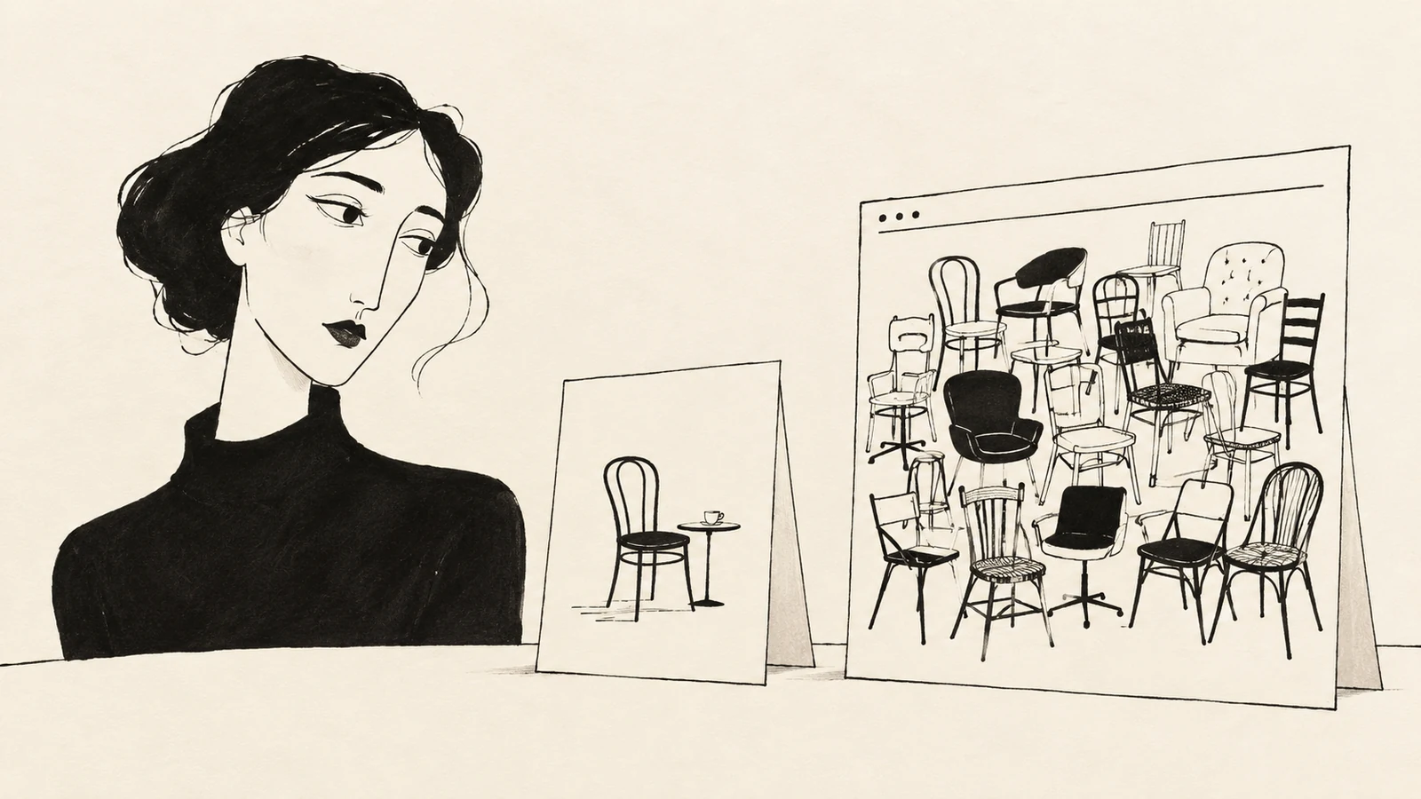
A consultation advert creates an expectation before anyone reaches your website. The landing page should make that expectation easy to recognize and confirm the same service, audience, conditions and next step. A mismatch can remain even when the advert and the page use similar colours or repeat the word “consultation.”
The most useful review compares the actual advert with the complete contact journey. Ask what a reasonable visitor would believe they have been offered, then check where the page confirms, qualifies or contradicts that belief. This guide provides a practical way to record those differences and decide what to change.
Collect the current headline, description, image or video, CTA and final destination for the campaign you are reviewing. Include any visible offer, eligibility rule or location. Save the date and version so that a later change does not make the audit impossible to interpret.
If several creative variants run at the same time, review the distinct promises they make. One might invite people to discuss a project; another might advertise a specific paid session. They should not be treated as the same invitation merely because they belong to one campaign.
Write down the expectation in plain language: “After clicking, I expect to find a way to arrange this particular conversation under these conditions.” Use only information present in the advert and its relevant context. Do not fill gaps with what the business owner knows.
Google Ads’ guidance on ads and landing pages recommends choosing a destination that matches the advert and its keywords, and keeping the call to action consistent. The worksheet below applies that principle to the practical decisions involved in a consultation.
A page can repeat “free consultation” prominently while failing to explain that the offer is restricted to existing clients. Another page might use different wording while accurately explaining the same introductory conversation. Message match is about the meaning a visitor takes away.
Compare each part of the invitation with the first screen and the sections that follow. Record the actual wording and location of the answer, rather than writing “looks fine.” This makes the review useful to the person responsible for revising the page.
| Part of the promise | Question to ask | A possible mismatch |
|---|---|---|
| Audience | Is the same person or project type being addressed? | An advert for small studios leads to enterprise-only copy |
| Service | Is the advertised conversation clearly identifiable? | A focused invitation leads to an undifferentiated services list |
| Scope | Does the page explain what the session includes? | “Review your current website” becomes a general sales introduction |
| Cost and conditions | Are material limits visible before commitment? | An apparently free session requires an undisclosed paid package |
| Format or location | Can visitors receive the service in the advertised way? | A remote consultation advert leads to an in-person-only booking |
| Action | Does the destination provide the advertised next step? | “Choose a time” opens a form that only requests a callback |
| Follow-through | Does the later screen preserve the same offer? | The calendar lists a different consultation with a different fee |
These are hypothetical failure patterns, not findings about SavianoDesign or any named client. Use the table to inspect your own journey, including details outside the hero section.
Imagine a fictional workspace consultant advertising: “Discuss your office layout before planning the move.” The destination opens with “Full-service workplace transformation” and a button labelled “Get a quote.”
The broad headline may describe the business accurately, but it leaves the advertised conversation hard to identify. A focused heading, a short meeting agenda and an appropriate enquiry action could resolve the gap if that conversation genuinely exists.
Now imagine the advert promises a free layout assessment, while the business only offers an introductory fit call. Repeating “free assessment” on the page would make both assets consistent and still misleading. The team must correct the offer or change the advert. Copy alignment cannot create a service the business does not provide.
Start with the guide to aligning the opening message with the first conversation when the scope itself is unclear. Decide what is being offered before polishing campaign language.
The opening should help visitors recognize why they arrived. It does not have to contain every condition, every review and a full explanation of the service. Give the audience, purpose and next action a clear hierarchy, then place essential decision details where people need them.
Review the page at a narrow width as well as on a desktop. A condition that appears beside the CTA on a large screen may fall much further down on a phone. Check the actual order of the content, whether headings remain understandable and whether overlays obscure the invitation.
The image matters too. A page inviting a one-to-one discussion can send a different signal if its dominant photograph depicts a large training event. The image does not need to illustrate the meeting literally, but it should support the same service and scale of interaction.
If an older business message keeps appearing across your site, the guide to revising outdated homepage positioning helps separate useful heritage from an offer that no longer describes the work.
Open the configured destination and inspect any redirects, intermediate pages and booking links. If campaign parameters are present, check that the page still loads correctly and that its main action remains usable. A correct mockup is not evidence that the live route reaches it.
Then follow the visible CTA up to the point of commitment. Does the next screen identify the consultation? Does it explain whether an appointment is confirmed or still subject to review? Is the advertised fee, location or format still accurate?
Use a preview or an agreed test process when a journey creates real enquiries or bookings. Do not generate false customer requests just to see what happens. Where a third-party tool is involved, record what you could inspect and what requires confirmation from its owner.
Clear navigation labels and destinations are part of this review. A generic “Continue” button may work inside a well-explained booking flow, but it cannot repair a page that never tells visitors what they are continuing towards.
Several adverts can share a landing page when they introduce the same consultation to a compatible audience under the same conditions. Different headlines may simply emphasize different reasons to start that conversation.
A distinct session, fee, audience or eligibility rule may justify a dedicated page. Begin by identifying the meaningful difference. If the only change is swapping a keyword in the headline, consider whether an existing page can answer the need clearly without creating extra maintenance work.
For a dedicated page, include enough information to explain that particular offer: purpose, suitability, process, evidence and action. Keep shared facts such as contact details and current terms consistent. Give someone responsibility for updating both the advert and the destination when the offer changes.
Resolve contradictions about the service, cost, eligibility or commitment first. Next, address missing information that prevents visitors from judging whether to proceed. Then refine hierarchy and wording that make an otherwise accurate offer difficult to recognize.
Record each issue as a short decision: the expectation created, the conflicting or missing content, the owner of the correction and the check needed afterwards. The owner may be the person managing the advert, the service itself or the website.
After revision, ask an appropriate newcomer to explain what they expect from the consultation and what happens when they respond. Compare the interpretation with the agreed offer. Keep this qualitative check separate from claims about campaign performance.
The guide to defining consultation landing page success explains how to review enquiry quality and completion without attributing every change to the page. A corrected promise is a useful improvement even before you have enough evidence to assess its commercial effect.
No. It should preserve the meaning and make the advertised offer easy to recognize. A page often needs more context than an advert can provide. Different wording is reasonable when the audience, scope and next step remain clear.
Only if the homepage clearly supports that invitation and provides a suitable next step. A broad homepage can work for a broad introduction. A specific consultation with its own conditions may need a more focused destination.
No. Exit behaviour alone does not reveal why someone left. Visitors may find the answer they need, decide they are ineligible or encounter a technical problem. Review the actual message and journey, and combine the data with observations before choosing a remedy.
SavianoDesign’s Web Design service can help structure a consultation landing page around the real offer, supporting information and next action. Browse the Web Design portfolio for examples of clear content hierarchy and responsive interfaces.
Discuss your consultation landing page with SavianoDesign. Share the current page and the advert or referral message that introduces it, so the website brief starts with the expectations visitors bring.
Web Design · 8 min read
Write a consultation landing page that explains the first conversation, who it is for, what to prepare and what happens after the visitor gets in touch.
Web Design · 9 min read
Define consultation landing page success with clear enquiry measures, quality checks and a review plan, without promising a fixed conversion increase.
Web Design · 8 min read
Write a local business homepage headline that reflects your offer today. Keep useful heritage, clarify your services and support the message with evidence.
Have a website in mind?