Logo Design
Grill Genius
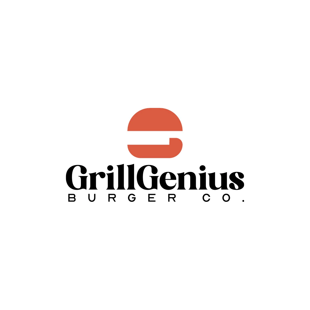
A personal identity concept for fictional GrillGenius Burger Co., with a burger-shaped G symbol and expressive typography built for instant recognition.
 Let’s talk
Choose a wordmark, symbol or combination for your café using name length, first-time recognition and real applications on signs, takeaway cups and menus.
For a new coffee shop, a readable name is often the most useful starting point. A symbol becomes valuable when it adds a recognisable idea or serves a real compact application. Many cafés need both, but the relationship should be designed around the name and the places people encounter it.
A wordmark presents the business name through lettering. A symbol identifies it through a separate shape. A combination brings the two together. The choice affects how a first-time visitor learns the name and how the identity works on a sign, cup or small profile image.
Write the full name at a realistic size before choosing a format. Is it short enough for a straightforward wordmark? Does it contain several words? Is a descriptor needed to explain that the place is a café?
A distinctive, concise name may do much of the identifying work itself. A long name may need a carefully planned arrangement rather than simply being squeezed into narrow letters. An unfamiliar spelling may make clarity especially important.
Think about recommendation as well as appearance. If someone sees a cup and wants to find the café later, can they read and remember the name? An attractive unfamiliar symbol alone may not give them enough information.
The coffee shop font-selection guide provides a closer way to review the actual letterforms and spacing.
A format is useful when it supports a job the identity needs to do.
| Format | Where it can help | What needs attention |
|---|---|---|
| Wordmark | Introduces the full name directly on signs, menus and cups | Long names, unusual spelling and very small spaces |
| Symbol with wordmark | Connects a repeatable shape with a readable name | Balance, spacing and whether the symbol adds a relevant idea |
| Compact symbol or monogram | Fits a profile image, stamp or small secondary position | Whether people can connect it to the café |
These are not competing packages that must be chosen in isolation. A primary name-led logo can have an agreed compact variation. What matters is that the versions remain recognisably related and have clear purposes.
A familiar global symbol can work without words because people have encountered it repeatedly. A new neighbourhood café begins in a different situation.
Introduce a new mark alongside the name in the places where people first meet the business. A symbol-only application may be appropriate where the name is already visible nearby, or where the space cannot support the full arrangement. Do not assume the symbol will explain the entire offer without context.
If you are considering initials as the compact option, read when café monograms help and when they confuse. Shorter is not automatically clearer to someone who has not learned the name.
A useful symbol can connect with a distinctive part of the name, a relevant idea or the café’s character. It does not have to contain every product on the menu.
The Grill Genius personal concept uses a burger-shaped G beside a full wordmark. The name and food reference have related roles in that fictional identity. For a coffee shop, the equivalent decision might involve a letter, a place-based idea or a more abstract form, depending on the brief.
Adding a generic cup solely because the business sells coffee may contribute little when neighbouring cafés use similar imagery. Assess the combined impression rather than judging the icon in isolation.
A strong symbol should not force the name into an unreadable supporting role. Compare the overall arrangement at the sizes people will actually encounter.
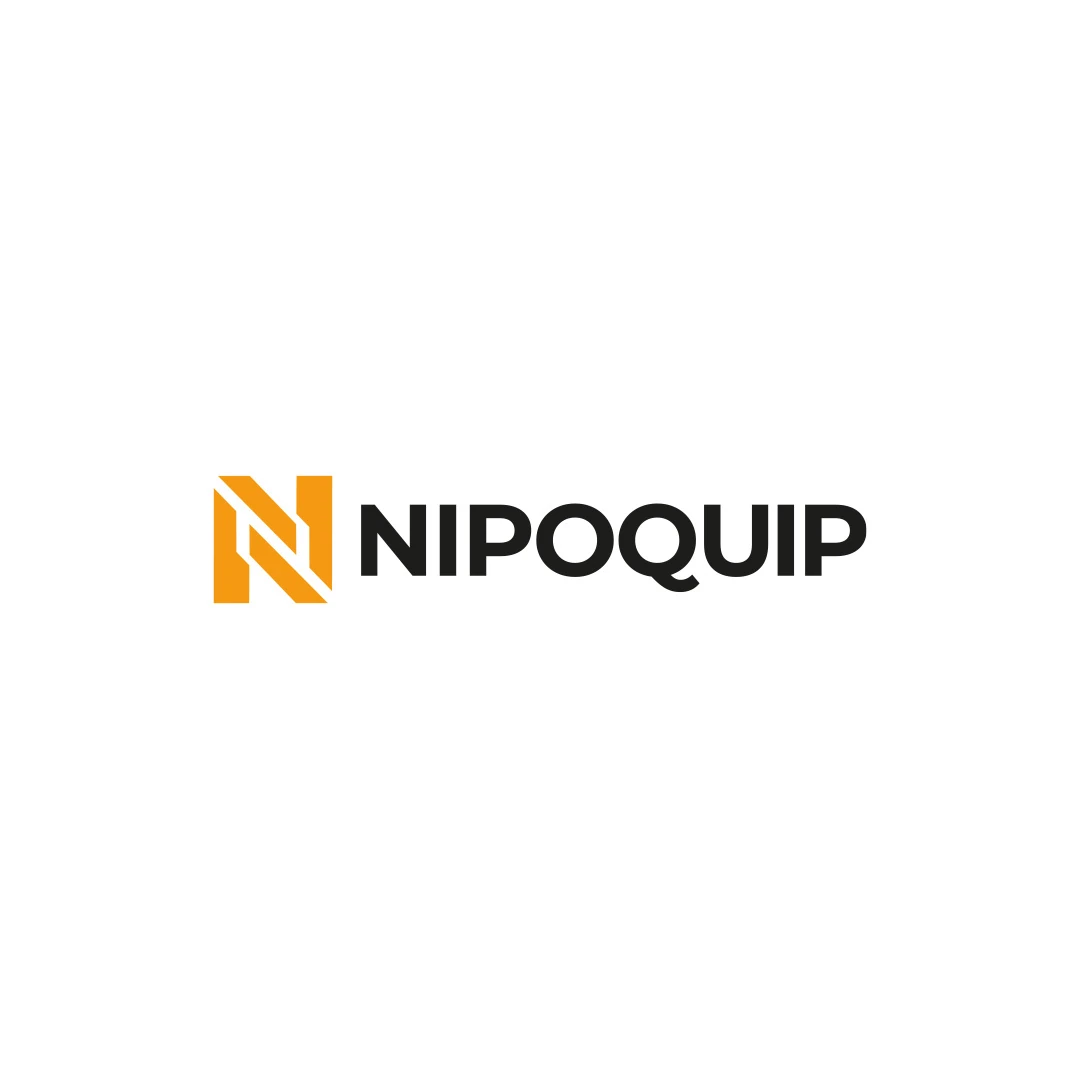
The Nipoquip contest proposal pairs a geometric N with the full name. It provides a clear example of a separate mark and wordmark working together in a primary arrangement. Its industrial character is specific to that brief; the useful lesson for a café is the relationship between the two elements.
Review several conditions: the wide sign, the curved cup surface and a small menu header. The same proportions may not work in every location, which is why an agreed alternate arrangement can be useful.
A horizontal and stacked version can express the same identity. A completely unrelated cup icon, script wordmark and initials badge can make the café harder to recognise as one business.
Define a primary version and the circumstances for using each variation. Keep the letterforms, visual relationships and approved colours consistent where appropriate. The logo-versus-identity guide for a new café explains how variations and usage guidance fit into the project scope.
A compact variation should be tested on its own terms. Removing the name from a combination mark does not automatically produce a successful small icon.
Compare the same name, colour treatment and applications where possible. If one proposal appears on an elegant embossed sign while another appears only as flat artwork, the presentation can influence the comparison.
Start with the plain logos, then use matched mockups to understand application. Ask people unfamiliar with the café to read the name and explain what they notice. Record hesitation or misreading rather than turning the exercise into a popularity vote.
A practical decision might favour a wordmark because the name is short and distinctive. Another might favour a combination because the business needs a strong compact mark for cups and profiles. Both decisions should be explainable through the brief.
If the name needs more character within a wordmark, custom lettering is another possibility to assess. It should solve a specific problem rather than decorate an already clear name without purpose.
Yes. Its quality depends on the name treatment, relevance, spacing and performance in use. A separate symbol is an option, not a requirement for a considered identity.
It can provide a compact supporting mark, but the café still needs places where newcomers can learn the full name. Plan the two uses together.
Only when that choice supports the brief and remains distinctive enough in context. Compare the trade-offs in the guide to abstract and figurative café symbols.
SavianoDesign’s Logo Design service develops symbols and wordmarks around the business, audience and intended uses. Share the exact café name, any descriptor and the places where the logo must appear.
We can discuss whether a wordmark, a combination or an agreed compact variation offers the clearest starting point.
Logo Design
A personal identity concept for fictional GrillGenius Burger Co., with a burger-shaped G symbol and expressive typography built for instant recognition.
Logo Design
An industrial identity proposal with a geometric N monogram, developed for an equipment sales and rental brief.
Logo Design
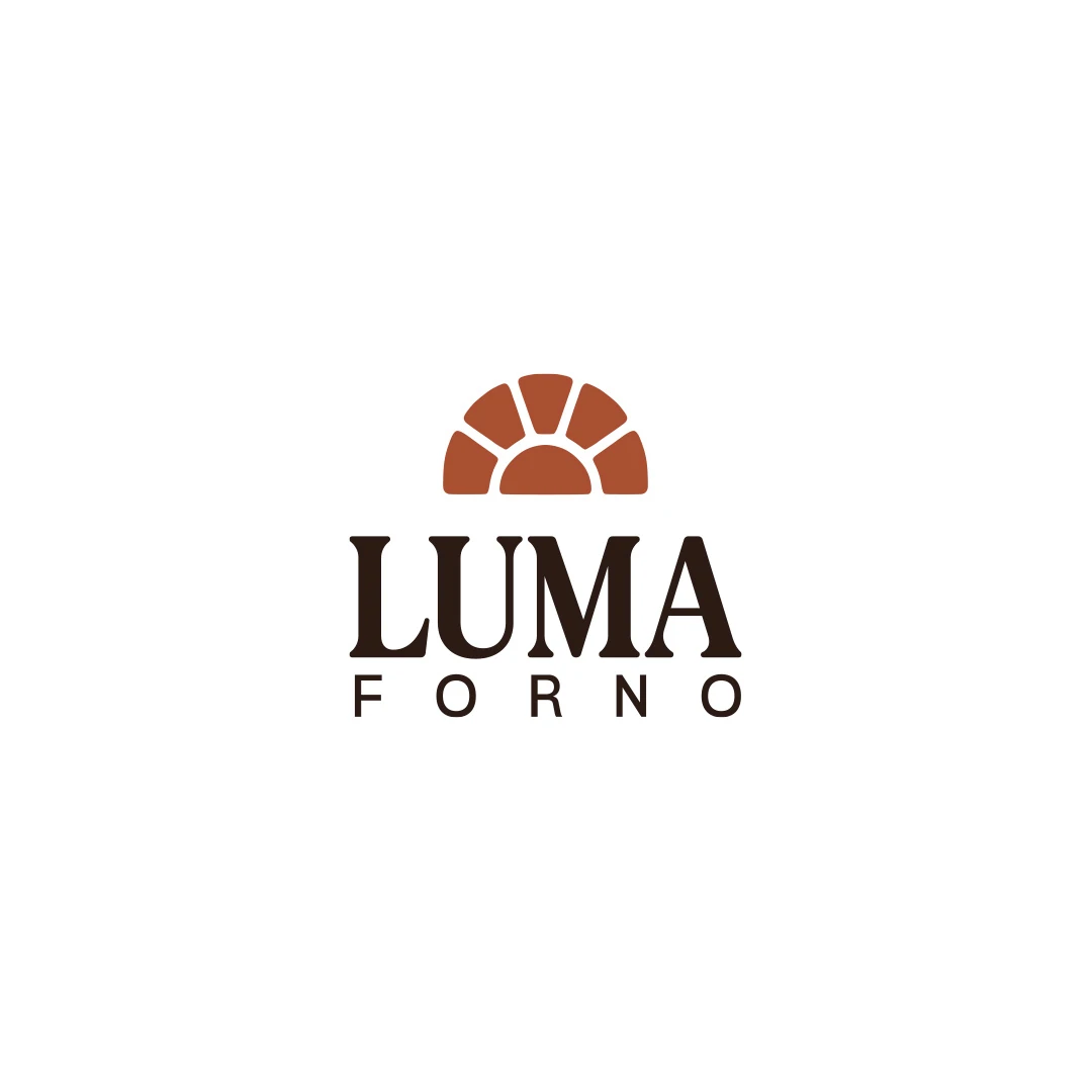
A personal logo concept for a fictional artisan bakery, pairing a terracotta oven-inspired symbol with a strong serif wordmark and a warm bread-bag presentation.
Logo Design · 6 min read
Choose a café logo font by testing the actual name, proportions, spacing and tone on signs, cups and menus, with practical comparison and handover checks.
Logo Design · 6 min read
Assess a café monogram against the full name, nearby identities and small-format uses. Learn when initials support recognition and when they create confusion.
Logo Design · 6 min read
Learn when custom lettering improves a café logo. Compare purposeful letter changes, readable wordmarks, real application tests and the scope of delivery.
A new logo in mind?
A short outline is enough to start a conversation.
Discuss your project View my 99designs profile5.0 / 5 from 25 reviews on 99designs. Read client feedback.