Logo Design
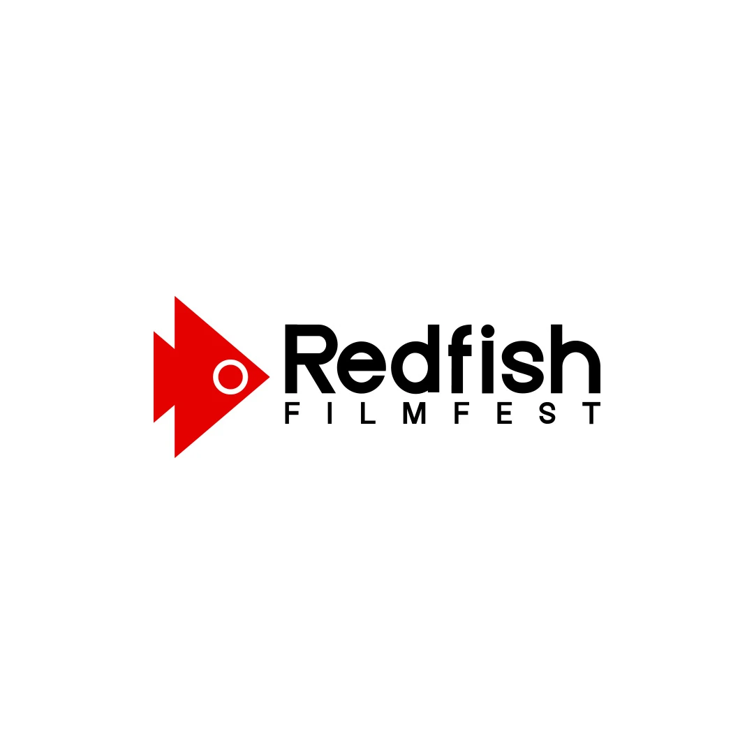
Redfish Filmfest
A documentary film festival logo contest proposal, connecting a red fish silhouette with a play-button shape and the visual language of cinema.
 Let’s talk
Compare abstract and figurative café symbols through meaning, recognition, ambiguity and practical use. Find a direction that fits the name and the business.
A figurative coffee shop logo can provide an immediate cue through a recognisable subject. An abstract logo can offer a more open-ended identifying shape. The better choice depends on what the café needs people to understand, how distinctive the result is in context and how it works beside the name.
Neither route guarantees recognition. A familiar cup may explain the category while saying little about this particular café. An elegant abstract mark may look distinctive while giving a newcomer no clue about the business until it is paired with a clear name or descriptor.
Write one central idea that belongs to the café. It might be a welcoming everyday meeting place, a particular relationship with the neighbourhood or a distinctive aspect of the name.
Then decide which parts of the message belong elsewhere. The business name, descriptor, menu, photography and shopfront can explain the offer. The symbol does not need to carry every fact about sourcing, pastries, service and location.
For a café seeking artisanal warmth with contemporary service, the task may be to feel approachable and carefully made while remaining direct and clear. The coffee shop logo brief guide explains how to turn those intentions into useful criteria.
A figurative mark depicts something recognisable, such as a cup, bird, plant or building. Its meaning still depends on the subject, treatment and context. A plant could suggest a garden café, a food ingredient or something unrelated to coffee.
An abstract mark uses forms without depicting a familiar object directly. Its character can come from rhythm, balance, movement or the relationship between shapes, but those qualities do not have fixed meanings for every viewer.
A hybrid can connect a letter or abstract construction with a recognisable subject. The distinction is therefore a spectrum rather than a requirement to choose a completely literal or completely non-representational design.
| Direction | Potential strength | Question to resolve |
|---|---|---|
| Figurative | A recognisable subject can provide an immediate association | Does it identify this café or simply resemble the category? |
| Abstract | A flexible shape can support a broader identity | What context helps a newcomer connect it to the business? |
| Hybrid | A letter or shape can carry a more specific reference | Does the idea remain clear without becoming a visual puzzle? |
A cup or coffee bean is easy to propose because it belongs to the offer. That familiarity can be useful, but it can also lead to an identity that looks similar to many others.
Explore what would make the treatment specific: a relationship with the name, a distinctive silhouette or a meaningful local reference. Avoid adding several objects merely to make a familiar icon seem original. More detail can reduce clarity on cups and small signs.
The Redfish Filmfest contest proposal combines a fish silhouette with a play-button shape, connecting the name with cinema. It illustrates a relationship between subject and context. A café needs an idea grounded in its own brief rather than an unrelated decorative object.
An abstract mark can be appropriate when the name or descriptor already explains the business and the symbol is intended to become a recognisable identifier through use.
Discuss its actual visual qualities: open or closed spaces, soft or angular transitions, compactness and rhythm. Then ask whether those qualities suit the café’s intended character. Avoid claims such as “this shape always means trust” or “everyone reads this curve as warmth”.
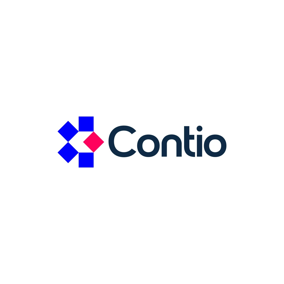
The Contio contest proposal explores an abstract geometric symbol alongside the full name. It offers a useful comparison with the more figurative Redfish proposal. The project contexts differ, but the contrast helps explain how a symbol and name share the communication work.
First show the plain mark without explaining it. Ask what people notice or associate with it. Then show the complete arrangement and ask whether the café’s name and offer are clear.
Keep the two observations separate. A symbol can be unfamiliar alone yet work well in combination. Conversely, a clever explanation should not excuse an unreadable name or an awkward overall arrangement.
The guide to wordmarks and symbols for coffee shop names helps determine when the name should lead and where a standalone mark might be appropriate.
Use these small reviews to uncover ambiguity, not to claim statistical proof of recognition. Record actual responses and decide whether they reveal a problem relevant to the brief.
Review nearby identities at a comparable size, including their name treatments and colours. A café might find that most competitors use circular cup badges, or that several already use minimal abstract flowers.
The opportunity is not necessarily to choose the opposite category. A well-resolved figurative mark can still be distinctive in a crowded category, while an abstract mark can resemble many existing logos.
If the proposed idea becomes an initials-based shape, use the café monogram guide to check whether the letters clarify the name or create another layer of ambiguity.
A café may later add retail coffee, simple food or another location. Discuss genuine plans that could affect the concept, while distinguishing them from speculative possibilities.
A narrowly specific illustration may need reconsideration if it represents only a temporary product. An abstract symbol is not automatically future-proof either; it still needs a relevant relationship with the business.
Aim for a clear idea that can support the plausible next steps. Do not remove all character to accommodate every imaginable future offer.
Both directions need practical checks. Look at the silhouette, important gaps and level of detail in one colour and at the smallest agreed size. A figurative image can lose its defining feature; an abstract arrangement can merge into an unclear block.
Use the real sign and cup specifications where possible, and confirm production proofs with the supplier. Define any compact or simplified version as part of the agreed delivery, not as an instruction for each supplier to improvise.
For the variations and guidance needed at opening, see logo design versus a wider café identity.
No. The name, descriptor and surrounding communication can establish the offer. A literal coffee reference is useful when it supports a specific and appropriate idea.
Not automatically. Both abstract and figurative marks can feel contemporary or dated depending on their treatment, typography and context.
That can be a useful agreed exploration when both respond to the brief. Define the rationale and number of directions before work begins rather than adding extra concepts during refinement.
SavianoDesign’s Logo Design service explores agreed directions around the business, audience and intended uses. Share the café name, the central idea you want to express and the nearby identities you need to distinguish it from.
We can discuss which approaches deserve exploration and agree the refinement, applications to check and final handover.
Logo Design
A documentary film festival logo contest proposal, connecting a red fish silhouette with a play-button shape and the visual language of cinema.
Logo Design
A logo contest proposal for Contio, using an abstract geometric symbol to express collaboration, structure and focus for a meeting productivity platform.
Logo Design
A personal logo concept for a fictional artisan bakery, pairing a terracotta oven-inspired symbol with a strong serif wordmark and a warm bread-bag presentation.
Logo Design · 6 min read
Write a coffee shop logo brief that turns warmth, craft and contemporary service into useful criteria, with application details and an illustrative example.
Logo Design · 6 min read
Choose a wordmark, symbol or combination for your café using name length, first-time recognition and real applications on signs, takeaway cups and menus.
Logo Design · 6 min read
Assess a café monogram against the full name, nearby identities and small-format uses. Learn when initials support recognition and when they create confusion.
A new logo in mind?
A short outline is enough to start a conversation.
Discuss your project View my 99designs profile5.0 / 5 from 25 reviews on 99designs. Read client feedback.