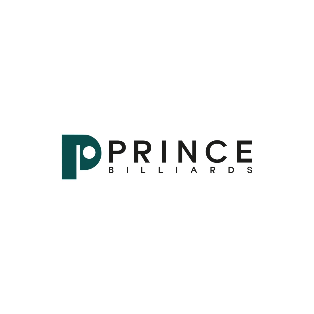
Logo Design
Prince Billiards
A logo contest proposal for Prince Billiards, using a P monogram and negative space to suggest a billiard ball and cue across brand applications.
 Let’s talk
Assess a café monogram against the full name, nearby identities and small-format uses. Learn when initials support recognition and when they create confusion.
A coffee shop monogram is useful when the initials form a clear, distinctive supporting mark and people have a way to connect it with the full name. It becomes less useful when it hides an unfamiliar name, resembles nearby businesses or depends on details that disappear in everyday use.
Initials solve a space problem by shortening what is shown. They do not automatically solve a recognition problem. Before choosing them, decide what the compact mark needs to do on cups, stamps, profiles or signage.
Begin with the application, not the attraction of a neat letter combination. A small profile image, a cup stamp or a secondary mark beside the full name may justify an initials-based design.
A new café’s main sign has a different responsibility. People who have never visited need to learn what the business is called. If the sign shows only unfamiliar initials, the wider presentation must make the name available elsewhere.
The guide to wordmarks and symbols for coffee shops explains how a primary name treatment and a compact mark can work together. A monogram is one option within that relationship.
Some initials create useful shapes naturally; others need substantial adjustment to avoid awkward gaps or confusing overlaps. Use the café’s real letters before deciding that a monogram is the right format.
Consider whether their order matters, whether the name contains a connecting word and whether punctuation should appear. Two founders’ initials, the first letters of a two-word name and a single distinctive initial create different design problems.
Do not force the full business name into an unexplained abbreviation simply because it produces a pleasing arrangement. The abbreviation should make sense in the way the café presents itself.
A letter-based symbol can serve as a memorable shape even when every letter is not immediately obvious. That may be appropriate if the brief prioritises a compact identifier and the full name appears alongside it.
If the brief specifically asks people to read particular initials, hidden or ambiguous letters are a more direct problem. Decide which task you are evaluating before judging the result.
Ask someone unfamiliar with the café what they see, without revealing the letters first. Their answer helps you distinguish an obvious reading from a meaning that becomes clear only after explanation. Neither response should be misreported as proof of broad customer recognition.
Review matched applications rather than an enlarged monogram on its own.
| Context | Useful check | Possible concern |
|---|---|---|
| Shopfront | Can a newcomer identify and read the café name? | Initials dominate while the name is too small |
| Takeaway cup | Is the compact mark clear, and is the name available where needed? | People can see a shape but cannot identify the business |
| Profile image | Does the mark fit without losing its defining detail? | A delicate overlap becomes an indistinct patch |
| Menu header | Does the arrangement connect with the primary identity? | It appears to belong to a different business |
| Single-colour stamp | Do the open spaces and separate parts reproduce clearly? | Ink spread closes important gaps |
The actual material and production method matter. Confirm a proof with the supplier where needed instead of treating a screen preview as a manufacturing test.
Common initials offer many opportunities for accidental similarity. A circle containing two letters, a mirrored pair or a familiar interlocking construction may already appear in the neighbourhood or wider category.
Compare the overall form, proportions, letter arrangement and supporting wordmark. A colour change alone may not create enough separation in a monochrome application. The general guide to avoiding a generic logo provides a useful wider review process.
Keep design comparison separate from legal availability. A monogram being drawn specifically for a project does not establish that similar marks do not exist.
If the café already uses an initials-based identity that creates confusion, assess the cause before replacing it. The café logo refresh-or-redesign guide helps separate a spacing or reproduction problem from an unsuitable underlying idea.
Negative space can give a letter-based mark an additional idea, but that idea should remain coherent at the intended size. The shape between strokes matters as much as the strokes themselves.
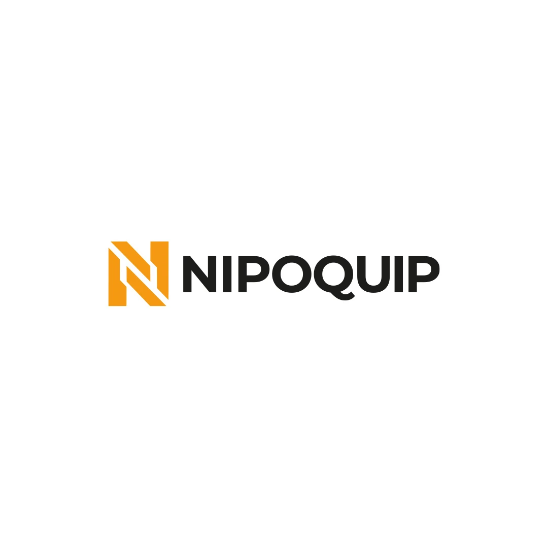
The Prince Billiards contest proposal uses a P-based mark with negative space suggesting a ball and cue. It is a useful example of connecting an initial with a relevant subject. The Nipoquip contest proposal takes a different direction through a geometric N and a clear full name.
These examples demonstrate distinct design approaches. A café monogram should find its own relationship with the name and offer, rather than borrowing the visual solution from an unrelated brief.
If the initials remain difficult to resolve, compare a simpler symbol or a reduced name treatment. The problem may be the format rather than the amount of refinement.
A long café name can sometimes use a recognisable word or an agreed short form instead of initials. In another case, a symbol paired consistently with the full name may work better. The abstract-versus-figurative symbol comparison offers another way to assess that choice.
You can also decide that a compact mark is unnecessary for the first phase. It should earn its place through a real use rather than being added merely because logo packages often display one.
Record where the monogram can appear alone and where it needs the full name. Include the appropriate size, spacing and background guidance for the agreed applications.
Make the primary artwork and the compact version easy to distinguish in the delivered files. A supplier should not have to choose between several unexplained initials treatments.
The guide to logo design versus a wider café identity explains where these variations and usage instructions belong in the scope.
No. Both can be generic or specific depending on the idea, construction and surrounding identities. Evaluate the actual result in context.
Only when that is an agreed requirement. Decide whether the initials are essential to understanding the name or whether a simpler letter-based mark would serve the intended role better.
It can in suitable supporting contexts, but people still need clear opportunities to learn the name. Plan recognition across the complete presentation rather than relying on the initials alone.
SavianoDesign’s Logo Design service can include agreed logo variations where the chosen design supports them. Share the full café name, the initials you are considering and the smallest application that needs to work.
We can assess whether an initials-based direction adds clarity and character to the identity, and define its relationship with the primary logo.
Logo Design
A logo contest proposal for Prince Billiards, using a P monogram and negative space to suggest a billiard ball and cue across brand applications.
Logo Design
An industrial identity proposal with a geometric N monogram, developed for an equipment sales and rental brief.
Logo Design
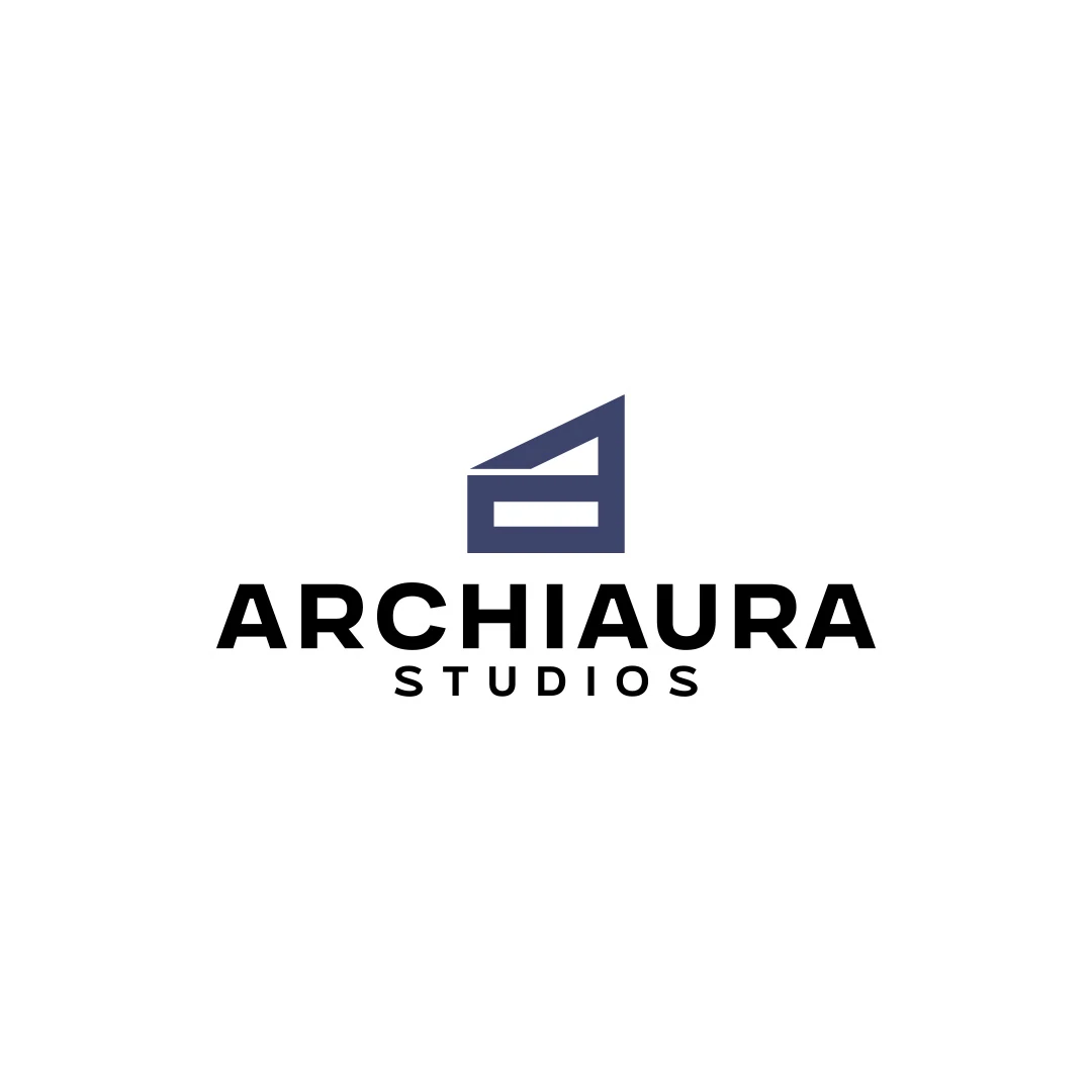
A personal logo concept for fictional ArchiAura Studios, combining an architectural A monogram with clean geometry and a contemporary visual identity.
Logo Design · 6 min read
Choose a wordmark, symbol or combination for your café using name length, first-time recognition and real applications on signs, takeaway cups and menus.
Logo Design · 6 min read
Compare abstract and figurative café symbols through meaning, recognition, ambiguity and practical use. Find a direction that fits the name and the business.
Logo Design · 6 min read
Decide whether your café logo needs a refresh or redesign. Review recognition, readability, production limits and similarity to nearby coffee shop identities.
A new logo in mind?
A short outline is enough to start a conversation.
Discuss your project View my 99designs profile5.0 / 5 from 25 reviews on 99designs. Read client feedback.