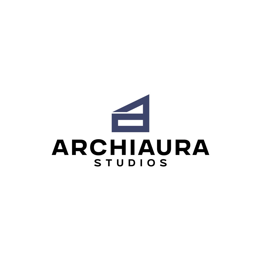
Logo Design
ArchiAura Studios
A personal logo concept for fictional ArchiAura Studios, combining an architectural A monogram with clean geometry and a contemporary visual identity.
 Let’s talk
Write a coffee shop logo brief that turns warmth, craft and contemporary service into useful criteria, with application details and an illustrative example.
A good coffee shop logo brief turns the café’s character into decisions a designer can work with. It explains the people, offer and uses behind words such as “warm”, “artisanal” and “contemporary”, while leaving room to find the right visual solution.
An unclear brief can produce attractive proposals that point in different directions: a nostalgic bakery, a luxury coffee retailer or a playful takeaway kiosk. The problem may be the information guiding the work rather than the quality of the drawing.
Begin with what the café offers and how people use it. Describe the location, the main reason to visit and the kind of service guests can expect.
For example: a new neighbourhood café serving carefully prepared coffee and a small pastry selection, with quick morning takeaway and a few seats for local residents. This is a fictional example, but it contains useful choices. The logo must suit everyday visits and a compact, approachable business.
If the name, offer or opening applications are still undecided, settle those items through the first-logo planning checklist before turning the brief into a style request.
Words such as friendly and premium can mean different things to different people. Explain how the intended quality should affect the impression, and identify an interpretation that would be misleading.
| Intended quality | Useful explanation in the brief | What to review in proposals |
|---|---|---|
| Artisanal warmth | The café feels carefully made and welcoming, without looking like a heritage business that has existed for generations | Character in the forms and spacing, without unnecessary nostalgia |
| Contemporary service | The experience is direct, organised and easy to understand | A clear composition and a name people can read quickly |
| Neighbourhood familiarity | The café should be recognisable through repeated local encounters | A consistent relationship between the name and any compact mark |
| Everyday quality | The offer feels considered and accessible to regular visitors | An appropriate tone rather than an unrelated luxury treatment |
These are review criteria, not compulsory graphic ingredients. The designer may express warmth through proportions or rhythm instead of a hand-drawn texture. A clear brief explains the intention without prescribing every visual move.
Write the exact name, descriptor and any essential punctuation. Identify which words must remain prominent and which may be secondary. If a pronunciation or spelling issue matters, describe it.
Then provide the first applications: sign, cup, sleeve, menu, profile image or another real use. Include dimensions and production information where known. Tell the designer whether a single-colour version is required.
Avoid mixing these requirements into a mood paragraph. A separate list makes it easier to check that every proposal addresses the same practical conditions.
The comparison of wordmarks and symbols for café names explains how name length and first-time recognition influence the format.
Select a few relevant references and annotate each one. Explain whether the useful quality is the letter spacing, compact composition, balance of name and symbol or an overall tone.
Also explain the limits of the comparison. You may like the clear hierarchy of a sports identity without wanting your café to resemble a sports business. A reference should make an observation easier to communicate, not become a template to copy.
The ArchiAura Studios personal concept connects an A monogram with architectural structure. It illustrates how a form can relate to a specific name and field. For a café brief, the useful question is which relationship would be equally relevant to your own business.
Include nearby café identities separately as market context. They serve a different purpose from references you admire.
A useful boundary might be: the name must remain readable without the symbol, the logo must reproduce in one colour, or the identity should avoid looking like a formal fine-dining venue.
An overly prescriptive instruction might require a cup, leaf, sunrise, initials and a particular script all at once. That combination can make it harder to create a coherent mark, especially at small sizes.
If a specific element is essential for a real reason, explain the reason. If it is simply an early idea, label it as a suggestion. The abstract versus figurative café symbol guide can help you discuss the kind of meaning required without settling on a drawing too soon.
Before proposals arrive, agree who consolidates feedback and which criteria will guide it. Begin with the idea and overall fit, then move to proportion, spacing and smaller details.
Useful feedback identifies a problem and its context: “The long name is hard to read in the narrow sign area” gives the designer something to resolve. “Make it more premium” is difficult to act on without a shared definition.
Separate a failure to meet the brief from a new requirement. Adding a second trading name or a new retail product line can change the scope even if it happens during a revision round.
For the wider collaboration process, see why logo design feedback matters.
The following is an illustrative brief for a fictional café, not an existing SavianoDesign client:
Business: Alder Corner, a neighbourhood coffee shop with quick morning takeaway and a small seated area.
Audience: Nearby residents and workers looking for a dependable everyday stop.
Impression: Carefully made, welcoming and contemporary, without a rustic or luxury treatment.
Priority uses: A wide shopfront sign, a single-colour cup print and an A4 menu header.
Name requirement: The full name must be easy to read; a compact mark may support smaller uses.
Review criteria: Suitable tone, readable name, clear monochrome reproduction and visual separation from the supplied nearby references.
Approval: One owner consolidates feedback; final production specifications are supplied before handover.
A real brief would add the actual dimensions, deadline, deliverables and reference notes. Its value is the connection between the café’s situation and the design decisions.
No. Plain descriptions of the business and the difficulties you want to avoid are useful. A designer can translate them into visual possibilities and explain the trade-offs.
Yes, when you explain why they are unsuitable. A short set of meaningful boundaries is easier to use than a long list of unrelated visual dislikes.
It can, but the change should be made explicit. Review its effect on the work and quote before treating it as an ordinary refinement.
SavianoDesign’s Logo Design service begins with the audience, intended uses and visual references. Share your draft brief, even if some decisions remain open, and identify what is fixed and what needs discussion.
We can turn that material into an agreed scope and useful criteria for evaluating the first directions.
Logo Design
A personal logo concept for fictional ArchiAura Studios, combining an architectural A monogram with clean geometry and a contemporary visual identity.
Logo Design
A logo contest proposal for Contio, using an abstract geometric symbol to express collaboration, structure and focus for a meeting productivity platform.
Logo Design
A personal logo concept for a fictional artisan bakery, pairing a terracotta oven-inspired symbol with a strong serif wordmark and a warm bread-bag presentation.
Logo Design · 6 min read
Plan your first coffee shop logo around your audience, name, sign, cups and menu. Prepare the decisions a designer needs before exploring colours and symbols.
Logo Design · 6 min read
Choose a wordmark, symbol or combination for your café using name length, first-time recognition and real applications on signs, takeaway cups and menus.
Logo Design · 6 min read
Compare abstract and figurative café symbols through meaning, recognition, ambiguity and practical use. Find a direction that fits the name and the business.
A new logo in mind?
A short outline is enough to start a conversation.
Discuss your project View my 99designs profile5.0 / 5 from 25 reviews on 99designs. Read client feedback.