Logo Design
Grill Genius
A personal identity concept for fictional GrillGenius Burger Co., with a burger-shaped G symbol and expressive typography built for instant recognition.
 Let’s talk
Logo Design
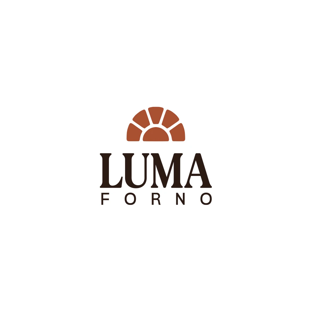
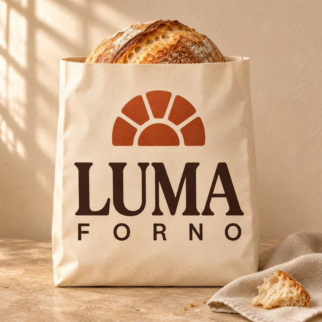
A personal logo concept for a fictional artisan bakery, pairing a terracotta oven-inspired symbol with a strong serif wordmark and a warm bread-bag presentation.
Forno Luma is a personal design concept for a fictional artisan bakery, developed around a brief for bread, focaccia and breakfast pastries. The imagined business combines a visible baking workshop with a welcoming neighbourhood shop. Its name evokes light: the first hours of the morning, the warmth of the oven and the feeling of being welcomed inside.
The brief called for an identity that feels contemporary and carefully made, with enough simplicity for everyday applications. A shop sign, a bread bag and a small stamp ask different things of the same logo. Establishing those uses before choosing a visual direction is the starting point explored in the bakery logo design brief guide.
The symbol uses five broad segments around a central semicircle. It suggests the opening of an oven while also allowing a reading of sunlight rising above the horizon. This connects the bakery category with the meaning behind Luma, without relying on an elaborate illustration.
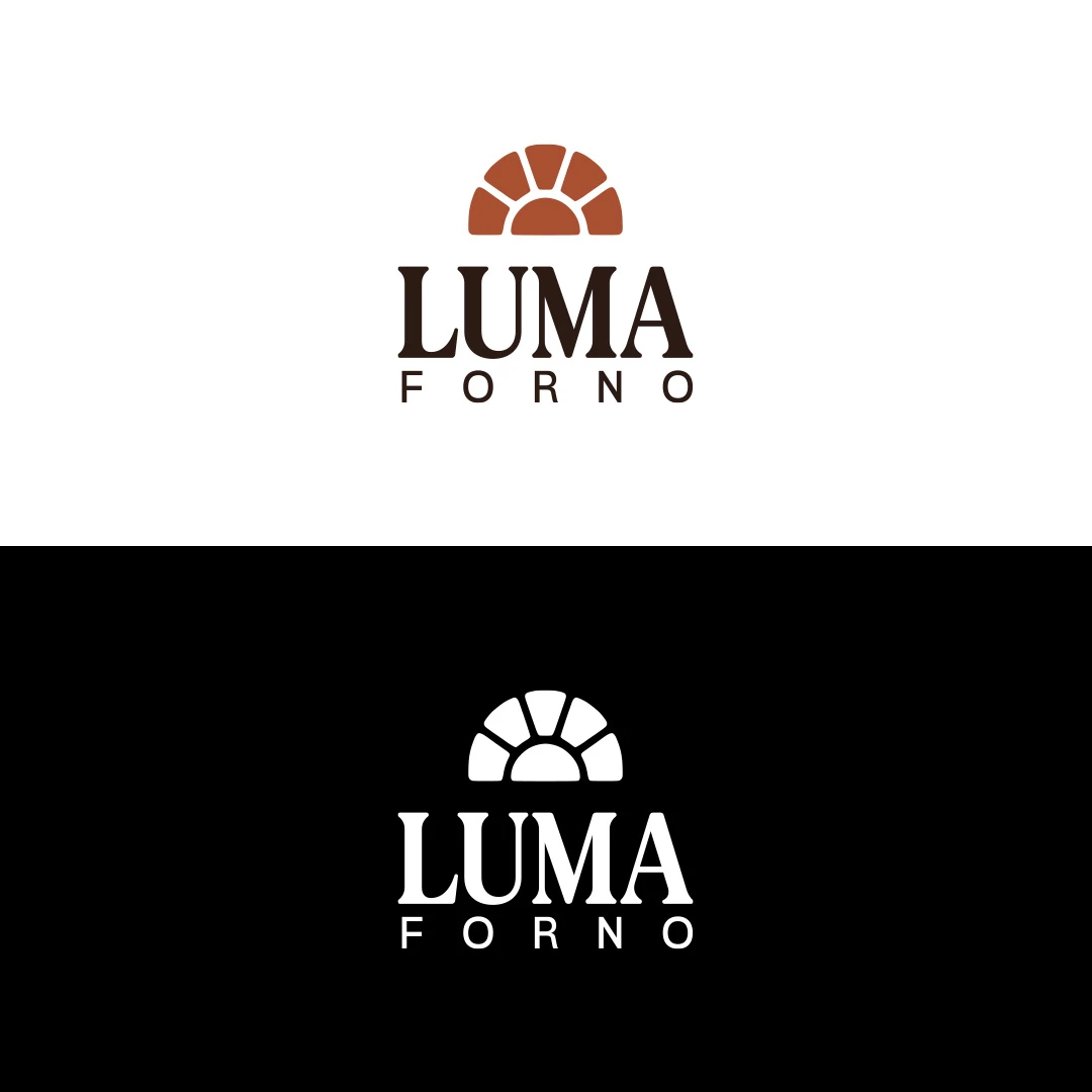
Open spaces separate the pieces, giving the mark a clear rhythm. Terracotta reinforces the intended warmth; the dark brown lettering provides a quieter, grounded counterpart. The presentation also includes a white version on black, showing how the idea remains visible without the colour distinction.
This direction sits between a literal picture and a fully abstract mark. The guide to abstract and figurative bakery symbols discusses how to assess that balance against a particular business and its audience.
LUMA carries the strongest typographic emphasis. Its substantial serif letterforms contrast with the smaller, widely spaced FORNO descriptor beneath it. The symbol completes a vertically stacked arrangement, while the separate symbol presentation explores a compact supporting element.
The full name remains important when someone encounters the bakery for the first time. A supporting symbol can gain meaning through repeated use; it should not be assumed to identify an unfamiliar business on its own. That distinction informs the choice between a wordmark, symbol or combination mark.
The bread-bag mockup places the identity beside the product it is intended to represent. Cream paper, a generous logo and warm light extend the character of the flat artwork into an application a customer might carry home.
The gallery presents the primary visual direction, colour and reversed variants, the standalone symbol and this packaging mockup. These are concept presentations, not photographs of a commissioned or operating bakery. The brief’s small-stamp requirement would still need a physical reproduction test before production, just as a final sign would need checking at its intended viewing distance.
SavianoDesign’s Logo Design service can help turn your business story, name and practical applications into a defined design brief. Tell me about your bakery and the places your logo needs to work, so we can agree the appropriate scope, variations and deliverables.
Logo Design
A personal identity concept for fictional GrillGenius Burger Co., with a burger-shaped G symbol and expressive typography built for instant recognition.
Logo Design
A personal logo concept for fictional ArchiAura Studios, combining an architectural A monogram with clean geometry and a contemporary visual identity.
Logo Design
A logo contest proposal for Prince Billiards, using a P monogram and negative space to suggest a billiard ball and cue across brand applications.
Logo Design · 6 min read
Write a bakery logo brief with production facts, customer needs and real applications. Turn handmade character and daily practicality into review criteria.
Logo Design · 6 min read
Choose a bakery wordmark, symbol or combination by testing the full name on bags, stamps and signs. Give each logo variation a useful role in recognition.
Logo Design · 6 min read
Compare abstract and figurative bakery symbols through product cues, interpretation and practical use. Test clarity, similarity and room for realistic growth.
Next in Logo Design
NipoquipA new logo in mind?
A short outline is enough to start a conversation.
Discuss your project View my 99designs profile5.0 / 5 from 25 reviews on 99designs. Read client feedback.