Logo Design
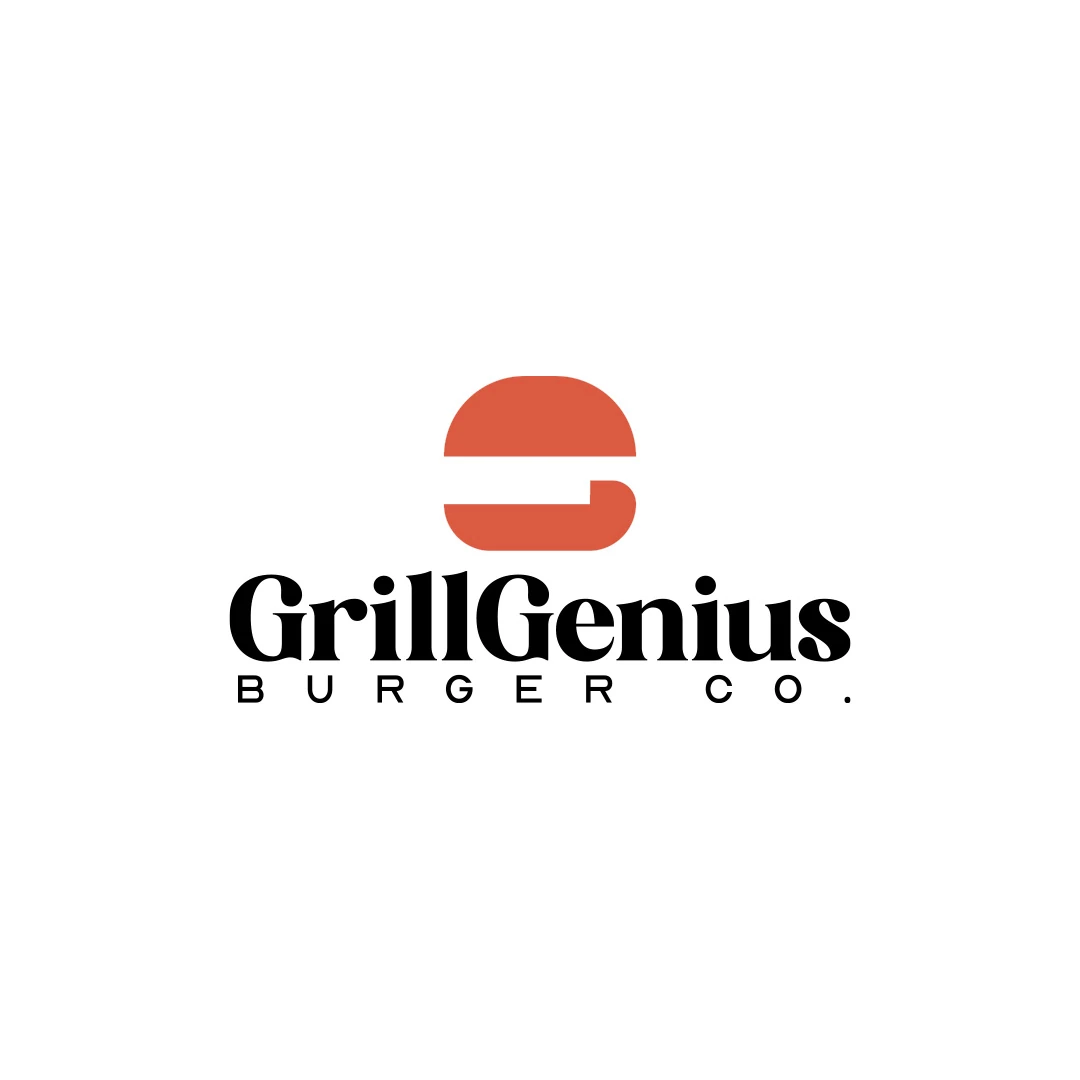
Grill Genius
A personal identity concept for fictional GrillGenius Burger Co., with a burger-shaped G symbol and expressive typography built for instant recognition.
 Let’s talk
Compare abstract and figurative bakery symbols through product cues, interpretation and practical use. Test clarity, similarity and room for realistic growth.
Choose a figurative bakery logo when a recognisable image adds a relevant association; choose an abstract direction when a more open shape better fits the name and intended identity. Neither is automatically clearer, more distinctive or more professional. Evaluate what people see, what the mark suggests and how it works with the bakery name.
For an artisan bakery, a loaf, wheat ear or oven can quickly suggest a category. It cannot establish that the bread is made by your team rather than bought for resale. That distinction needs accurate communication around the logo, whichever visual direction you choose.
A figurative symbol depicts something recognisable, such as a loaf, a tool or a feature of the bakery. An abstract symbol uses shape without directly illustrating an object. Some marks combine both approaches or connect an image with a letter.
The boundary is not always sharp. A few curved forms might read as rising dough to one viewer and simply as a rhythm to another. What matters is whether the interpretation supports the business and remains useful in context.
| Direction | Possible benefit | Main question to investigate |
|---|---|---|
| Figurative | Offers a familiar association with a product or activity | Does it identify this bakery or repeat the category’s most common image? |
| Abstract | Leaves room for a broader visual character | Is there enough context for customers to understand the business? |
| Hybrid | Connects a name or letter with a relevant image | Does the combination remain clear without a lengthy explanation? |
Use these as design questions, not as promises about how every customer will interpret a mark.
Write down what gives the bakery its particular character. It might be the name, a distinctive product shape, the rhythm of everyday production or a feature of the actual shop. Choose something that can support the identity beyond one seasonal campaign.
Separate meaningful facts from generic aspirations. “Quality bread” offers little direction. A specific relationship between the name and the making process may offer more. The bakery logo brief guide helps turn those observations into a usable design starting point.
Do not force the logo to describe every stage of baking. One coherent idea is easier to review than a composition containing wheat, flour, hands, an oven, a loaf and the whole business story.
Bread imagery can be useful, but ask what it adds beyond “this is a bakery”. A familiar silhouette may be appropriate when the name supplies the distinctive element. It may be less useful when several nearby businesses use almost the same image and arrangement.
Also consider unintended associations. A mark centred on a croissant may suggest a pastry-led offer even if everyday bread is the main product. An oven illustration may suggest a particular production setting. Review whether the impression matches the operation rather than relying on the owner’s intended explanation.
Compare the proposed cue with the range you actually sell and the way it may reasonably develop. A highly specific product symbol can be a deliberate choice, but its implications should be understood before it becomes the main identifier.
An abstract mark can provide a compact, flexible shape, but a new customer may not infer the bakery category from it. The full name, descriptor, shop display and supporting words then have an important role.
Discuss the association the designer intends, but do not evaluate the mark only after hearing that explanation. Ask what someone unfamiliar with the project sees first. An interesting shape that consistently suggests an unrelated business may need a clearer relationship with the wordmark.
The bakery wordmark-or-symbol guide helps decide how much identifying work the name should do. An abstract symbol does not need to tell the whole story if the complete presentation communicates it clearly.
SavianoDesign’s Grill Genius personal concept combines a burger shape with the initial G. The food cue and the letter relate to the fictional brand’s name and category within one symbol.
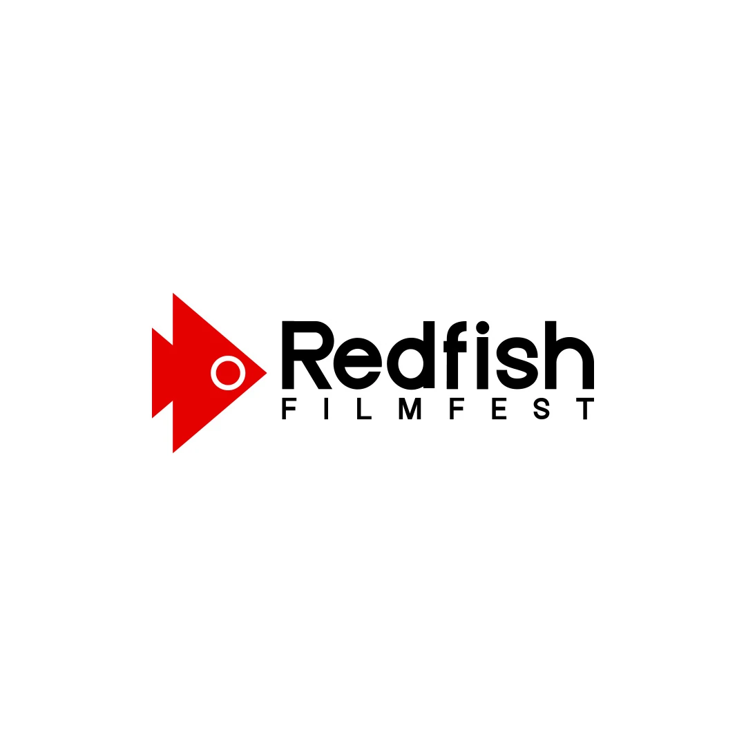
The Redfish Filmfest contest proposal connects a fish silhouette with a play-button shape, relating the name and cinema. It offers another reference for joining two relevant ideas without illustrating an entire activity.
For a bakery, look for a connection that belongs to the name or business. Do not turn the design into a visual riddle merely to claim hidden meaning. If the idea requires several explanatory steps, compare it with a simpler alternative and judge what each contributes in actual use.
Present each direction at a similar size, in the same colour and with the same name arrangement. First ask what people see and what kind of business they expect. Only then ask which treatment they prefer and why.
Note repeated misunderstandings. If a proposed loaf reads as a mountain, that may be acceptable in some concepts and unhelpful in others. The decision depends on the brief, not on whether the designer can explain the drawing convincingly afterward.
A few observations can expose issues worth refining, but they do not prove broad market recognition. Keep the claims proportionate and use the feedback to improve the direction within the agreed process.
Evaluate the silhouette in one colour, the stamp at its intended size and the bag after filling and folding. Test the sign in its real proportions. Detail that makes an illustration charming when enlarged may not contribute at normal use size.
Check the space between the symbol and the name. A strong icon can still make a weak overall identity if it pushes the wordmark into a cramped or unreadable position.
If the current identity uses a generic bread badge, the bakery refresh-or-redesign guide helps assess whether the problem lies in detail, arrangement or the underlying idea. Avoid replacing one common symbol with another without revisiting the reason for change.
Consider changes that are plausible for the business: adding a collection point, introducing a small pastry range or supplying local cafés. Ask whether the proposed mark would still fit, without trying to design for every possible future venture.
A symbol does not need to show every product to support a broader range. Equally, a deliberately specialist identity can be appropriate when that focus is central to the business. Record the choice in the brief so growth assumptions do not silently change during review.
If the fundamentals remain uncertain, return to planning your first bakery logo. Clear business decisions usually make the visual comparison more useful.
No. Assess its treatment, relationship to the name and local context. A familiar subject can be appropriate, but it should not be assumed to create distinction on its own.
It can support that impression through its drawing and wider presentation. The actual production story still needs to be communicated with accurate information.
Clear identification is valuable, but the complete context matters. Compare immediate readability, relevant associations and practical use rather than selecting solely by how literal the symbol is.
Share your name, production story and essential applications. SavianoDesign’s Logo Design service can explore appropriate creative directions and refine the selected idea through agreed review rounds.
Logo Design
A personal identity concept for fictional GrillGenius Burger Co., with a burger-shaped G symbol and expressive typography built for instant recognition.
Logo Design
A documentary film festival logo contest proposal, connecting a red fish silhouette with a play-button shape and the visual language of cinema.
Logo Design
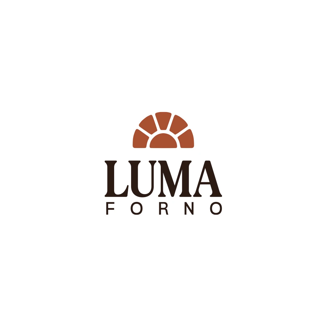
A personal logo concept for a fictional artisan bakery, pairing a terracotta oven-inspired symbol with a strong serif wordmark and a warm bread-bag presentation.
Logo Design · 6 min read
Write a bakery logo brief with production facts, customer needs and real applications. Turn handmade character and daily practicality into review criteria.
Logo Design · 6 min read
Choose a bakery wordmark, symbol or combination by testing the full name on bags, stamps and signs. Give each logo variation a useful role in recognition.
Logo Design · 6 min read
Decide whether your bakery logo needs refinement or a redesign. Review recognition, stamp problems, similar bread symbols and the cost of replacing materials.
A new logo in mind?
A short outline is enough to start a conversation.
Discuss your project View my 99designs profile5.0 / 5 from 25 reviews on 99designs. Read client feedback.