Logo Design
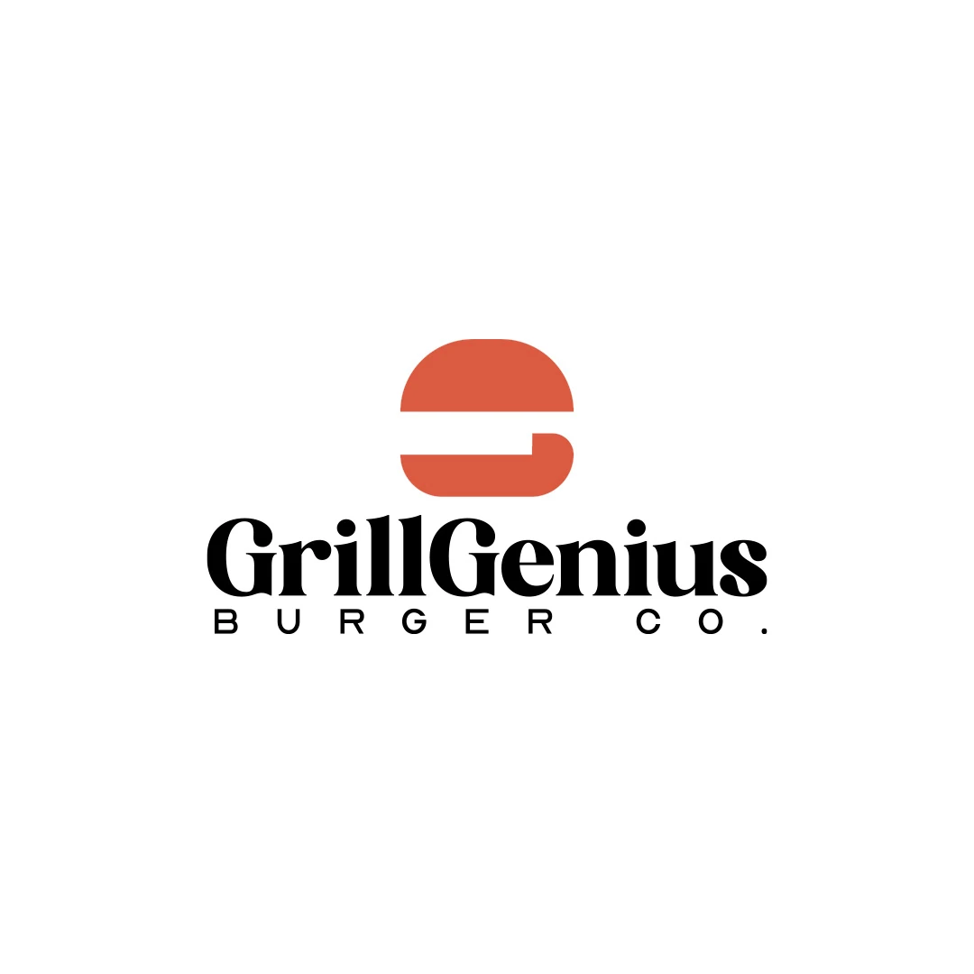
Grill Genius
A personal identity concept for fictional GrillGenius Burger Co., with a burger-shaped G symbol and expressive typography built for instant recognition.
 Let’s talk
Write a bakery logo brief with production facts, customer needs and real applications. Turn handmade character and daily practicality into review criteria.
A good artisan bakery logo brief explains the business, the production story and the practical conditions the design must meet. It turns “handmade and approachable” into facts and review questions, while leaving the designer room to develop the visual solution.
The brief is especially useful when customers need to distinguish what the bakery makes from what it resells. Without that information, a designer may create a convincing bakery atmosphere that says little about the actual operation. Start with the truth of the business, then describe the impression you want it to create.
Record the exact name, location, opening stage and normal product range. Explain what happens in your own production space and which products arrive from other producers. Include any central workshop, additional shop or wholesale arrangement that affects how the business should be described.
Be precise about current and future activity. “We plan to add pastry production next year” should not read like an existing capability. The identity can allow room for growth without presenting future plans as present facts.
The bakery logo planning guide helps resolve these decisions if they are still open. A design brief works best when it records decisions rather than hiding unresolved questions behind a moodboard.
Replace a broad audience such as “everyone who loves good food” with a few realistic situations. A neighbour wants a reliable everyday loaf. Someone collecting a preorder wants to find the right shop and name. A café buyer wants to understand who makes the bread and how to enquire.
Choose the situations that matter to your opening phase. Explain what information those people already have and what they need from the identity and its surroundings.
This is not a prediction that a particular typeface will attract a particular demographic. It gives the designer context for decisions about readability, tone and the role of the full business name.
“Artisan” can lead to very different proposals: rustic stamps, refined lettering, illustrated hands or spare typography. Explain which qualities of your bakery the word refers to and how they should affect the evaluation.
| Starting phrase | Useful context | Review question |
|---|---|---|
| Made by hand | The team shapes the bread in its own workshop | Does the identity suit real process photography without relying on artificial distress? |
| Everyday bakery | Regular bread purchases are central to the offer | Does the presentation feel suitable for daily use, not only gift packaging? |
| Clear and practical | Staff bag products quickly using one main format | Can the name be read after the bag is filled, stamped and folded? |
| Distinct from resellers | The bakery wants its own production understood | Is there room for clear supporting copy, with the business name still primary? |
These questions do not prescribe a symbol. They make it possible to discuss whether a proposal serves the brief.
For each essential use, provide the format, material, supplier and deadline if known. Attach a photograph or physical sample where it answers a real question.
A bag specification should identify the visible area after folding. A stamp request should identify its intended size and use. A sign reference should show the available space and how people approach the shop.
If you do not yet know the details, mark them as provisional and assign someone to confirm them. The logo versus brand identity guide for bakeries helps separate the mark from the application layouts and production tasks around it.
The following is an illustrative brief for a fictional business, Alder Bench Bakery. It is not a SavianoDesign client or a claim that the name is available.
We are opening one neighbourhood shop supplied by our own workshop nearby. We mix, shape and bake the bread ourselves; selected biscuits will come from a named local producer. Everyday loaves and preorder collection are the first priorities. The identity should make the bakery name easy to recognise on the shop sign and on a folded paper bag. It should feel considered and approachable alongside photographs of the real baking process. We need a primary logo and an agreed one-colour stamp arrangement. Bag layout and stamp manufacture must be scoped separately. Avoid implying that every product is made in the shop. The owner will consolidate feedback, and the packaging supplier will confirm production requirements.
Notice what the example leaves open: the symbol, colour, type style and composition. It gives enough information to design without treating the brief as a sketch the designer must trace.
For each reference, say what is useful and what is not. You might like the clarity of a name but dislike a crowded badge; admire a compact symbol but prefer a quieter tone.
The Grill Genius personal concept connects a burger shape with the initial G. It can help you discuss how a food reference and a name might form one idea. It does not establish that your bakery needs a loaf initial or the same expressive style.
Include examples from your local market to identify repeated conventions. Use the abstract versus figurative bakery logo guide to discuss possible associations without selecting a finished symbol in advance.
A preference is something to explore: “We tend to like warm, restrained lettering.” A constraint is something the solution must accommodate: “The approved sign area is wide and shallow.” Treating them as equivalent can unnecessarily limit the work.
The same applies to logo format. If you are unsure whether the name or a symbol should lead, use the bakery wordmark-or-symbol guide to describe the use cases. If you want custom type, explain the problem and consult the bakery lettering guide before making it a requirement.
Record genuine non-negotiables, including the confirmed name and essential application needs. Leave room for the designer to challenge a preference when a different approach better satisfies the brief.
Choose a small set of criteria before seeing the designs: readability of the name, relevance to the bakery, distinction from local identities and suitability for the required materials. Review those before discussing personal favourite colours.
Ask reviewers to describe the issue and its location. “The descriptor becomes unreadable in the stamp proof” is actionable. “Make it more artisanal” needs explanation before it can guide a useful revision.
Confirm the decision-maker, review rounds, deadlines and handover. A brief is a shared reference that can be updated deliberately when the business changes; it should not expand silently with each feedback email.
Long enough to state the relevant facts, uses and decisions clearly. A concise document with a few labelled references is usually easier to work with than a large collection of unexplained images.
You can share a sketch as a preference or starting thought. Explain the idea behind it and remain open to another solution that addresses the same need more effectively.
Resolve the business priorities first and nominate someone to consolidate feedback. Record the shared criteria so the designer receives one coherent response rather than competing instructions.
Share your draft, real packaging examples and a few annotated references. SavianoDesign’s Logo Design service can turn that information into an agreed scope and a focused set of creative directions.
Logo Design
A personal identity concept for fictional GrillGenius Burger Co., with a burger-shaped G symbol and expressive typography built for instant recognition.
Logo Design
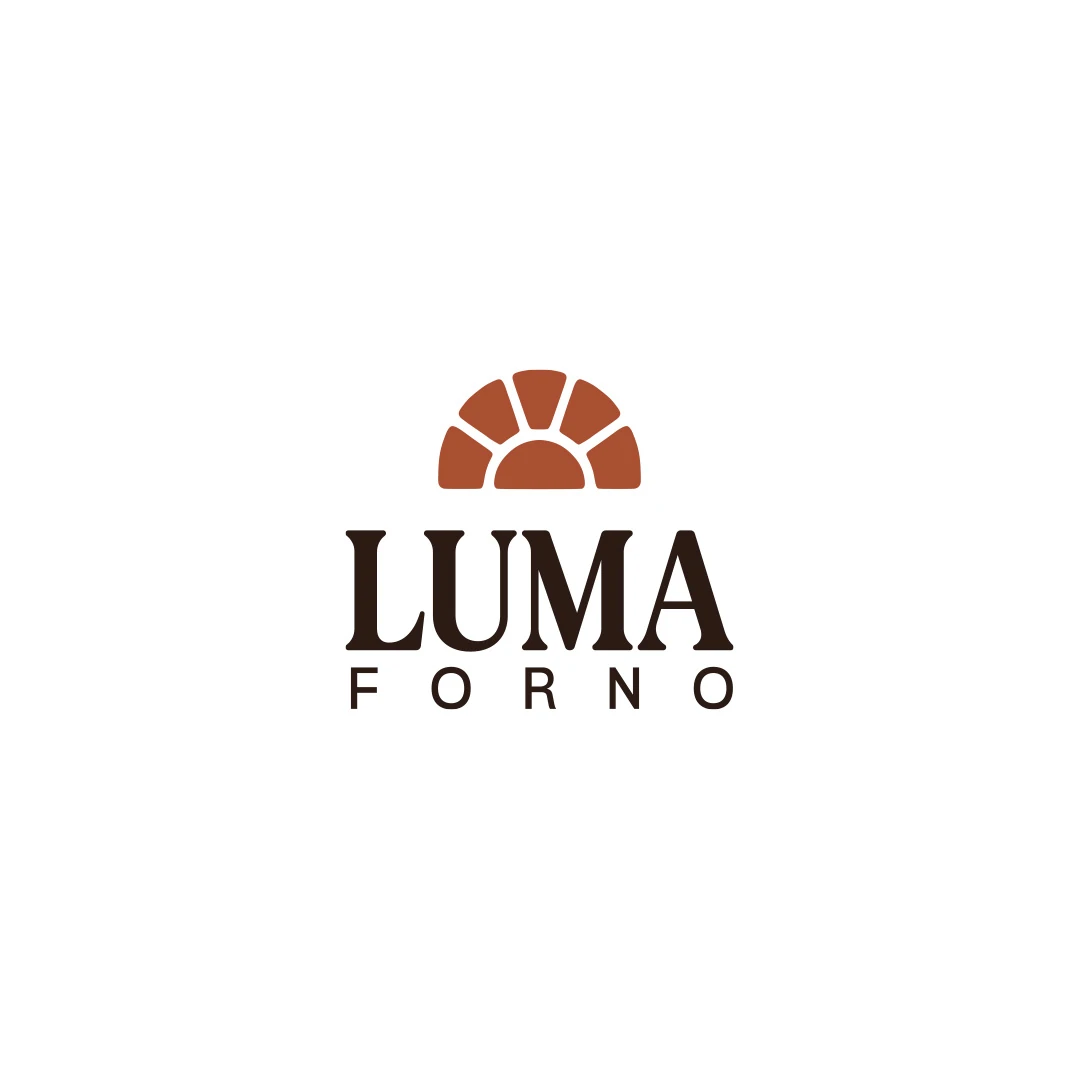
A personal logo concept for a fictional artisan bakery, pairing a terracotta oven-inspired symbol with a strong serif wordmark and a warm bread-bag presentation.
Logo Design
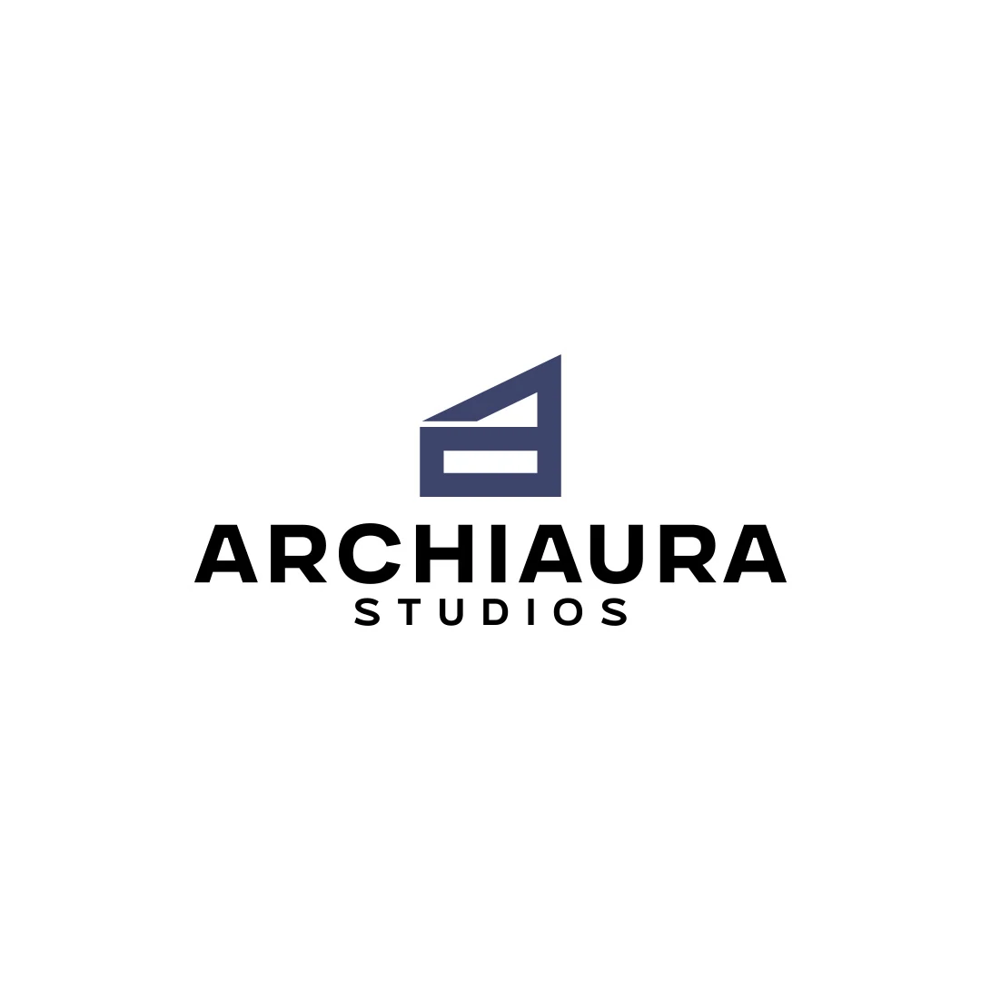
A personal logo concept for fictional ArchiAura Studios, combining an architectural A monogram with clean geometry and a contemporary visual identity.
Logo Design · 6 min read
Plan an artisan bakery logo around what you make, who buys it and real uses. Define bag, stamp and sign requirements before commissioning your first design.
Logo Design · 6 min read
Assess custom bakery lettering through the actual name, handmade character and daily use. Compare typesetting, targeted changes, proofing and project scope.
Logo Design · 6 min read
Compare abstract and figurative bakery symbols through product cues, interpretation and practical use. Test clarity, similarity and room for realistic growth.
A new logo in mind?
A short outline is enough to start a conversation.
Discuss your project View my 99designs profile5.0 / 5 from 25 reviews on 99designs. Read client feedback.