Logo Design
Grill Genius
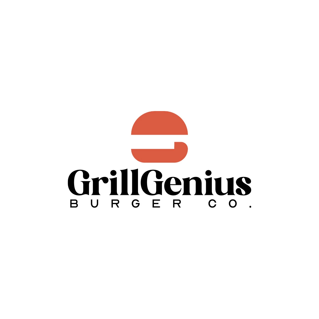
A personal identity concept for fictional GrillGenius Burger Co., with a burger-shaped G symbol and expressive typography built for instant recognition.
 Let’s talk
Choose a bakery wordmark, symbol or combination by testing the full name on bags, stamps and signs. Give each logo variation a useful role in recognition.
Use a wordmark when the bakery name needs to lead identification; add a symbol when it has a useful role that the name alone cannot comfortably fill. Many bakeries benefit from both, with a clear rule about when each appears. A compact shape is helpful only when customers can connect it with the business.
A person discovering your bread through a bag needs a readable name. A returning customer looking at a familiar profile image has more context. Designing for both situations is more useful than choosing between “text logo” and “icon logo” as a matter of taste.
A wordmark is the business name treated as identifying typography. A symbol is a shape or image that identifies the business. A combination mark brings the two together in an agreed arrangement.
A monogram uses one or more initials and can serve as a compact supporting mark. It still needs to be learned; initials do not automatically make a new bakery recognisable.
| Format | Potential strength | Question to test |
|---|---|---|
| Wordmark | Makes the name available to read and remember | Does the full name fit the required spaces? |
| Symbol | Offers a compact identifying shape | Can customers connect it with this bakery rather than the category in general? |
| Combination | Connects the name with a visual idea | Does either element become too small or crowded? |
| Monogram | Creates a compact link to the name | Are the letters clear and meaningfully connected with the full name? |
No format proves that bread is made in-house. That distinction needs accurate supporting information whatever the logo structure.
Imagine someone sees your bread at a friend’s table. They did not visit the bakery and may never have encountered the symbol. What can they read on the bag that lets them find you?
The full name is particularly valuable in this situation. A generic loaf or pair of wheat ears may identify the product category but not its source. A symbol can help distinguish the bag, provided the name has not been reduced to unreadable supporting text.
Test the bag filled and folded. The relationship between the logo and the physical format matters more than how balanced the artwork looks on an unlimited white canvas. The bakery logo planning guide explains which samples and constraints to collect.
Set the full name before judging a type style. A short name and a long family name create different proportions. Consider punctuation, accents, repeated letters and whether a descriptor belongs in the main arrangement.
A wordmark can be distinctive through its proportions, spacing and letter relationships without needing a separate icon. Conversely, an attractive font specimen may become awkward when used for your particular name.
Use the bakery logo font-selection guide to compare options on the real name and materials. If a specific letter relationship needs development, custom lettering may be worth discussing; it should solve an identified issue rather than satisfy a demand for novelty.
List where a compact mark would be used and what surrounding information would identify the bakery. A small profile image, a closure sticker or a secondary stamp might justify it. A main shop sign may still need the full name to do most of the work.
Ask whether the symbol adds an idea that belongs to your bakery. It could relate to the name, a distinctive product form or an aspect of the making process. Avoid assuming that any bread-shaped image will communicate the difference between your own production and resale.
The comparison of abstract and figurative bakery symbols explores how different cues can be interpreted. Category recognition and recognition of your business are related but separate questions.
A name, wheat wreath, loaf, founding date and descriptor may feel complete in a large presentation but become crowded in a stamp. Decide which elements are essential to identification and which belong elsewhere.
Test the combination at the intended size before making the symbol and lettering equally prominent. Sometimes the name should lead, with the symbol acting as an accent. Elsewhere a compact mark can lead because the full name is already nearby.
If a secondary version is needed, define it deliberately. Do not let suppliers invent new arrangements by moving letters, changing proportions or removing details without an agreed reference.
The Grill Genius personal concept connects the initial G with a burger shape. It shows how a food cue and a name can inform the same symbol. For a bakery, the useful discussion is whether your own name or product offers a similarly relevant relationship, not whether the same visual device should be copied.
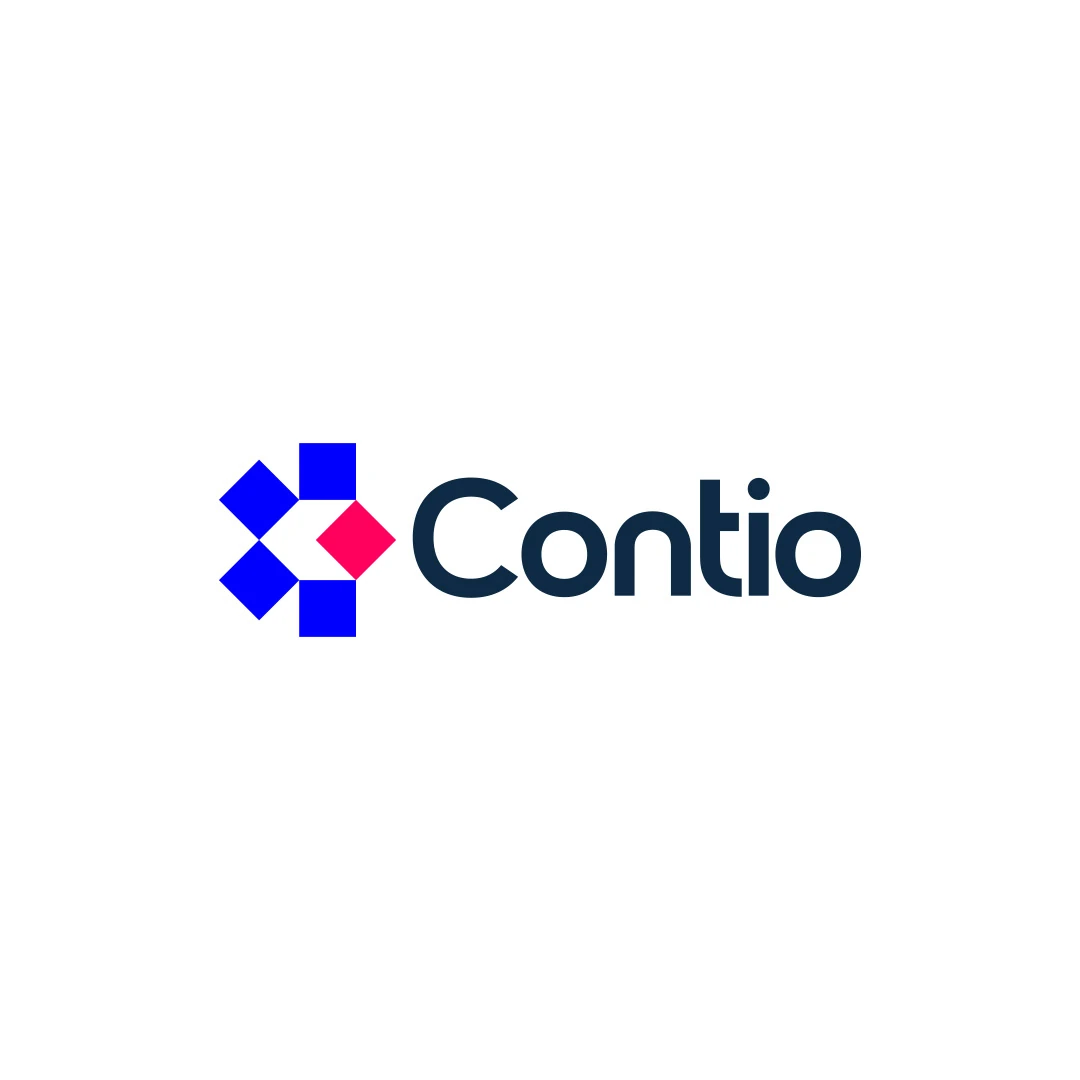
The Contio contest proposal takes a different route, pairing an abstract geometric symbol with a wordmark. Although it belongs to another sector, it is useful for considering how a name can provide explicit identification while a symbol contributes a separate visual character.
These are references for design reasoning. Neither demonstrates how a bakery’s customers will respond; your own name and applications still need to be reviewed.
Initials may solve a genuine space problem, but they remove information from the full name. Before introducing them, check whether customers use the abbreviation and whether it resembles other local identities.
The bakery monogram guide includes practical checks for letter clarity, similarity and stamp reproduction. Compare a monogram with a simplified full-name arrangement, not only with an overly detailed version of the main logo.
If the full name fits well and remains clear, you may not need initials at all. A smaller set of purposeful assets is easier for staff and suppliers to use consistently.
Show the proposed bag or sign to someone unfamiliar with the bakery and ask what name they read. Then evaluate a compact mark in a context where the name is already present. These are different tasks and should not be mixed into a simple popularity vote.
Record misread letters, unclear associations and places where the mark loses detail. Treat a few conversations as useful observations, not proof of market-wide recognition. Ask the designer to address repeated issues within the agreed review scope.
The final decision should explain which asset leads on the bag, stamp, sign and digital profile, and why. That is more useful than declaring one logo format universally superior.
Not automatically. A distinctive shape can help, but a new customer still needs a way to connect it with your bakery. Compare the complete identity in its actual context.
Yes, where the business is already clearly identified or the use has been agreed. Avoid removing the name from discovery situations without checking what information remains.
No. A small number of related variations can accommodate different spaces. The relationship and usage rules should remain clear.
Bring your full name and examples of the bag, stamp and sign. SavianoDesign’s Logo Design service can explore the appropriate balance of wordmark and symbol, with variations defined around the uses that matter.
Logo Design
A personal identity concept for fictional GrillGenius Burger Co., with a burger-shaped G symbol and expressive typography built for instant recognition.
Logo Design
A logo contest proposal for Contio, using an abstract geometric symbol to express collaboration, structure and focus for a meeting productivity platform.
Logo Design
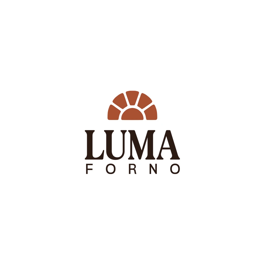
A personal logo concept for a fictional artisan bakery, pairing a terracotta oven-inspired symbol with a strong serif wordmark and a warm bread-bag presentation.
Logo Design · 6 min read
Choose a bakery logo font by testing the real name, proportions, spacing and tone on bags, stamps and signs. Clarify working typography and handover needs.
Logo Design · 6 min read
Evaluate bakery initials against the full name, nearby identities and stamp proofs. Test letter clarity, negative space and real use before choosing a monogram.
Logo Design · 6 min read
Compare abstract and figurative bakery symbols through product cues, interpretation and practical use. Test clarity, similarity and room for realistic growth.
A new logo in mind?
A short outline is enough to start a conversation.
Discuss your project View my 99designs profile5.0 / 5 from 25 reviews on 99designs. Read client feedback.