Logo Design
Prince Billiards
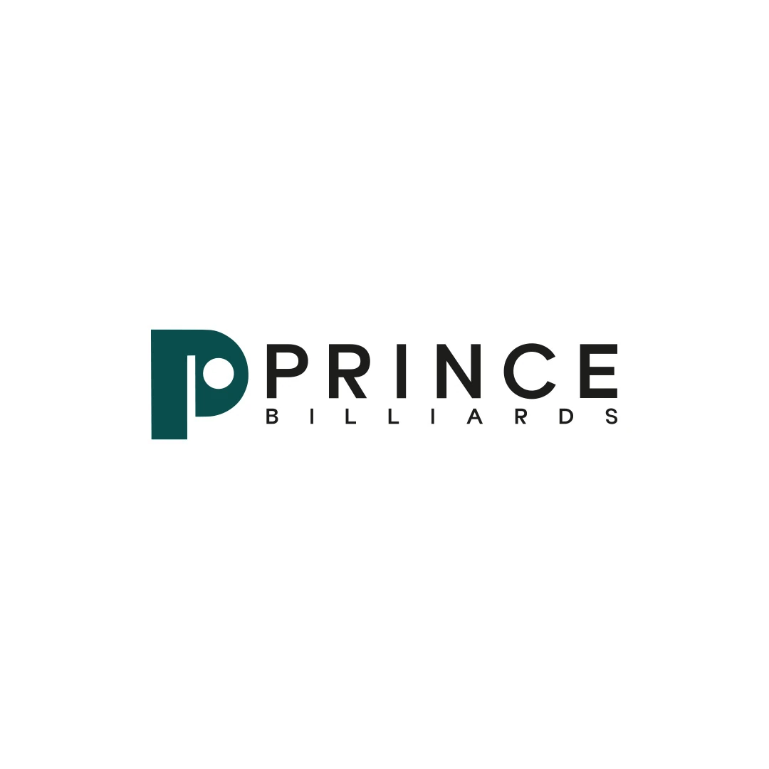
A logo contest proposal for Prince Billiards, using a P monogram and negative space to suggest a billiard ball and cue across brand applications.
 Let’s talk
Evaluate bakery initials against the full name, nearby identities and stamp proofs. Test letter clarity, negative space and real use before choosing a monogram.
A bakery monogram is useful when initials create a clear, compact link to the full business name. It becomes less useful when customers cannot read the letters, connect them with the bakery or distinguish them from similar marks. Small size alone is not a reason to replace a readable name with initials.
For an artisan bakery, a monogram often looks appealing on a stamp or closure sticker. Those applications deserve careful testing: a clever letter combination seen large on a screen may become an anonymous shape on a folded paper bag.
Begin with the full name and write down the proposed initials. Do they preserve the part of the name people actually use? Is an initial taken from a generic word such as “Bakery” doing useful work, or making the mark look like many other businesses?
Imagine a first-time customer taking the bag home. If the only visible element is a pair of letters, can someone else identify where the bread came from? An abbreviation familiar to the owner may be unfamiliar to everyone outside the business.
The bakery wordmark-or-symbol guide helps decide which applications need the full name and which can support a compact mark. A monogram can complement the identity without becoming its only form.
Name the use before developing the letters. A closure sticker, a small secondary stamp and a profile image have different surroundings. In one case the bakery name may be printed on the bag; in another the mark may appear alone.
Record the intended size, material and nearby information. If the application has enough space for a clear full-name treatment, compare that option too. Do not create a monogram solely because a branding presentation is expected to contain one.
Also distinguish an identifying mark from a product label. Initials should not be expected to explain whether the contents were made by your team, supplied by another producer or part of a particular range. Keep those facts in the relevant information around the logo.
Show the monogram without a verbal introduction and ask what letters people see. Note the order they read, any alternative letters and whether a decorative join becomes a confusing stroke.
Then show the full name and ask whether the relationship feels understandable. A mark that only makes sense after a long explanation may be unsuitable for a quick glance at a bag or sign.
| Check | What to observe | Possible design response |
|---|---|---|
| Letter reading | People see the wrong initial or reverse the order | Clarify the letter structures or relationship |
| Name connection | The initials feel unrelated to the spoken name | Reconsider which letters are used or keep the full name primary |
| Small application | Internal gaps disappear in a proof | Simplify, enlarge or use another agreed variation |
| Local comparison | The silhouette resembles nearby bakery marks | Explore a different structure rather than adding decoration |
These observations guide refinement; they are not a statistical test of future brand recognition.
A letter inside a wheat wreath may seem personal because it uses your initial. Yet if nearby bakeries use similar wreaths, the dominant shape may still look interchangeable.
Compare the marks at similar sizes and in one colour. Look at the outer contour, the density of the centre, the position of the name and the way bread-related details are arranged. Changing an initial does not necessarily change what someone notices first.
If an existing monogram has this problem, the bakery logo refresh-or-redesign guide can help decide whether a focused adjustment is enough. Avoid assuming that rearranging familiar components automatically creates a distinctive identity.
Ask the stamp supplier to review the intended artwork, size and material. Their requirements should guide the production file and proof. A screen preview cannot establish how the chosen combination of stamp, ink, paper and handling will behave.
Test an actual impression on the proposed bag where possible. Examine the counters inside letters, the spaces between strokes and the edges of any negative-space detail. Repeat the impression under normal use rather than approving only a single carefully prepared example.
Assess the mark after the bag is filled and folded as well. A successful impression can still be badly placed. If the design requires a larger area or a simpler version, resolve that before ordering a production run or making the stamp part of the daily routine.
There is no need to invent one universal minimum line width for every supplier and material. Agree the relevant limits and inspect the result for your application.
SavianoDesign’s Prince Billiards contest proposal uses a P with negative space suggesting a ball and cue. The reference is useful because the letter and business cue are related within one idea.
For a bakery, ask whether a similarly purposeful connection exists in the name or making process. Do not force a loaf, rolling pin or wheat stem into a letter merely to make the explanation sound clever. If the result weakens letter recognition, the extra meaning may not justify the cost in clarity.
The project is a design proposal from another sector, not evidence of a tested bakery stamp. Your production proof remains a separate step.
Interlaced letters, uneven contours and small decorative cuts can suggest a particular tone, but they should be reviewed against the practical application. Decide which detail carries the idea and which can be removed without losing it.
The bakery logo font guide is useful when the initials originate from a typeface. It explains how letter proportions and spacing affect the result. If the mark is becoming more pictorial, the abstract versus figurative guide helps assess what people may actually see.
A quieter monogram that remains legible can be more useful than an intricate mark that only works when enlarged. The objective is a dependable identifying asset, not a puzzle customers must solve.
At handover, agree where the monogram can appear alone and where it must sit with the wordmark. Identify the approved file, minimum-use guidance established for the design and any application-specific variation.
Give suppliers the relevant asset rather than asking them to extract initials from the full logo. If a small-use version has been simplified, label it clearly so it is not confused with the main artwork.
The bakery should remain recognisable as a single business across the shopfront, bag, website and secondary mark. Consistency depends on that relationship, not on forcing the same arrangement into every space.
No. Their impression depends on the drawing, context and wider presentation. Choose them for a useful role, not an assumed status signal.
It can, but assess how unfamiliar customers will learn and find the full name. For many uses, pairing the initials with a wordmark provides more information.
It is a helpful design check, but it does not replace a supplier proof or actual impression on the intended material.
Share the full name, proposed initials and intended stamp or sticker format. SavianoDesign’s Logo Design service can assess whether a monogram has a useful role and define the artwork and variations needed for it.
Logo Design
A logo contest proposal for Prince Billiards, using a P monogram and negative space to suggest a billiard ball and cue across brand applications.
Logo Design
A personal logo concept for a fictional artisan bakery, pairing a terracotta oven-inspired symbol with a strong serif wordmark and a warm bread-bag presentation.
Logo Design
An industrial identity proposal with a geometric N monogram, developed for an equipment sales and rental brief.
Logo Design · 6 min read
Choose a bakery wordmark, symbol or combination by testing the full name on bags, stamps and signs. Give each logo variation a useful role in recognition.
Logo Design · 6 min read
Decide whether your bakery logo needs refinement or a redesign. Review recognition, stamp problems, similar bread symbols and the cost of replacing materials.
Logo Design · 6 min read
Choose a bakery logo font by testing the real name, proportions, spacing and tone on bags, stamps and signs. Clarify working typography and handover needs.
A new logo in mind?
A short outline is enough to start a conversation.
Discuss your project View my 99designs profile5.0 / 5 from 25 reviews on 99designs. Read client feedback.