Logo Design
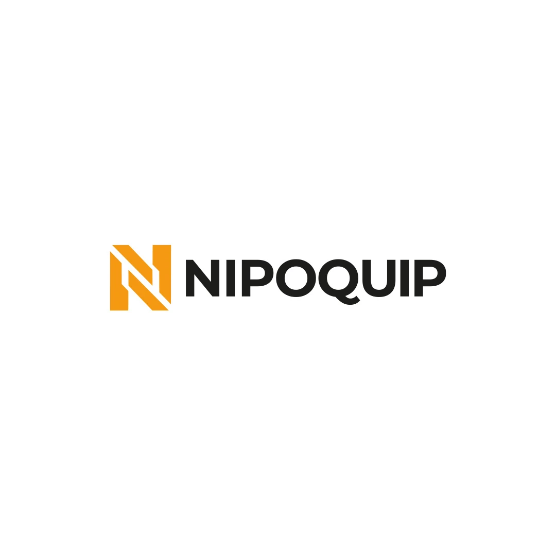
Nipoquip
An industrial identity proposal with a geometric N monogram, developed for an equipment sales and rental brief.
 Let’s talk
Decide whether your bakery logo needs refinement or a redesign. Review recognition, stamp problems, similar bread symbols and the cost of replacing materials.
A bakery logo needs a refresh when the identifying idea still works but its execution creates problems. A redesign becomes more relevant when the identity itself no longer fits the business or is easily confused with other bakeries. Start by diagnosing the issue before deciding how much to change.
An owner can become tired of a familiar wheat badge long before customers do. Equally, a much-loved mark may be difficult to read on a bag or almost indistinguishable from the bakery down the road. Personal preference and practical evidence deserve separate places in the decision.
Collect the logo as customers encounter it: on a filled bread bag, a stamped sleeve, the shop sign, the website and any wholesale paperwork. Use recent examples rather than only the original designer’s presentation.
Write down what fails and where. “The name disappears under the bag fold” points to placement. “The letters merge in the stamp” raises an artwork or production question. “People think we are a bread reseller” may involve positioning, copy and product information as well as the logo.
Customer comments are useful when recorded accurately. Note what was said and the context; do not turn one ambiguous comment into proof of a widespread problem. A short evidence log helps the designer identify patterns without exaggerating them.
Poor reproduction does not always require a new logo. The supplier may have received a low-resolution image, an unsuitable version or a file that includes tiny text never intended for that size.
| Observed problem | First question | Possible response |
|---|---|---|
| Blurred sign or print | Is the source artwork suitable? | Recover or prepare usable artwork before considering a new direction |
| Fine details disappear in the stamp | Has the chosen artwork been sampled at its intended size? | Review reproduction and an agreed simpler variation |
| Different versions appear on every item | Is there a clear master and file guide? | Consolidate assets and usage rules |
| Customers confuse the identity with another bakery | Which shapes, words or arrangements overlap? | Reconsider the identifying idea and its presentation |
The first three problems can sometimes be addressed while preserving the recognisable structure. The fourth may require a more substantial creative change.
A bakery that began as a market stall may now have a shop, preorders and wholesale accounts. An identity designed around one celebratory cake might no longer represent an everyday bread business. A shop that once resold bread may now run its own production.
Describe the change in operational terms. What does the bakery make now? Which customers matter most? Where does the name need to work? The first bakery logo planning guide provides a useful framework even for an established business.
If the main gap is that people cannot tell what you produce yourselves, improve the explanation alongside the identity. A redesigned loaf illustration cannot carry a production distinction that remains absent from the website, bag or counter information.
Place your current identity beside relevant competitors at comparable sizes. Include neighbourhood bakeries, market stalls and shops whose bags customers encounter in the same area.
Look for shared combinations: wheat ears around initials, a round seal with a small loaf, identical script lettering or similar name arrangements. A common ingredient is not automatically a problem, but several common decisions together can make identification difficult.
If initials dominate the mark, use the bakery monogram guide to examine whether they connect clearly with your full name. If the symbol feels interchangeable, compare the possibilities in the abstract versus figurative bakery logo guide.
This visual review helps define a design problem. It is not a trademark search or a clearance decision, which is outside a standard logo design scope.
Before discarding the old identity, list the features worth investigating: the full name, a distinctive letter, a characteristic arrangement or a colour customers associate with the shop.
Ask a few customers or staff to describe what helps them recognise the bakery without first suggesting the answer. Treat the responses as qualitative observations, not a representative market study. Compare them with actual uses of the mark.
A refresh might preserve the overall name shape while correcting spacing and removing a fragile border. A redesign might retain the established name but replace an overused symbol. Neither approach is inherently more professional; the appropriate level depends on the diagnosed issue.
Review the current mark, a restrained update and a more substantial proposal on identical bag, stamp and sign formats where those options are part of the agreed scope. Keep sizes and backgrounds comparable.
Evaluate whether the customer can read the name, distinguish it from nearby identities and connect the new application with the bakery they know. Review one-colour artwork before relying on a decorative mockup.
The Nipoquip contest proposal in SavianoDesign’s portfolio pairs a geometric N with a full wordmark. Although it is an industrial concept, it is a useful reference for discussing separate roles for a compact identifying shape and a readable name. It is not a before-and-after bakery case study.
Count the things that carry the current logo before approving a rollout: printed bags, stickers, stamps, signs, uniforms and customer-facing digital assets. Identify which can be updated quickly and which involve an external order.
The cost of the design is only one part of the change. The bakery logo budget guide separates creative work from production, supplier proofs and replacing existing materials.
Decide which touchpoints should change together. A new online identity and an unrecognisable shop sign can create avoidable doubt for a first-time visitor. If old packaging will remain in use temporarily, keep the business name clear and communicate continuity where customers might otherwise be confused.
Summarise the problem in one paragraph: what is happening, where it happens, what should remain and what a successful update would improve. Include the evidence and application inventory.
A useful request might be: “Keep the established name recognisable, improve the stamp version and review whether our generic wheat badge still helps identification.” This leaves room for professional judgment while giving the project a concrete purpose.
Avoid requesting a completely new style simply because a trend feels fresher. The investment is easier to evaluate when the proposed changes address a known limitation.
No. An older identity can still fit the bakery and reproduce well. Age alone is a weak reason to change it; assess recognition, relevance and use.
Yes, if that solves the problem. Review how much recognition depends on the existing symbol and test the new relationship between the name and mark.
Resolve the direction and supplier requirements before a large new order where possible. Ask for a proof of the approved artwork on the chosen material before committing to production.
Send the current artwork, examples of its use and the problems you want to address. Through the Logo Design service, SavianoDesign can help define whether the next project calls for focused refinement or a new direction, with deliverables agreed before work starts.
Logo Design
An industrial identity proposal with a geometric N monogram, developed for an equipment sales and rental brief.
Logo Design
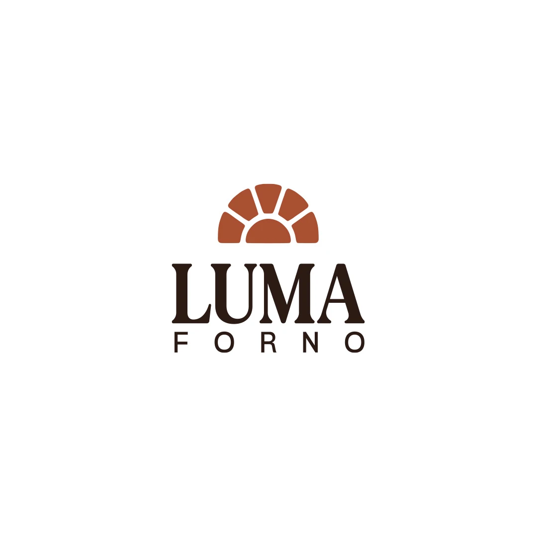
A personal logo concept for a fictional artisan bakery, pairing a terracotta oven-inspired symbol with a strong serif wordmark and a warm bread-bag presentation.
Logo Design
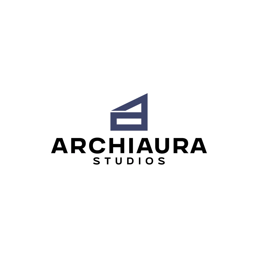
A personal logo concept for fictional ArchiAura Studios, combining an architectural A monogram with clean geometry and a contemporary visual identity.
Logo Design · 6 min read
Plan an artisan bakery logo around what you make, who buys it and real uses. Define bag, stamp and sign requirements before commissioning your first design.
Logo Design · 6 min read
Evaluate bakery initials against the full name, nearby identities and stamp proofs. Test letter clarity, negative space and real use before choosing a monogram.
Logo Design · 6 min read
Compare bakery logo quotes by research, lettering, revisions and files. Separate design fees from bag printing, stamps and signage, with clear pricing context.
A new logo in mind?
A short outline is enough to start a conversation.
Discuss your project View my 99designs profile5.0 / 5 from 25 reviews on 99designs. Read client feedback.