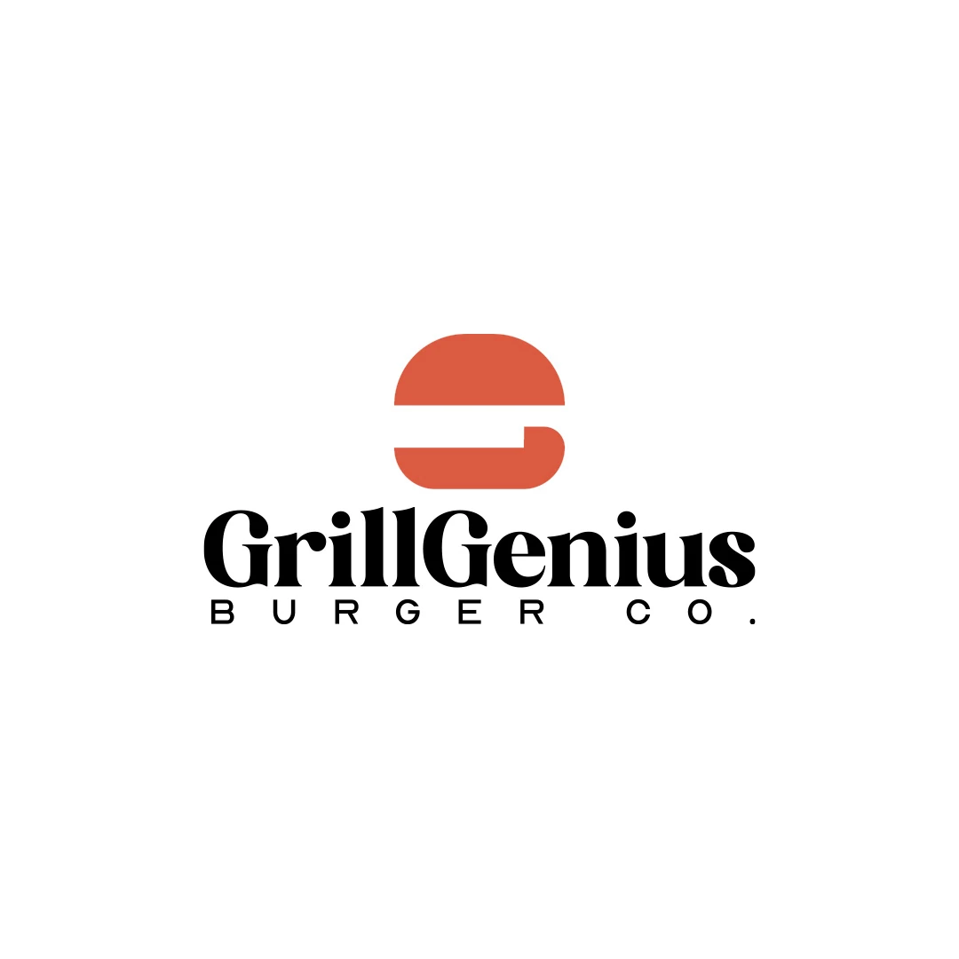
Logo Design
Grill Genius
A personal identity concept for fictional GrillGenius Burger Co., with a burger-shaped G symbol and expressive typography built for instant recognition.
 Let’s talk
Learn when custom lettering improves a café logo. Compare purposeful letter changes, readable wordmarks, real application tests and the scope of delivery.
Custom lettering is useful in a coffee shop logo when it solves a specific problem with the name’s character, rhythm or recognisability while keeping the name readable. Changing letters simply to make the artwork look more customised can introduce problems that were not there before.
A distinctive wordmark might need one carefully judged adjustment, several related changes or a fully drawn treatment. There is no meaningful minimum number of altered letters. The brief and the way the name works in real applications should determine the effort.
Start with the café’s exact name in a suitable typographic direction. Look at the word as a whole before isolating a decorative opportunity.
Perhaps a repeated letter creates an awkward rhythm, a pair appears too close, or the unmodified type feels too formal for the café’s welcoming character. Those are different problems from a logo that is simply too small on its sign.
Write the intended improvement in plain language: make this pair easier to read, give the name a gentler rhythm or create a distinctive feature that remains clear on a cup. If the reason cannot be explained, the change may be decoration rather than useful refinement.
For the starting type choice, use the coffee shop logo font-selection guide.
These terms describe different deliverables. A carefully typeset wordmark can use an existing font with deliberate spacing and composition. Modified lettering changes selected forms within that wordmark. A drawn wordmark may be developed specifically for the name.
A custom typeface is a much larger system of characters that can be typed as new text. A customised café logo does not automatically include that system.
| Approach | What is being developed | A useful question |
|---|---|---|
| Refined typesetting | Choice, spacing and arrangement of existing letterforms | Does the name already have the right clarity and tone? |
| Modified wordmark | Specific changes to the letters of the name | What does each alteration improve? |
| Drawn wordmark | A name-specific lettering design | Does the whole word retain a coherent rhythm? |
| Custom typeface | A reusable character set and font system | Is this broader commission actually needed? |
Ask which approach is proposed and what will be delivered. The terminology should clarify the scope rather than imply that more extensive work is automatically better.
For a café balancing artisanal warmth with contemporary service, the useful tension may be between individual character and a direct, readable name.
Subtle changes to terminals, curves or proportions can make a wordmark feel less rigid. A consistent structure and controlled spacing can keep it clear. Neither warmth nor modernity belongs exclusively to a script, serif or sans-serif style.
Use the criteria from the coffee shop logo brief to discuss the effect. “The modified curves make the name more approachable while preserving the letter shapes” is more informative than “the custom version has more personality”.
Avoid forcing a coffee bean, cup or steam line into a letter unless the resulting word remains clear. A hidden illustration should not make an unfamiliar café name harder to read.
An attractive isolated letter may create an uneven wordmark. Compare the rhythm of straight and round forms, the internal spaces and the balance at the beginning and end of the name.
For a simple illustrative problem, an overly tight r–n pair can resemble an m in some treatments. Adding a connecting stroke may make that ambiguity worse. Opening the relationship could be more useful than adding a distinctive flourish.
Likewise, a large custom initial can overpower the rest of a short name. Review the whole word at a realistic size before refining a detail at extreme magnification.
When looking through the Logo Design portfolio, examine the relationship between lettering, symbol and spacing. A finished image alone does not establish whether the letters were drawn, modified or carefully typeset; ask about the approach when it matters to your commission.
Compare the initial and modified lettering at the same size, colour and position. Otherwise, a more flattering presentation can influence the choice.
Review three conditions: plain artwork, a realistic application and the smallest agreed use. Ask people unfamiliar with the name to read it without prompting. Note the exact misunderstanding rather than asking only whether they like the style.
If a change improves character at large size but harms readability on a cup, it may need refinement or a separate small-use treatment. Define any alternate version explicitly so suppliers are not improvising it later.
The guide to wordmarks and symbols for café names can help when the full name and a compact mark need different jobs.
If the work starts from a font, review that font’s licence for the intended use and modification. Permissions vary by source and should not be inferred from the ability to convert text into shapes.
For example, Adobe Fonts’ licensing guidance permits modifying outlined or rasterised type from its service, while distinguishing that artwork from changes to the font software itself. That guidance is specific to Adobe Fonts; it does not describe every font licence.
Also understand the editing implications. Adobe’s outline documentation explains that outlined text becomes vector shapes rather than editable typed text. A delivered wordmark can therefore be editable as artwork without functioning as an installable font.
Name development, extensive letter drawing and additional variations can affect the work required. Discuss those requirements before comparing a basic typesetting proposal with a more developed lettering commission.
Confirm what happens if the café’s spelling or descriptor changes after approval. A wordmark built for one name may need further design work to accommodate another.
The coffee shop logo budget guide explains how to compare lettering, refinement and handover alongside the rest of the quote.
As many as the design needs, which may be very few. Judge the improvement to the whole name rather than counting modifications.
No. Appropriate selection, spacing and refinement can produce a considered result. Custom drawing should be justified by the brief and the final quality.
Not unless that is explicitly part of a separate typeface scope. A custom wordmark and the type used for ordinary menu content can have different roles and licensing needs.
SavianoDesign’s Logo Design service considers custom lettering within the agreed complexity and scope. Share the café name, intended character and the sign or cup applications that matter most.
We can discuss whether careful typesetting, selected letter changes or a more developed treatment is appropriate for the project.
Logo Design
A personal identity concept for fictional GrillGenius Burger Co., with a burger-shaped G symbol and expressive typography built for instant recognition.
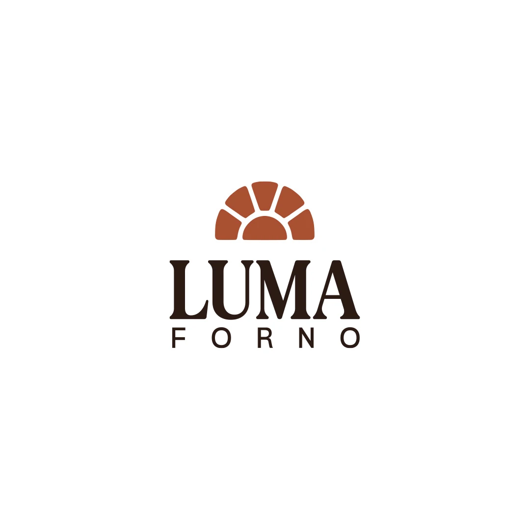
Logo Design
A personal logo concept for a fictional artisan bakery, pairing a terracotta oven-inspired symbol with a strong serif wordmark and a warm bread-bag presentation.
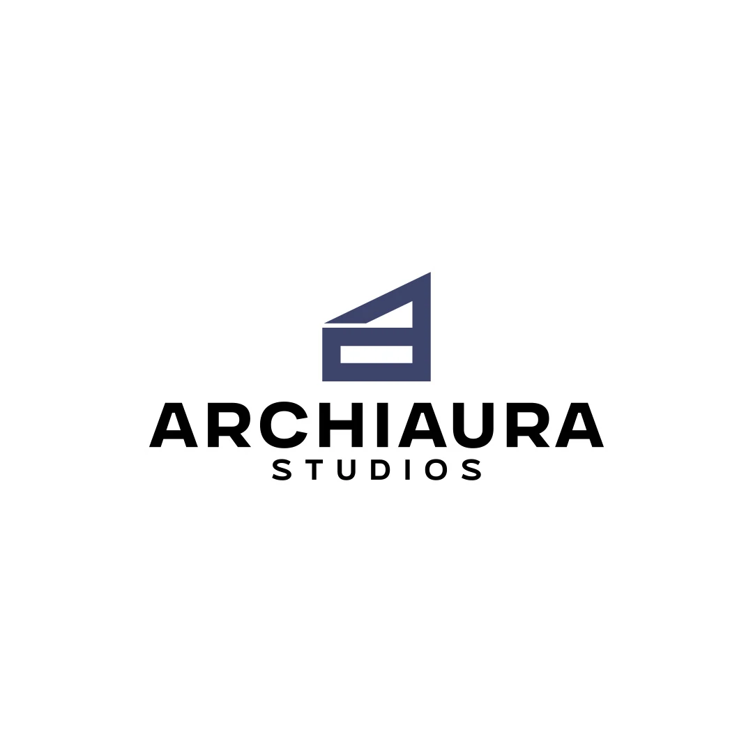
Logo Design
A personal logo concept for fictional ArchiAura Studios, combining an architectural A monogram with clean geometry and a contemporary visual identity.
Logo Design · 6 min read
Choose a café logo font by testing the actual name, proportions, spacing and tone on signs, cups and menus, with practical comparison and handover checks.
Logo Design · 6 min read
Write a coffee shop logo brief that turns warmth, craft and contemporary service into useful criteria, with application details and an illustrative example.
Logo Design · 6 min read
Compare coffee shop logo quotes by scope, lettering, revisions and deliverables. See SavianoDesign pricing and separate design fees from production costs.
A new logo in mind?
A short outline is enough to start a conversation.
Discuss your project View my 99designs profile5.0 / 5 from 25 reviews on 99designs. Read client feedback.