Logo Design
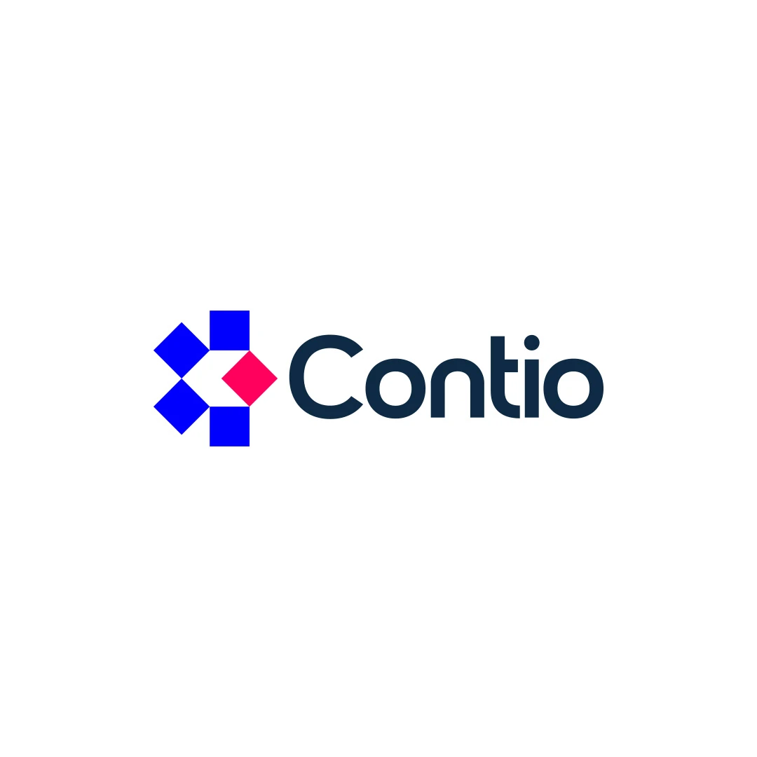
Contio
A logo contest proposal for Contio, using an abstract geometric symbol to express collaboration, structure and focus for a meeting productivity platform.
 Let’s talk
Choose a hotel logo font by comparing the real name, spacing, proportions and tone on signage, linen and the website, with practical handover checks included.
Choose a boutique hotel logo font by testing the actual property name, its proportions and its tone in real applications. A typeface that looks refined in a large specimen may become cramped in the website header or lose important details when reproduced on linen. The name and intended uses should lead the decision.
Serif, sans-serif and script are broad categories, not automatic signals of the right guest experience. A useful comparison asks how particular letterforms behave and whether the overall treatment belongs with the hotel’s setting and service.
Set the complete property name in each candidate, with the required spelling, punctuation and accented characters. Include small words and descriptors rather than evaluating only the most attractive part.
Look at the combinations the name creates. Repeated round letters can produce a different rhythm from a sequence of narrow vertical forms. A distinctive capital may be appealing alone but awkward next to the following letter.
For an illustrative comparison, prepare the same full name in two or three suitable directions at a comparable apparent size. Do not choose a winner from a type specimen that never shows your letter combinations.
The same point size does not make different typefaces look equally large. Compare the visible height and overall footprint, then place the wordmark within the actual space available.
A wide name treatment may suit an entrance fascia but leave little room in a mobile header. A tall, narrow treatment may fit that header while feeling too formal or compressed elsewhere. Consider a planned alternate arrangement before distorting the letters to force a fit.
The hotel wordmark-or-symbol guide helps establish which applications need the full name and which might use a supporting compact mark.
Review the spaces between letter pairs, inside counters and between words. Consistent numerical spacing does not necessarily create a visually even wordmark.
Pay particular attention to a large capital beside a smaller rounded form, punctuation and the gap before a descriptor. Read the name aloud after a quick glance; if a word break is unclear, identify the actual relationship causing the hesitation.
Spacing should be reviewed at the intended size, not only while zoomed in. A gap that feels generous on a large screen may be necessary to preserve separation in a small reproduction.
Use the same settings for each candidate so the presentation does not decide the outcome before the typography is examined.
| Check | What to compare | Useful evidence |
|---|---|---|
| Name recognition | Letter shapes and word boundaries | Someone unfamiliar with the property reads the exact name |
| Entrance use | Proportion within the available area | A correctly scaled layout and supplier feedback |
| Website header | Readability beside navigation | The actual narrow layout, not an isolated large logo |
| Textile use | Fine strokes and internal spaces | A sample produced on the intended material |
| Property fit | Tone beside real images and materials | A matched presentation using the same hotel references |
Record observations rather than assigning a vague style score. “The second word disappears in the narrow header” is actionable; “this feels less premium” needs an explanation.
A serif can be restrained, robust, delicate or expressive. A sans-serif can be formal or welcoming. Script can introduce a personal quality, but its usefulness depends on the particular letterforms and the reader’s ability to recognise the name.
Use the hotel logo brief to explain the intended relationship with the property. A restored building does not require an imitation historical typeface, and contemporary service does not require an austere geometric wordmark.
The Contio contest proposal shows a direct typographic relationship with an abstract mark. The Aster House personal website concept explores a hospitality presentation with prominent serif typography. These are different projects and scopes, useful for discussing tone rather than selecting a universal hotel style.
The logo’s type treatment identifies the property. Website navigation, room descriptions, rates and arrival instructions must support sustained reading and clear decisions. They do not have to reproduce every feature of the wordmark.
W3C’s guidance on minimum text contrast distinguishes logo text from other website text: the logo exception does not extend to ordinary content simply because a colour is part of the brand. Hotel information and controls should be evaluated for their actual role.
This is one reason a logo-only commission is not a complete typographic system. The hotel logo versus brand identity guide explains where broader rules and application design need to be defined separately.
Check every character required by the property name. If a font is also proposed for guest documents or the website, evaluate the languages, numerals and punctuation needed there as a separate use case.
Confirm the licence for each intended use and identify who needs access to the font. For example, Adobe Fonts’ client-work guidance distinguishes finished artwork from a client’s need to access and edit the fonts directly. Other providers may set different conditions.
The delivery should make clear which files contain vector logo artwork and which documents rely on editable text. Avoid leaving the hotel or a future supplier to guess why a file displays correctly but cannot be retyped in the same lettering.
Once the shortlist is sound, identify any remaining problem. A particular terminal, connection or spacing relationship may benefit from refinement, but changing letters should not become an end in itself.
Use the hotel custom lettering guide to define the purpose of the change and compare it fairly with the starting version. If a candidate needs extensive correction simply to remain readable, reconsider the choice before adding complexity.
There is no universal safest category. Compare suitable candidates against the hotel’s character, exact name and practical applications. The details matter more than the classification.
Possibly, if it is appropriate for interface and reading tasks and licensed for the intended use. A modified wordmark may also differ from the underlying font, so document the relationship.
Evaluate it against the required sizes, backgrounds and production methods. If the name loses clarity in important uses, adjust the direction or agree an appropriate variation instead of relying on a flattering large mockup.
SavianoDesign’s Logo Design service develops typography around the actual business name and intended uses. Send your hotel name, property references and the sign, website or linen requirements so the comparison can begin with the right constraints.
Logo Design
A logo contest proposal for Contio, using an abstract geometric symbol to express collaboration, structure and focus for a meeting productivity platform.
Logo Design
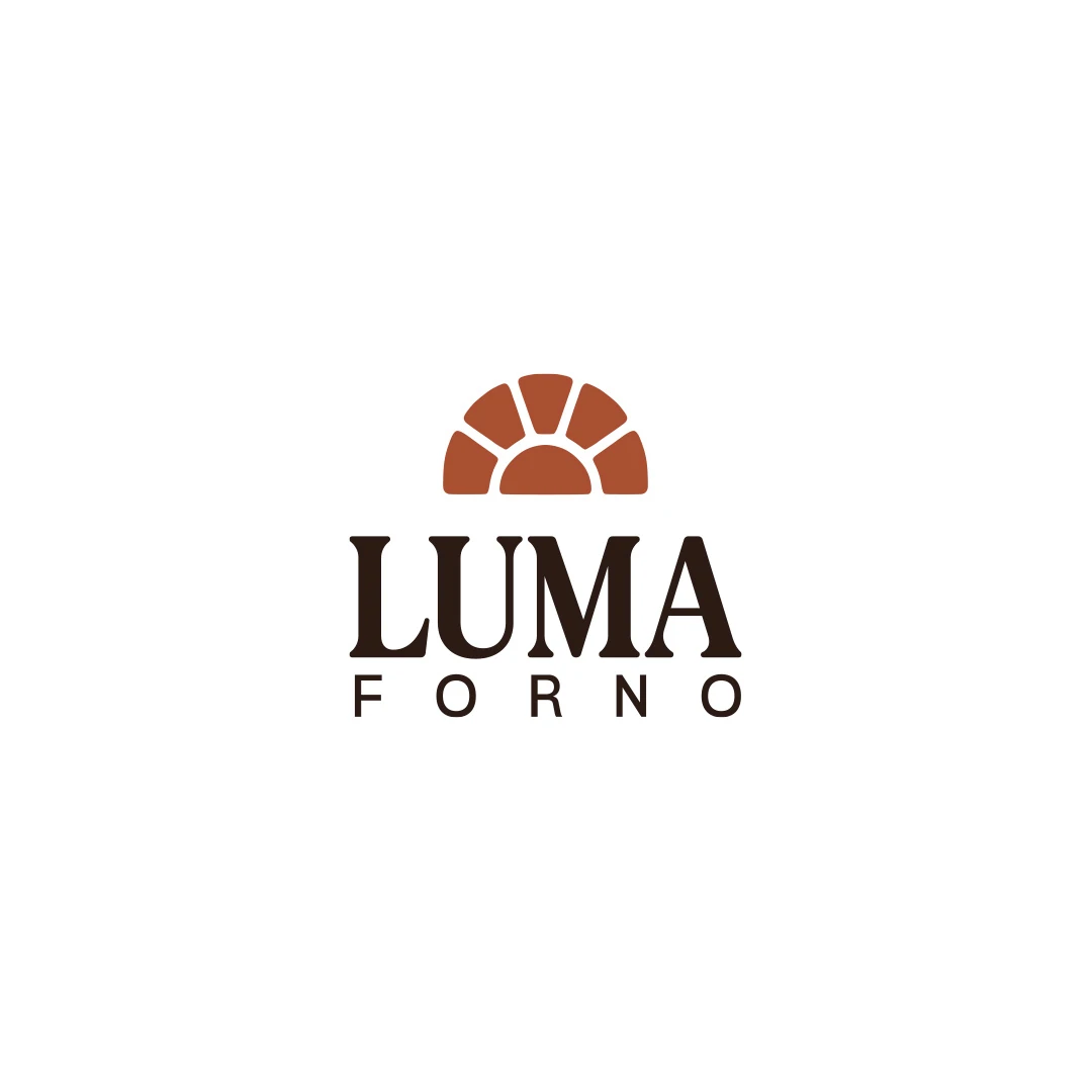
A personal logo concept for a fictional artisan bakery, pairing a terracotta oven-inspired symbol with a strong serif wordmark and a warm bread-bag presentation.
Logo Design
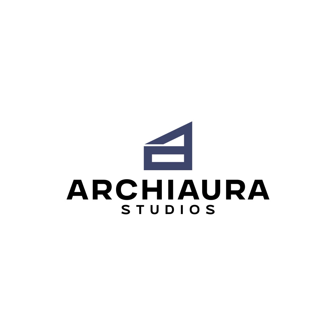
A personal logo concept for fictional ArchiAura Studios, combining an architectural A monogram with clean geometry and a contemporary visual identity.
Logo Design · 6 min read
Assess custom hotel lettering through the actual name, property character and real applications. Compare refinements, readability, licensing and project scope.
Logo Design · 6 min read
Choose a hotel wordmark, symbol or combination by testing the full name at booking, arrival and during the stay, with practical roles for each logo variation.
Logo Design · 6 min read
Separate a hotel logo, variations, usage guidance and finished applications. Plan a useful first phase for signage, linen and the website with clear ownership.
A new logo in mind?
A short outline is enough to start a conversation.
Discuss your project View my 99designs profile5.0 / 5 from 25 reviews on 99designs. Read client feedback.