Logo Design
Contio
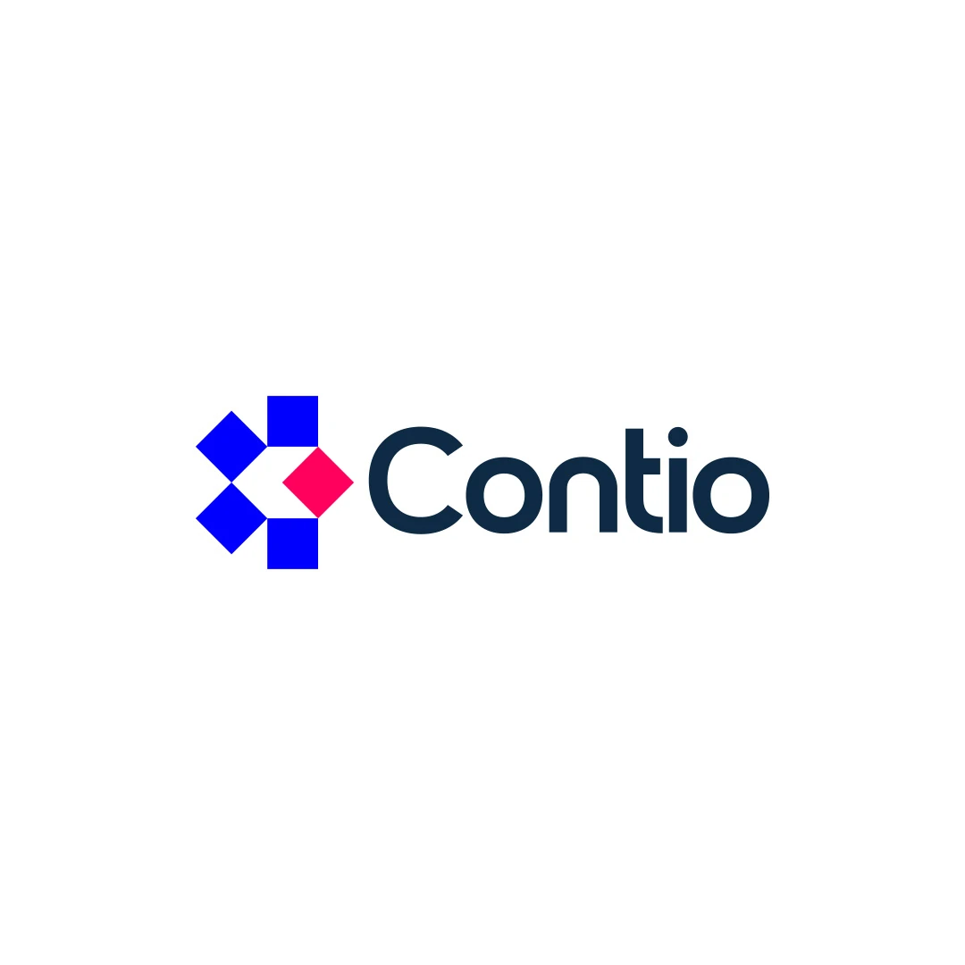
A logo contest proposal for Contio, using an abstract geometric symbol to express collaboration, structure and focus for a meeting productivity platform.
 Let’s talk
Choose a hotel wordmark, symbol or combination by testing the full name at booking, arrival and during the stay, with practical roles for each logo variation.
Use a wordmark when the hotel’s name needs to lead identification; add a symbol when a compact visual cue has a clear job. For a boutique hotel, the most useful solution may be a coordinated combination, with the full name prominent during discovery and arrival and a smaller mark used in appropriate supporting contexts.
This choice is not a contest between sophisticated symbols and ordinary text. A guest must connect the name seen while booking with the property they reach. The identity should make that connection easier while expressing something appropriate about the stay.
A new guest may know nothing about the hotel beyond a name in a recommendation or reservation. A wordmark makes that name visible and gives its spelling a stable visual form.
Start with the exact name, including any required descriptor. Test it in a realistic website header and on the entrance. A long name might need a considered line break; an unusual spelling might benefit from more familiar letterforms. Neither automatically requires a symbol to compensate.
The hotel logo font-selection guide explains how width, spacing and letterform clarity affect these decisions. Avoid judging the name only in an oversized presentation.
A symbol can provide a recognisable shape, express an aspect of the property’s character or fit a compact application. It should have a purpose beyond filling the space beside the name.
Write that purpose in the brief. “A supporting mark for small guest items, linked to the main identity” is more useful than “something iconic”. The symbol does not have to explain the whole hotel, and its meaning may not be obvious on first exposure.
The comparison of abstract and figurative hotel symbols helps assess whether a literal subject, an abstract construction or a hybrid would provide a suitable cue.
The appropriate emphasis can change without creating a different identity. What matters is a planned relationship between the versions.
| Situation | Identification need | Useful direction to explore |
|---|---|---|
| A first visit to the website | Learn the property name | A readable full wordmark or combination |
| Arrival at an unfamiliar entrance | Confirm the correct hotel | Full name with sufficient prominence |
| A small item inside the room | Reinforce an already established identity | A compact symbol or monogram, where appropriate |
| A digital context with the name already displayed as text | Recognise a small brand cue | A simplified mark that remains clear at the actual size |
These are planning choices, not a rule that every item needs a separate logo. Keep the smallest set of versions that solves the real applications.
A mark may fit a square perfectly while communicating very little to a first-time guest. Compactness is a technical advantage; recognition depends on the design and the context in which people encounter it.
For an illustrative hotel with a long name, replacing the entire entrance wordmark with initials may save space but remove the information arriving guests need. A stacked name treatment might solve the available-space problem more directly.
If initials are being considered, use the boutique hotel monogram guide. It distinguishes an attractive abbreviation from one that people can connect with the actual property.
A strong symbol and a good wordmark can still feel unrelated. Compare visual weight, proportions, spacing and overall character. The symbol should not overpower the name when the name carries identification.
The Contio contest proposal pairs an abstract geometric symbol with a clear wordmark. It is a cross-sector example for discussing how symbol and name work together, not a hospitality case study or evidence that an abstract direction suits every hotel.
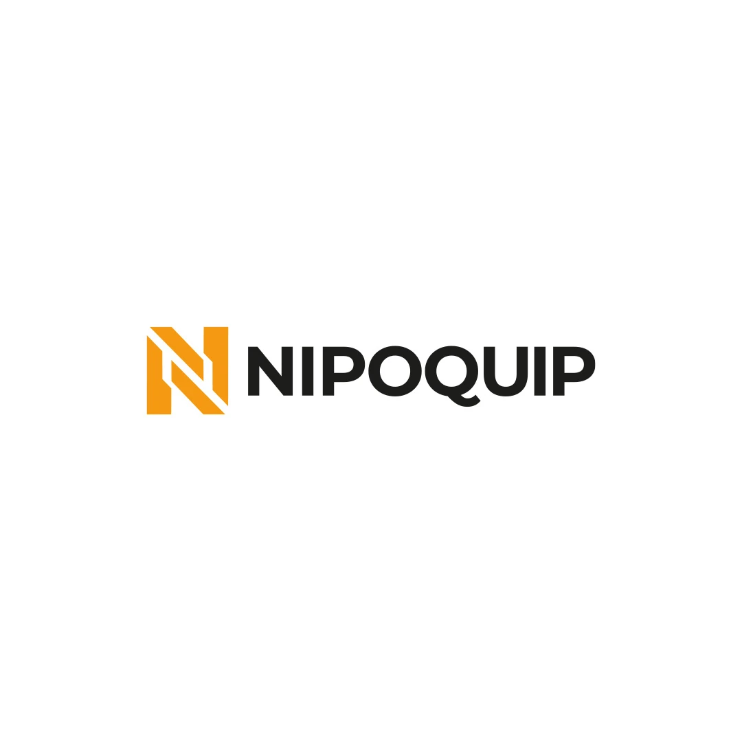
The Nipoquip contest proposal offers another relationship: a geometric initial alongside the full business name. In a hotel brief, the transferable question is how a compact element supports the name without forcing guests to decode it.
Place each direction next to actual property photography and representative guest information. A logo that feels appropriate on an empty page may become too ceremonial, too informal or too visually busy in that setting.
Keep the comparison fair. Use the same image, background and scale for each direction before trying expressive mockups. This helps separate the quality of the logo from the appeal of a particular presentation.
The hotel name should also be available as ordinary text where guests need to read or search for it. An image of a wordmark should not carry every piece of identifying information in a booking or website experience.
Decide whether “Hotel”, a location line or another descriptor belongs in every version. A descriptor that is useful on the entrance may become unreadable when squeezed into a small mobile header.
Also clarify the relationship between the hotel and any restaurant, bar or spa. Giving every offer a separate symbol may create unnecessary complexity, while using the same mark without any naming distinction can make the relationship unclear.
These questions can extend into a broader visual system. The hotel logo versus brand identity guide helps distinguish essential logo variations from separately scoped application and identity work.
Prepare a small application sheet using the actual name and agreed formats. Include the entrance, a narrow header and one compact use. Ask someone unfamiliar with the property to identify the name and explain which marks seem to belong together.
If they can read the wordmark but cannot connect the symbol with it, consider whether the relationship needs refinement or whether the symbol simply needs to appear with the name more often. Do not treat a small informal review as a forecast of brand recognition.
Document where each version is allowed and which uses still require supplier confirmation. A variation without a role adds files, not clarity.
Yes. A considered name treatment can carry the identity. A symbol is useful when it solves a real application or recognition need, not because the hotel category requires one.
No. A readable wordmark may work if the size and production method support it. Compare it with a compact option using a sample on the intended fabric.
It can support that impression, but the name, descriptor and surrounding information can identify the business more directly. Avoid asking one small shape to communicate every facility and feature.
SavianoDesign’s Logo Design service develops symbols and wordmarks around the name, audience and intended applications. Share the hotel’s exact name and the spaces where the identity needs to work so we can agree which directions and variations are useful.
Logo Design
A logo contest proposal for Contio, using an abstract geometric symbol to express collaboration, structure and focus for a meeting productivity platform.
Logo Design
An industrial identity proposal with a geometric N monogram, developed for an equipment sales and rental brief.
Logo Design
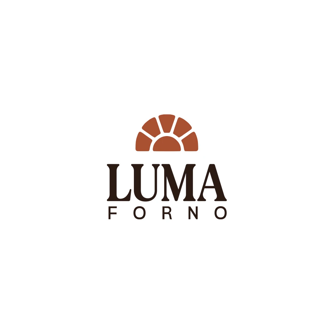
A personal logo concept for a fictional artisan bakery, pairing a terracotta oven-inspired symbol with a strong serif wordmark and a warm bread-bag presentation.
Logo Design · 6 min read
Choose a hotel logo font by comparing the real name, spacing, proportions and tone on signage, linen and the website, with practical handover checks included.
Logo Design · 5 min read
Evaluate hotel initials against the full name, nearby identities and linen. Test readability, negative space and embroidery before approving a monogram.
Logo Design · 6 min read
Compare abstract and figurative hotel symbols through place, guest expectations and practical use. Test meaning, ambiguity and room for the identity to grow.
A new logo in mind?
A short outline is enough to start a conversation.
Discuss your project View my 99designs profile5.0 / 5 from 25 reviews on 99designs. Read client feedback.