Logo Design
Prince Billiards
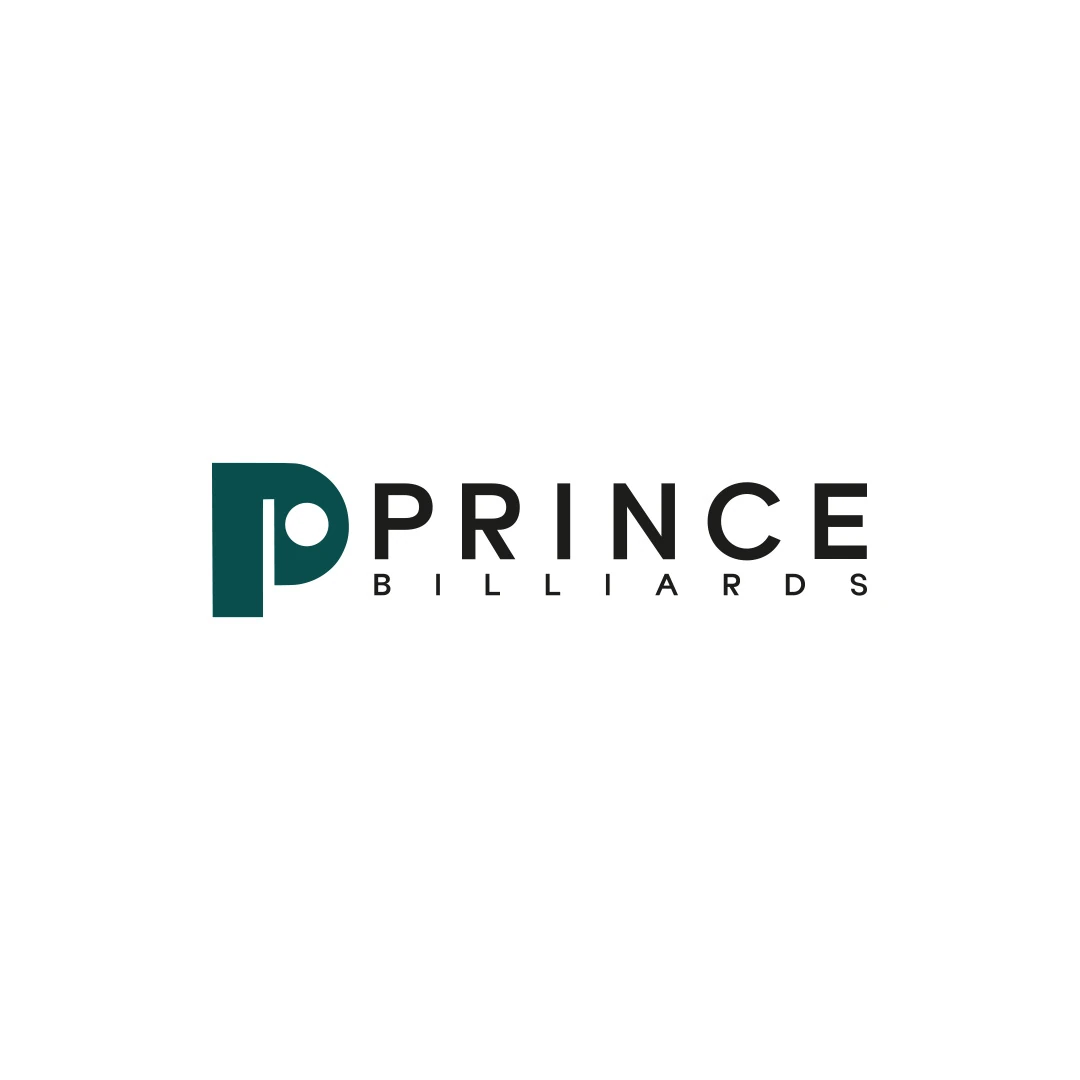
A logo contest proposal for Prince Billiards, using a P monogram and negative space to suggest a billiard ball and cue across brand applications.
 Let’s talk
Evaluate hotel initials against the full name, nearby identities and linen. Test readability, negative space and embroidery before approving a monogram.
A boutique hotel monogram is useful when initials form a clear, distinctive supporting mark and guests can connect it with the full property name. It becomes a problem when it hides the name at important identification points, resembles another hotel’s mark or depends on details that do not survive the intended application.
Linen and small guest items make monograms appealing, but a compact shape is only one part of the decision. Evaluate the initials as a communication device, an element of the wider identity and a piece of artwork that must be produced reliably.
Write the full name beside every proposed abbreviation. Clarify whether an article, location or descriptor contributes a letter. If different teams naturally shorten the name in different ways, resolve that before refining a monogram.
For a fictional example, a hotel called The Wren Courtyard might be shortened to TWC or WC. Those options have different visual possibilities and different potential associations. The example illustrates a naming decision; it does not establish that either abbreviation is suitable or available.
The hotel wordmark-or-symbol guide explains why a compact mark should have an assigned role rather than replace the full name by default.
Consider what the guest already knows when seeing the initials. Someone in a room has context that a visitor approaching an unfamiliar doorway may not have.
Use the full name wherever it is needed to confirm the property. A monogram can sit alongside it, but the composition should not make the wordmark too small or difficult to find.
On a website, initials in a compact mark do not remove the need for a clear hotel name in the page content. The same reasoning applies to guest communications: visual consistency should not depend on the reader already knowing the abbreviation.
Interlocking letters can be satisfying to draw but difficult to read. Check which letter is seen first, whether another disappears and whether the combined shape suggests something unintended.
Review the mark as a small black shape and as a reversed version. Then compare it with the full wordmark. If the monogram only makes sense after a diagram explains the overlaps, decide whether that ambiguity is acceptable for its supporting role.
The Prince Billiards contest proposal uses a P with negative-space references to a ball and cue. It provides a concrete example of an initial carrying another idea. It is not a hotel project; the useful question is whether the extra meaning remains coherent with the letter.
Two hotels can share initials without looking alike. Conversely, different letters can produce a similar crest, outline or arrangement. Compare the overall impression, not just the alphabetic content.
Review nearby properties and relevant chains in the same size and colour conditions. Include surrounding type and any border. A familiar wreath or enclosure may dominate recognition more than the initials inside it.
This is a visual design review, not trademark clearance. If an existing initials-based identity is causing confusion, use the hotel logo refresh-or-redesign guide to decide whether refinement is sufficient or the underlying direction needs reconsideration.
A smooth digital mockup cannot show exactly how a monogram will behave on a particular textile. Supply the intended fabric, placement and dimensions to the embroidery specialist, and request a sample before approving a larger production run.
Madeira’s embroidery-thread guidance describes different thread weights for different levels of lettering and detail. This supports a practical distinction: there is no single logo size that guarantees the same result across all thread, fabric and production combinations.
Ask the supplier to review open spaces, fine strokes and overlapping areas. Confirm who prepares the embroidery data and whether a separately approved simplified version is needed. A vector logo file and the supplier’s digitised embroidery file are different deliverables.
Record the intended use and the actual observation, rather than approving a monogram only because it looks elegant in one mockup.
| Test | What to inspect | Possible response |
|---|---|---|
| Full name and monogram together | Whether they appear to belong to the same property | Refine proportion, weight or spacing |
| Small monochrome reproduction | Whether internal gaps remain understandable | Simplify a detail or set a suitable minimum use |
| Embroidery sample on the selected fabric | Whether letters and negative spaces remain clear | Review artwork and digitising with the supplier |
| Comparison with relevant hotel identities | Whether the overall impression could be confused | Reconsider the construction or supporting form |
Retain the approved sample and record which artwork version produced it. That gives future orders a useful reference and avoids suppliers independently redrawing the mark.
A border, crest or decorative flourish may support the property’s character, but it also adds another element to reproduce and recognise. Remove the decoration temporarily and ask whether the initials still work.
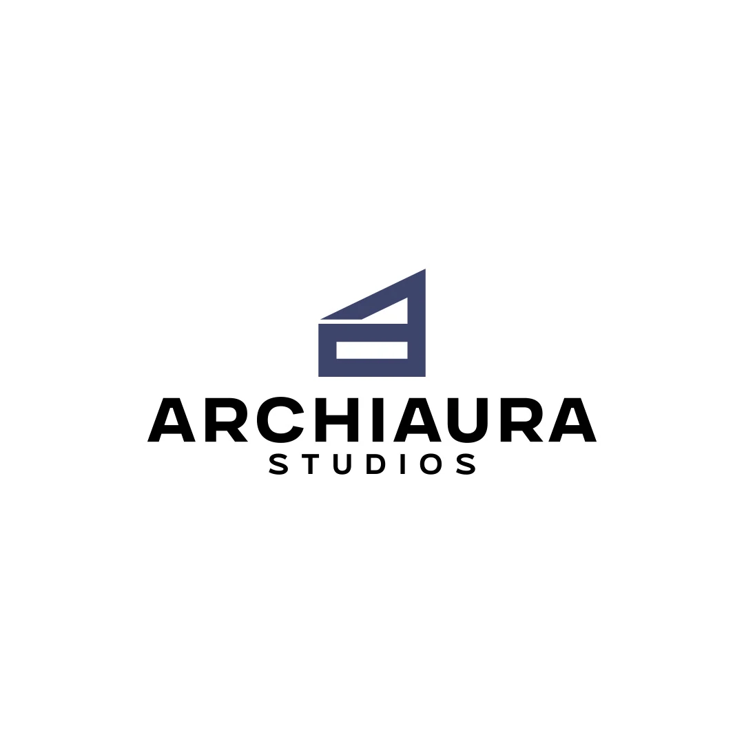
The ArchiAura personal concept connects an A with architectural structure. Its geometric approach is one example of integrating a letter and a subject without requiring a complex scene. A hotel may call for a very different tone, but the relationship between letter and idea remains worth examining.
For letter-level refinements, the hotel custom lettering guide explains how to assess the effect of a change. The hotel font-selection guide helps when the starting letterforms create the difficulty.
No. Their effect depends on the construction, context and relationship with the property. A well-chosen full name can be more appropriate than a monogram that adds ambiguity.
Only when symmetry supports the letters and the intended character. Forcing unlike letters into a symmetrical construction can reduce clarity or create an unintended shape.
Technical adaptation may be necessary, but agree how changes are reviewed and approved. Keep an authoritative artwork version so the identity does not gradually diverge across suppliers.
SavianoDesign’s Logo Design service can explore initials and compact variations within an agreed scope. Send the full hotel name, existing identity and the intended linen or small-format applications. We can define the design work and the points requiring supplier sampling.
Logo Design
A logo contest proposal for Prince Billiards, using a P monogram and negative space to suggest a billiard ball and cue across brand applications.
Logo Design
A personal logo concept for fictional ArchiAura Studios, combining an architectural A monogram with clean geometry and a contemporary visual identity.
Logo Design
A logo contest proposal for Contio, using an abstract geometric symbol to express collaboration, structure and focus for a meeting productivity platform.
Logo Design · 6 min read
Choose a hotel wordmark, symbol or combination by testing the full name at booking, arrival and during the stay, with practical roles for each logo variation.
Logo Design · 6 min read
Decide whether your hotel logo needs a refresh or redesign. Audit recognition, technical issues, similarity to other hotels and material replacement costs.
Logo Design · 6 min read
Assess custom hotel lettering through the actual name, property character and real applications. Compare refinements, readability, licensing and project scope.
A new logo in mind?
A short outline is enough to start a conversation.
Discuss your project View my 99designs profile5.0 / 5 from 25 reviews on 99designs. Read client feedback.