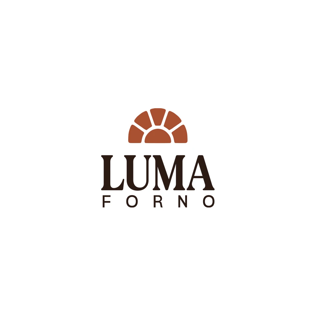
Logo Design
Forno Luma
A personal logo concept for a fictional artisan bakery, pairing a terracotta oven-inspired symbol with a strong serif wordmark and a warm bread-bag presentation.
 Let’s talk
Assess custom hotel lettering through the actual name, property character and real applications. Compare refinements, readability, licensing and project scope.
Custom lettering is useful for a boutique hotel logo when it makes the actual name more appropriate, more coherent or easier to distinguish without sacrificing readability. It should address a specific relationship between the letterforms and the property’s character. Adding ornamental strokes simply to make the logo look bespoke is not the same as solving that problem.
A hotel wordmark has to work beyond a large sign or a presentation image. Its character should remain recognisable in the website header, on practical guest materials and, where specified, in a smaller textile application.
Begin with the exact name in a plausible typographic direction. Look for an identifiable problem: awkward spacing around a distinctive capital, an overly severe rhythm, a descriptor that feels unrelated or a particular letter that is easily misread.
Different problems call for different interventions. A spacing issue may not require redrawing a letter. A name that feels too formal may need a different starting typeface rather than extra curves. A long wordmark may need a revised arrangement rather than compressed lettering.
The hotel logo font-selection guide helps establish whether the foundation is suitable before investing in customisation.
The building or setting can provide a useful reference: the rhythm of openings, a restrained curve or a particular balance of solidity and lightness. Treat these as possible influences, not instructions to insert architectural drawings into the name.
For an illustrative direction, a softened terminal might sit more comfortably beside warm interior materials. A controlled angular detail might relate to a contemporary extension. Neither association is automatic; compare it with the property context and ask whether viewers can still read the word naturally.
Use the boutique hotel logo brief to keep this conversation connected to evidence. The objective is a suitable name treatment, not a hidden story that requires a long explanation.
A considered wordmark does not need every letter redrawn. Describe the proposed work accurately so its value and scope are clear.
| Approach | Work involved | Reason it might suit the hotel |
|---|---|---|
| Refined typesetting | Typeface selection, spacing and arrangement | The underlying letterforms already support the name and character |
| Modified wordmark | Selected changes to specific letterforms | A targeted adjustment improves rhythm, character or clarity |
| Drawn lettering | A name-specific set of letterforms | The brief calls for a more developed treatment that existing forms do not provide |
These are not quality rankings. A restrained typeset solution may be more successful than an extensively drawn one that makes the name difficult to recognise.
A customised initial can draw attention away from the rest of the name. Review the beginning, middle and ending as one composition. Check repeated forms, internal spaces and whether the final letter leaves an awkward visual gap.
Do not overlook “The”, “House” or “Hotel”. If these belong to the name, decide how they remain legible in the intended applications. A refined main word does not compensate for a descriptor that becomes a faint decorative line.
Test accented characters and punctuation as part of the actual identity. Removing or reshaping them for visual convenience may change how the name is read. The brief should specify which forms are fixed.
Ask to see the starting and modified versions at the same size, weight and colour, with the same surrounding space. Then compare both in the agreed sign and header settings.
This makes the effect of the lettering easier to assess. A foil effect, textured paper or carefully lit entrance can make almost any proposal feel more impressive without revealing whether the letter changes improved it.
When reviewing the Logo Design portfolio, use the same approach: examine the name, spacing and relationship to any symbol. A finished image alone does not establish whether the lettering was drawn, modified or typeset. Ask about the method when it matters to the proposed scope.
Look at the smallest required use, the least forgiving background and any production process likely to affect fine details. If a flourish works on the entrance but disappears in embroidery, decide whether to refine it, limit its use or agree a supporting variation.
Do not allow a production variation to become an unrelated second wordmark. Record the relationship and the circumstances in which each version is used.
The boutique hotel monogram guide explains the role of compact marks and supplier samples. A monogram may support a wordmark, but it should not be added merely to avoid resolving poor readability in an important full-name application.
If lettering begins with an existing font, check the licence for the intended use and modification. Being able to edit outlines in design software does not, by itself, establish permission.
For example, Adobe Fonts’ licensing guidance permits modification of outlined or rasterised type from its service, while prohibiting changes to the font software itself or creating font software from those outlines. Those are Adobe-specific terms; another source may use different conditions.
A custom wordmark is also different from a reusable custom typeface. The hotel may receive editable vector artwork of its name without receiving an installable font for typing room descriptions or guest documents. Make the distinction explicit in the handover.
Identify the current decision before giving feedback. Are you selecting a direction, refining the chosen letterforms or testing a final application? Comments should address that stage.
“The altered capital now reads as another letter in the header” identifies a problem. “Make it more unique” leaves the designer guessing. Compare the observation with the brief and request a purposeful adjustment.
If the hotel name changes after the lettering is approved, further work may be required. The hotel logo budget guide helps distinguish lettering scope, review rounds and changes to the underlying brief.
No. Some useful refinements are subtle. Judge the coherence, readability and appropriateness of the result rather than how visibly different every letter appears.
Not as a typing system unless a separate typeface has been commissioned and licensed accordingly. A logo wordmark normally represents a particular name, not a complete alphabet.
No. Start with the brief and the actual name. Carefully selected and refined typography may meet the requirements without extensive drawing.
SavianoDesign’s Logo Design service considers custom lettering within the agreed complexity and scope. Share the exact hotel name, property references and the applications that expose the current difficulty. We can discuss whether typesetting, selected changes or a more developed treatment is appropriate.
Logo Design
A personal logo concept for a fictional artisan bakery, pairing a terracotta oven-inspired symbol with a strong serif wordmark and a warm bread-bag presentation.
Logo Design
A personal logo concept for fictional ArchiAura Studios, combining an architectural A monogram with clean geometry and a contemporary visual identity.
Logo Design
A logo contest proposal for Contio, using an abstract geometric symbol to express collaboration, structure and focus for a meeting productivity platform.
Logo Design · 6 min read
Choose a hotel logo font by comparing the real name, spacing, proportions and tone on signage, linen and the website, with practical handover checks included.
Logo Design · 6 min read
Write a boutique hotel logo brief with property facts, guest needs and application requirements. Turn atmosphere and service into useful design review criteria.
Logo Design · 6 min read
Compare hotel logo design quotes by scope, lettering, revisions and files. Separate design fees from signage, embroidery and rollout, with pricing context.
A new logo in mind?
A short outline is enough to start a conversation.
Discuss your project View my 99designs profile5.0 / 5 from 25 reviews on 99designs. Read client feedback.